Feature
Post

Category
Design

The Evolution of Design

Much like everything else in the world, web design and development evolves a lot more frequently then you think. Yes, I’m sure all you keep hearing is the emergence of xhtml and use of css, but in fact the evolution is much more than that. Throughout this article will be hitting up some old versions of two popular sites – Neowin and Sitepoint. We’ll compare their old designs and coding to their current day states, and how exactly they’ve changed with the times.

Let’s Start at the Core

In order to survive on the net, it’s important to update your strategies and techniques to modern day versions of the same thing. If not, chances are you’ll start to lose visitors as your site ages and you stay trapped in the past. Don’t believe that design and development really evolve? Think again.

Using the lovely Internet Wayback Machine, we’ll travel back in time to 2001 and explore some of the most successful and well known design and tech related sites.

Neowin – 2001

Neowin has long been known as an excellent portal destination containing all types of tech related news and exclusive features. In 2001 Neowin only covered tech news with portal articles and a forum. The site design was simple and bland, but was right in line with many of the other forum based portals on the net. Let’s take a look at the Neowin design in 2001:

Neowin - Circa 2001

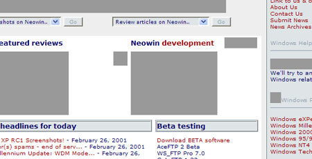
Note: Some images are missing due to IWBM not having them on file.

A look at the source reveals tables.

Sitepoint – 2001

Sitepoint has been around for a good 5+ years as well. As a designer and developer resource, it’s always been important for them to be setting the tone for fellow designer and developers. Here’s what sitepoint looked like in 2001:

Sitepoint - Circa 2001

Their source code also includes tables as far as the eye can see.

Sitepoint looked pretty good, but did you notice the code for both Sitepoint and Neowin? Tables! And the problem is – well, there is no problem, because at the time, putting together complex layout sites using tables were leading the way for up and coming developers.

On the next page we’ll show you Neowin and Sitepoint today, and how they’ve changed their ways to keep up with today’s standards.

Feature
Post

Category
Homepage News

Sounds of Upgrades

We successfully upgraded to WordPress 2.0.5, which was just released a short time ago. We haven’t found anything wrong since the upgrade, but if you encounter some kind of odd error let us know. In other news, the podcast page is finally up! As of right now the page is a bit empty. We’ll be finishing it up tomorrow and then we’ll begin to populate it. We have a lot of ideas on turning existing content in audio format (using Talkr) as well as new podcast only content. Drop us your suggestions!

Feature
Post

Category
Friday Focus

Friday Focus #4

Sites of The Week:

Sites that caught my attention is css galleries over the past week.

Friday Focus - I.G.T

A cool blue theme and a simple, clean design lead to a great looking store front. All they need is some more tees to fill this new design up with!

Friday Focus - Mozilla Firefox 2 Refresh

The new Mozilla / Get Firefox homepage sporting a very colorful illustration. Should be inspiration enough to upgrade to FF 2 if you haven’t already.

Friday Focus - DDMW

A smooth combination of valid xhtml and css along with flash to display portfolio work. Nicely done for a dark color schemed site.

Digg Weekly:

Design: How Much Should a Design Cost?
An interesting article discussing the ever hard to narrow down subject of “how much do I charge for this” or “how much should I expect to pay”. I’ll be writing my own response post to this in the next few days with my own thoughts on the issue, as they do vary a little bit from this authors. I’ll also be covering decided what to charge for advertising.

Programming: 37Signal’s Gets Real W/ Free Read
This has been out for a while, but just hit the weekly popular radar on Digg this week. You can now read and print the entire 37signals book, Getting Real, a guide to building a successful web application, online. As the creators of many of them, I think they know what they’re talking about.

Application of the Week:

If you have yet to upgrade to Firefox 2, then what are you waiting for? While not being web based, Firefox 2 released a few days back, and we’re thrilled to see it reach this stage. FF 2 has quite a few updates, as well as many backend / behind the scenes things that have been tightened up. Make sure you make it your browser of choice – we highly recommend it!

Feature
Post

Category
Podcasts

Interview Triple Play #1

Audio versions of our interviews with Matt Davies, Paul Scrivens, and Ryan Sims.

The first in our new podcasting feature. You’ll see much more content being turned into audio, and original interviews in one one one audio format. Stay tuned!

Feature
Post

Category
General

9rules Network Round 5 Has Ended

9rules Network has started their Round 5 submission round for just 24 hours. What are you waiting for? Get over to 9rules and submit your site!

Note: 9rules submission has ended. There were 1190 sites submitted. Hopefully you were able to submit your site in time if you aren’t already a member of 9rules.

Feature
Post

Category
Homepage News

Cleaning Up

A few different announcements to cover today. First, late last week we surpassed 50,000 unique visitors. This is a great accomplishment for us. While we’d like to be a 50,000 unique a month site, reach 50,000+ total was a big step in getting to that point. We’ll be putting together a bunch of contests as we near the 100,000 mark, so help us get their quick!

Now speaking of content, we’ll be doing a minor clear out during the next few days. Our hope is to remove some of the useless and misleading articles that we’re published awhile back. This will help improve the overall strength of the article database.

Thanks for sticking with us!
Team Devlounge.

Feature
Post

Category
Interviews

Matt Davies

Who’s behind the “Attitude” of Attitude Design? Find out in this insightful interview with this talented young designer.

DL: Hey Matt, how are you today. Before we get into things, mind giving us the “411” on yourself? Basic background stuff is fine since we’ll be asking more detailed stuff soon enough.

MD: Greetings DevLounge. Before we start I just want to say its an honor to be featured on your site. I visit here frequently and find it extremely useful.

Matt Davies - Attitude Design

Basic Background Stuff – I’m a 21 year old multi disciplined Graphic Designer. I grew up in Croydon (South London UK) but am now married and living in the wonderful city of Nottingham (Midlands UK).

My background is in print and branding design but over the last few years I have moved into accessible html, flash and rich media designing.

DL: How did you first get started in design? In a recent journal entry you stated sketching as a kid had a lot to do with it. I have to say that’s what really got me into design as well.

MD: Yes, I was always very creative. I seem to have a passion for new and effective visual ideas and have done so from since I can remember. I used to draw and paint as a child. As time went on and I needed to think about a career, I soon realised that it was mainly dead artists that made any money – which, at that tender age didn’t seem like a great career path – so I looked around and discovered graphic design. This had a better appeal to me as it seemed to be creating for a purpose, rather than creating because of a personal whim.

Matt Davies - Attitude Homepage Screen

I went to College and studied a diploma in Graphic Design. In the first year of my course, at the age of 16, I started Attitude Design and also started to freelance in my spare time. I also had the opportunity to do part time work at a small agency and when I finished my college course I then went on to work for this agency full time.

I loved it and didn’t look back from then on. Being in the real world with real people and real money was something that college and university couldn’t offer me and I took to the working environment well. That’s really how I started. Since then I have worked for about 3 other agencies full time and freelanced on and off both in house with other agencies or on my own. The agency I currently work for is called Defacto.

DL: What’s it like being an employee of De Facto? The site itself is rather hush-hush, with not a lot to it but links to clients. Do you believe in the “let work speak for itself” philosophy?

MD: To be fair our site is not a good example of the work we do. I think its quite a few years old. We have been so busy that whenever we seem to have some time to work on it something comes up. Defacto are a fantastic example of letting their work speak for itself. With clients like Fred Perry and Hugo Boss we don’t really need to shout very loud. Saying that, I have heard a rumor we may start looking at designing a new site in the new year – we’ll see if we get time!

Its great working at Defacto. We have a really talented team and I am learning loads. I also enjoy working with recognized brands and within a creatively focused environment. I feel in myself that since I joined the team I have improved my skills about 10 fold.

Let work speak for itself? Personally I think allowing your work to speak solely for itself is nice but clients need to know they can work with you on a personal level. You may be a fantastic design company but if you are disorganized then you may not be in the best position to offer clients what they need, when they need it. Work and client management have to go hand in hand, although normally at the beginning the work speaks for itself, as time goes on, the way you handle your clients will determine if you hang on to them or not.

DL: You’re also an author for fadtastic. What’s your favorite piece you’ve contributed over there? I really liked The Future of Design, it provided some great insight.

MD: My favorite piece? Owww – that’s a tough one. I quite liked “Is Glass Still Class” because to me, it represents what fadtastic is all about – web and design trends being discussed and debated. Saying that, I love all the articles that come out of fadtastic – whither they are mine or another author. There are a great set of individuals that contribute from varying back grounds but all with a passion for design.

DL: You have quite an extensive portfolio. What’s your favorite thing to do – logos, illustrations, full site designs, or photography?

“I think what I really love is the journey you undertake with a brand design. There’s not just the logo but the goals and the strategy to achieve those goals.”

MD: If I were to say what I enjoyed the most it would be logo design – but logo design with an in depth perception of what the client is trying to achieve. “Branding” I guess is the common term.

I think what I really love is the journey you undertake with a brand design. There’s not just the logo but the goals and the strategy to achieve those goals. There’s the online and offline strategies and the implementation of the brand into all the assisting materials used.

Matt Davies - Logo Samples

What I’m trying to say is that although I do enjoy working on odd projects, what I mostly enjoy is larger jobs and clients who I can really get my teeth into (not literally you understand – that would be painful and probably against the law).

DL: Working for a company and all, do you have time to take your own personal work, or does most of your work come through company clients?

MD: I frequently get requests for freelancing but unfortunately I am currently unavailable for private work – all my work is done as a member of the team at De-facto. I have a good relationship with them and am morally and contractually obliged to respect them and not compete with them. However even if I wanted too, I have very little free time and so I currently decline to work on private jobs.

DL: Have you liked being part of a firm more than working on your own?

MD: There are perks in both situations. You don’t get the risk factor in an agency but you do get fellow creatives and larger projects. The team at Defacto are really talented guys and I feel very at home around them. On your own however the money is better and you can suite yourself in regards to hours and what work you take on. I would like to think I will go back to freelancing at a later stage of my career – but for now I’m cool where I am.

DL: Besides designing, what else do you like to do in your free time? Any other jobs?

MD: I am a firm believer in the Bible and so in my spare time I am always studying and reading it, trying to prepare myself for the return of Jesus to the earth.

I am also currently doing a lot of DIY to my house – which is a mammoth job in itself! If you ever get to meet me you’ll be sure to see a few bumps and scratches from my latest DIY adventure.

When I’m not doing the above you will probably find me walking around the Nottinghamshire and Derbyshire countryside, working out in the gym, gardening, experimenting with some new design technology or technique, or eating a large English breakfast in my local high street café.

DL: Any advice you’d give new designers?

MD: Passion Passion Passion. If you can develop a passion and a genuine mindset to do your best – you will go far. There’s nothing worse than a non-motivated designer. This was my reason for calling my freelance company and online portfolio “Attitude”. Having the right mindset and allowing yourself some confidence to release your creative flair is what you will need.

“If you can develop a passion and a genuine mindset to do your best – you will go far.”

Also get yourself a website. We are in the year 2006 – you are a designer – why have you got no web presence?

DL: Alright, I know you’re busy yourself, so I think now would be a good place to stop. Thanks for answering a few for us!

MD: Its been a pleasure and an honor. All the best and keep up the good work…

Feature
Post

Category
Friday Focus

Friday Focus #3

A day late and a buck short, mostly because we spent yesterday tweaking out the extras page and working on some other site related issues. Sorry for the minor delay.

Sites of the Week

Sites that caught my eye in css galleries over the past week, now with brief overviews of why I like them. Clicking the screenshots will take you to the entire sites.

Friday Focus - Launch Feed

Without a new web based application crossing our radar again this week, we decided Launchfeed can serve as both a featured design for the past week, and an application. Launchfeed is a site designed for announcing new site or product launches in various forms – beta, alpha, final, etc. The design is simple and clean, and clicking on launch titles brings you to a screenshot and review / comment area.


Friday Focus - Patratelu Rosu

While most of the site is not in English, you do get a calming feeling by the use of a three column layout and pastel colors. Not to mention some of the content is pretty hot.

Friday Focus - Semtex Magazine

Semtex Mag is a online independent music magazine that news, reviews, and interviews. I liked the design because of it’s simple layout and clear purpose. Reminds me of what my original intentions were for soundchronicle before I sold it off last summer.

Digg Weekly

My personal favorites of the weeks most dugg articles in both design and programming.

DesignBuild a Simple Liquid Layout
Article that goes into detail about creating the html and css required for a pure liquid, cross browser layout “done right”.

ProgrammingMy Rails Toolbox
An article outlining some of the best in Ruby tools, such as servers, deployment, plugins, libraries, and more.

Weekly Opinion

This weeks weekly opinion has been stirred up by a conversation followup to one of my designs posted at Mintpages. When designing, do you try to perfect mocks to the absolute exact as they will appear following completion, or do you do most of the tweaking later on in the process, after the client has approved the mock?

Everyone is different, but I myself spend way less time on mockups then I used to. Before, mockups had to be perfect, because that was the site, simply cut up and turned into table-filled html. With the use of css, you can accomplish many tweaks later on in the process. Because of this, I myself tend to spend less time concerned over little discrepancies which can be fixed at a later time in development. Still, there are many who get their mocks to absolute perfection. Which one are you? Please share.

Feature
Post

Category
Webapps

Yahoo! Site Explorer Beta Review

This is my second review, and third article for Devlounge. Please let me know what you would like to see from me as a contributor.

Yahoo! Site Explorer is a tool designed for webmasters to view all pages within a site (and a site’s subdomains) as indexed by Yahoo. Webmasters can also view all inlinks that are pointed at a particular domain. This review will go briefly into the setup process, and point out some of the useful features associated with this webmaster tool.

Website Authentication

In order to use Site Explorer, you need a Yahoo! username and password. Setting up a Yahoo! account is outside the scope of this article, but registering an account isn’t too difficult.

Once you have navigated over to http://siteexplorer.search.yahoo.com and signed in, you are presented with a page to add in your site.

Adding a Site to Yahoo! Site Explorer
For purposes of demonstration, I will be using the Devlounge website.

Once you have added your site to Site Explorer, you must authenticate your website.

Yahoo! Site Explorer Site Authentication

By clicking the “Authenticate” button, you are taken to a page that gives instructions for authenticating your site in order to prove that you are the site owner. The easiest way to authenticate your site is to download the authentication file and upload the file to the root of your website.

Yahoo! Site Explorer - Ready to Authenticate Site
Click the image for a larger view

The authentication process takes about twenty-four hours, but when authenticating Devlounge’s site, it took about two days.

Setting up the Site’s Feeds

Site is Authenticated

Once your site has been authenticated, you will want to set up any feeds that your site has. You can add in any feeds by clicking the “Manage” button on the main Site Explorer screen.

Adding a Feed for a Site

The “Add Feed” button is towards the top and provides easy access for adding in your site feeds. One feature that is sorely lacking with Site Explorer’s feed feature is lack of support for FeedBurner. It also isn’t apparent what benefit a webmaster gets by adding in a feed. I’m assuming that Yahoo! uses the feeds to index new content.

Feeds are Successfully Added
Click the image for a larger view

Once the feeds have been added, it’s now time to go exploring. Head back to “My Sites” to begin exploring your site.

Exploring a Site

Exploring a site using Site Explorer is rather intuitive. Once you are exploring a site, you can view how many pages have been indexed, the inlinks to the site, and the subdomains.

Pages Listed by Yahoo! Site Explorer

As you can see from the image above, Devlounge has 427 pages indexed and 8,407 inlinks. The inlinks can further be refined by filtering out the links from within the Devlounge domain.

Inlinks Filtered

In the case of the image above, I have chosen to exclude the inlinks from the Devlounge domain, and apply the inlinks to the entire site (not just the Devlounge homepage).

When browsing the pages that are indexed, there is one obvious benefit of having a site authenticated. The owner of a site can see information of when a page was last crawled.

Last Crawled

The owner of the site can also submit web pages that have yet to be indexed. Although when you have a lot of pages indexed (such as with Devlounge), it’s not obvious which pages haven’t been indexed.

Other Useful Features

Site Explorer allows you to export the first thousand results to a TSV file. From there, you can open the TSV file in any spreadsheet file that supports tab separated values.

You are also able to explore individual pages, as well as other websites.

What is Needed

You can consider this section my personal wish list for Yahoo! Site Explorer.

For new sites, Site Explorer needs an intuitive way to submit all the pages of a particular site. Right now, the best thing to do is submit an RSS or Atom compatible “sitemap”, or a text file with all of the URLs of a site. Furthermore, once a “sitemap” is submitted, there is no indication of the status of the submitted URLs. It would be nice if there was a separate tab that showed which URLs have not been indexed when compared to the submitted URLs.

I would also like to see Yahoo! incorporate its Web Rank system into Site Explorer. When the owner of a site is exploring a URL, the Web Rank should show up next to the “Last Crawled” data.

The last feature I’m going to suggest is keyword detection. For indexed URLs, it would be nice to see a feature that lists keywords associated with that particular page. To add onto the feature, perhaps Yahoo! could show how popular that keyword is currently. This would help out immensely with search engine optimization.

Conclusion

Overall, Yahoo! Site Explorer has its uses, but it doesn’t give nearly as much data as Google Sitemaps. Hopefully Yahoo! incorporates a lot more webmaster-friendly features before it goes out of Beta.

A gracious thanks to Devlounge for allowing me to use their site for this review.

Feature
Post

Category
General

Internet Explorer 7 is Available

For those wanting to be one of the first to download, Internet Explorer 7 is now available. For a video review of the software, check out CNET’s review of IE7.

IE7 is a good first step forward for web standards. Hopefully future releases will embrace standards in their entirety.

Is is of note that IE7 is only for Windows XP Service Pack 2

Admin Note: We suggest you upgrade to IE 7 as soon as possible to see what Devlounge should really look like in modern browsers.

Feature
Post

Category
Column

Out of the Box

Out of the Box

Welcome to the first addition of my new weekly column. I often wonder what makes a lot of these columnists legitment, and I don’t mean names like Cameron Moll, Andy Budd, Dave Shea, or the countless other web developers who have made a universal name for themselves on the internet through actual book publishings and the countless seminars they speak at. Sometimes I read comments and articles that seem to be written from the perspective of a fourteen year old, for fourteen year olds. As a result, I thought I should take some time before we get started to just list my own credentials. I am a college graduate from Durham College in Oshawa Ontario, and as a result I have had classes in a little bit of everything ranging from CSS and design to the server side scripting languages such as PHP and ASP. I graduated after a two year program as one of seven from an initial class of thirty five. By the time I graduated I was working with two popular web design companies in the Oshawa/Durham region as well as participating in freelance work. Almost six months ago, I left these two companies to work for the Royal Bank, where I worked with a development team to overhaul the internal web site that is used for the Investment Advisor. I also work along side the marketing department for the Investment Advisor’s web sites. I have also just finished a web site for Golfing Buddies Inc. (This web site is a story in itself!) which is a national company across Canada already, selling golfing books that attempt to help improve your golf game.

I am not trying to gloat, or try and seem like I am better then I am, in fact it’s really the opposite. I want everyone reading this to believe that I at least have some experience in my field, and that I am not basing everything on what could be, or what if. So with all this stated, I would like to bring up my topic of interest, assuming you’re still reading of course. As I am sure everyone knows, the white canvas can be a frustrating place to be in, when you are attempting to create work for a client. I’ve been there, and I know just how frustrating it can be. However, my topic won’t be covering that, bet I fooled you! Instead, it’s about something very similar, and very frustrating, if not more frustrating. This topic being, the inability to leave the comfort zone you’ve created for yourself. My topic is about stepping out of the box.

Now before we keep going, and you all roll your eyes and say “Been here, heard that” I am not saying use a red arial font, instead of a blue times new roman font. I am talking about complete rehaul of your style. Some of you may have already decided that you don’t have an exact style yet, or you are always thinking out of the box, but let me ask a question. Are all your layouts fixed or liquid? Do you have all your navigation’s at the top? Are you a fan of using stock photography as the main header? Do you using the same font style all the time? Do you prefer specific colors all the time? Are yo…. OK, I guess you have the picture. If you can truthfully answer NO to all of those things without even hesitating, then you MUST be a design guru… or blind. The fact of the matter is, every single designer and developer has a specific style when they are creating their web sites, and the problem with this, is that after a while we don’t offer anything new to our clients. Are work becomes the same, and all of sudden we have our own little Web 2.0 look on every web site. A great designer knows how to switch it up all the time, but that can only be done over years. However, the first part is identifying it. Usually it takes someone grabbing you, shaking you, and saying “THIS ALL LOOKS THE SAME!” Being close with about fourteen designers in my class, I saw this all the time. One girl in my class was very talented, but at the exact same time, she was known to repeat certain elements in her designs. She refused to use anything other then 10px arial. She used mostly pinks, blues, and purples. Every layout was centered, no border, solid background. Looking through her portfolio, with every page flipped, you felt like you were looking at the same site, just slightly altered with a new logo. Of course, I wasn’t really innocent either. I was notorious for the fixed, centered, one pixel black borders, with a pixel background, and a combination of arial and georgia. I could go on, and list off every single designer in my class this way, but that would be a waste of time, because I assume you all have the picture. Our problem was that we’d all, as is the case with nearly every designer, had found our comfort zone and we needed to break out of the box and created something more. We never realized it, until we had someone else tell us we needed to diversify.

Thinking out of the box doesn’t just apply to our design abilities, it also can be applied to client work and requirements that don’t seem “possible” at first. At my work, one of their biggest requirements is user interaction. This means forms, and large menus that should only be updated by one file. What’s the catch? No server side scripting is possible due to security restrictions. My example for this, is a set of landing pages, all designed with dozens of links on each page. So far, it wasn’t too much of an issue since only one page needed the list of links. I only need to edit that one page, and we’re done. Now the problem at hand, however, was the main navigation which had to be identical on every single page, which was about twelve pages over all. I could have gone in, and updated each page individually. That means big changes for each page could take more time then allotted, since each change needed to be repeated and tested. It felt beyond impossible to do, since I wasn’t able to call on a simple include script for the navigation file and solve my problems like I was used to. I was in a position where my employer wanted something, and due to their restrictions I couldn’t provide! The most frustrating thing about it all was I knew how, and wasn’t able to do it. That’s when I realized that I needed to think outside of the box. Since I couldn’t rely on asp or php, I had to improvise I use what I knew. The result was a combination of XML, and Actionscript. In what resulted to be one of the most unconventional navigation techniques, everything was set up in XML, where I provided a link title and a url. Then in flash, I used actionscript and called for the XML to populate the menu system. While navigation techniques are used all over the web already, at a bank where their requests usually come along the lines of “We want you to make something that look great, and simple, and easy to navigate, and easy to use… but absolutely no graphics, just text” you don’t see too many interactive, graphic friendly interfaces. Due to this technique, a large positive feedback occurred, as everyone ended up enjoying the more graphic friendly interface. Not only did I solve my navigation problems, I also integrated something the bank wasn’t used to, and so I received praise on an easy and effective way to update as well as a good looking interface that was still able to meet the look of the bank. Of course, sometimes, you’ll find that even with looking at options outside the norm, somethings just cannot be done. My new task is to create a form, that saves to an xml file once submitted and then can be than be released to the public at a later time by means of a html styled e-mail newsletter… all without any server side scripting. While I am still looking for options through javascript, and flash, it is appearing to be more difficult then first expected.

The over all point I am trying to make, is we all get stuck in our own comfort zones, should they be on a design side or a development side. We have our styles and we struggle and refuse to break away from them. It isn’t until you are able to break out of the box, are you able to grow as a web designer and web developer. You need to push yourself to do something new, and learn new techniques. Our own comfort zones are aids to all of us, but they can also stop us from growing as well. After all, once you’re all done you will probably end up saying to yourself “I’m glad I stepped out of the box, this is the best work I’ve created to date.”

Thanks for reading,
Andrew Kelly

Feature
Post

Category
General

Great Web Standards Podcast

I came across a great podcast today from my favourite Brit, Paul Boag. The podcast is geared towards those that need web standards explained in non-technical terms. The podcast is also useful for those still skeptical about using web standards (perhaps your boss?).

For the podcast, please follow this link: The business benefits of web standards.