We’ve all seen it. Any time you visit Sitepoint, you’ve probably been hit with the ad for their Ruby on Rails book, titled “Build Your Own Ruby on Rails Web Applications”, by Patrick Lenz. Dubbed as “The Ultimate Beginners Guide to Ruby On Rails”, I figured the book was pretty good.
Still, I had no intent to learn RoR simply because I didn’t have time. Then came the opportunity for me to review the book for Sitepoint thanks to Reviewme, and I finally decided to take a look at the book and see what I could learn. For this review I’ll be using the first four chapters of the book, which are currently available as a free trial so you can get a taste of the book before you purchase. I’ll be breaking down the key points of each of the four chapters, with a final wrap-up at the end of the review.
Chapter 1: Introducing Ruby on Rails
The first chapter presents you with a lot of history on RoR. Since I knew so little prior to reading this, I learned a whole lot that I never understood about RoR. Rails was actually extracted from Basecamp, the lead project of 37Signals, and then released – something I would have never expected. The first chapter also touched on three principles that differentiate Rails from other development languages. They were:
- Convention of Configuration
- Don’t Repeat Yourself
- Agile Development
Each category was than expanded with a description of what exactly each principle meant in everyday language for us non-programmers. Finally the first chapter wraps up with a summary of what you can expect to get out of building your own sample application by following the instructions throughout the book, which lets you create a cloned site of Digg.
Chapter 2: Getting Started
The second chapter is all about getting your system setup and ready to develop your first RoR application. You install three key components, which the book outlines how to install depending on your Operating System. They are:
- The Ruby language interpreter
- The Ruby on Rails framework
- The MySQL database server
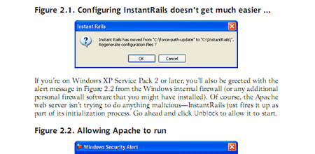
The book does a really good and straightforward job at describing the setup process. Windows, Mac OS X, and Linux are all covered. Towards the end of the chapter you learn how to setup “one directory setup to rule them all”. Finally, you’ll start up WEBrick, a small web server written in Ruby. While it has almost no functionality, you have started up your first Ruby Application.
Chapter 3: Introducing Ruby
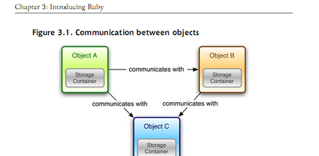
Chapter 3 is a very informational chapter that outlines on what exactly Ruby is, and how a object orientated language works. It talks a lot about how Ruby objects communicate with each other, how to read and write Ruby code, standard output and core classes, running Ruby files, and control structures. You can learn a hell of a lot of information on Ruby just from this one chapter alone – it really does an excellent job going over all the different elements that make up the Ruby Language.
Chapter 4: Rails Revealed
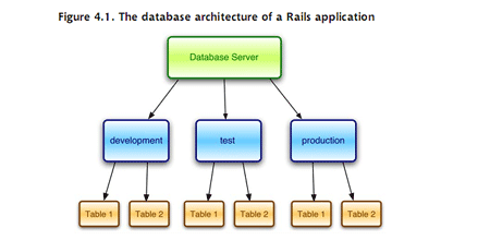
The final chapter in the downloadable sample of “Build Your Own Ruby on Rails Web Applications” covers the Rails in Ruby on Rails. In it Patrick Lenz talks about using three different environments when developing in Ruby: development, test, and production. Next you learn how to setup the database for Rails – quick, easy, and straightforward. There is then a nice description of the MVC (model-view-controller) architecture that Ruby uses. This includes describing the differences between models, controllers, and views.
The chapter also contains information on generating code with Rails, and testing and debugging with RoR.
Summary
The first four chapters were very helpful in giving me (a non-programmer) a much better understanding on Ruby. It’s easier to understand why it should be looked at as the programming language of the future, because it helps make things so much easier and can greatly improve development time.
Reading these first four chapters really sparked my interest in Ruby, and it’s something I’d really like to try to learn more in depth in the summer months. The book itself does, in my opinion, a wonderful job by organizing the information in each chapter really nicely, and incorporating a lot of visual graphics to give you a much clearer understanding of the instructions and how things work in Ruby on Rails.
If haven’t read the book, you’re thinking about giving RoR a shot, or you just want to learn a little more about the programming language that is helping aid the boom in web based applications, this book is for you. With 163 pages just in the first four chapters, you are definitely getting your moneys worth by purchasing the book, which contains over 400 pages and digs a lot deeper than the intro chapters, and will help you put together your first application.
You can grab the first four chapters for free from here, or purchase the book at Sitepoint.
Note: The preceding was a paid review.