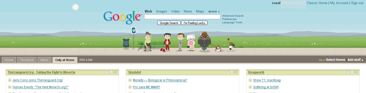
Feature
Post

Category
Homepage News

Weekend Wrap-up

Here we are again, back with another update. I want to apologize for what might have seemed like a lack-luster week last week. After a week full of reviews, last week was fairly quiet. Each of us in the small team that makes up Devlounge has been busy of late, leading to less full articles. We promise it won’t stay slow forever. In some ways maybe this is the “quiet before the storm” that’s to come in April. For now, try leaving your response to Friday’s Design Dilemma , as it is a very good question that can really be a pain when you get stuck in that situation.

I also wanted to give fair warning that this week and next week may be on the slow end as well. I have started testing in school, and I don’t know how much I’ll be into putting together any lengthly articles after writing for hours straight. I will try to get at least one good sized article out this week though.

I hope everyone enjoyed their weekend, and for those of you in the U.S., hopefully you remembered to set your clocks ahead early this morning, or you may be late for work tomorrow!

Feature
Post

Category
Friday Focus

Friday Focus #21

Welcome to another edition of Friday Focus, now in it’s twenty-first week of wrapping up all the weekly happenings on the web (ok, not all, but some). Let’s get started.

Sites of the Week

Expression Engine (EE) recently launched a new design for the products site, I it looks very good. It’s a really great, streamlined designs composed of navy and light blues, and whites.

Expression Engine

Virb, a social networking site from the creators of Purevolume (Unborn Media) also launched publicly this week. It’s simple design beats out Myspace, and what’s even better is the almost unlimited ways you can customize your profile using css and html.

Virb

And finally this week comes Carfreaks, an absolutely great looking car blog / magazine. Even on dark colors, the design works perfectly.

Carfreaks

Digg Weekly

This week’s best according to AJ, picked from the top dugg articles over the past 7 days.

DesignWhat Can Pulp Fiction Teach You About Typography?
An amazing animation to an audio clip from “Pulp Fiction” that uses various fonts and text sizes to convey the meanings behind the words. I thought this was very, very cool.

ProgrammingHow to Create Sliding, Collapsible Div
An article outlining the steps to create a sliding, collapsible div with javascript and css. Includes step by step instructions.

This week’s up and coming according to Ronalfy from Digg.

DesignWeb 2.0 Tutorials Round Up
Smashing Magazine does it again with a nice list of Web 2.0 tutorials.

ProgrammingInclude Flash in web pages without “Click to activate this control”
Unobtrusive Flash Objects (UFO) v3.20 is a neat little tool that allows you to include a flash object in Internet Explorer without the user having to click to activate the control. I personally use an alternate solution that works great as well.

Design Dilemma

The purpose of Design Dilemma is to post one dilemma a week and allow the readers to voice their suggestions and/or opinions. If you have your own dilemma, please send me yours at ronalfy+devlounge@gmail.com.

Congratulations. You’re a freelancer and you’ve been hired by a company to redesign its website and input the old content into a new content management system. There’s only one minor problem: there are over a thousand static html pages and all of them contain tag soup. What would be your approach for stripping out the content and inputting everything into the CMS?

As a sidenote, nobody responded to last week’s design dilemma. I assure you that this dilemma has a solution. If you would like to know my approach, please express your interest in the comments. The solution is fairly involved, so I would have to write a tutorial for it.

WordPress Plugin Spotlight

The first plugin spotlighted is called MoveComments. When a user leaves a comment on an old post, or the wrong post, it is not very simple to move comments. The MoveComments plugin allows you to easily move comments from one post to another. The plugin is in an early version and I am looking forward to seeing what the author will do with the plugin on later versions.

The second plugin spotlighted is called Ajaxified Expand Post Now. If you use the “more” tag when you publish posts, this plugin will allow a user to see the rest of the content (via AJAX) by clicking on the “more” link. This plugin is also in an early version and is in need of an admin panel. To install and configure this plugin, you will need to be fairly comfortable with PHP.

Feature
Post

Category
General

Clearmint Ice

Check out this awesome modification of Clearmint by Rusty Mitchell. He took Clearmint and went a few steps beyond to make an excellent mod for those that want more distinction between peppers and panels, and added tweaks here and there. He has put up a few larger screenshots on his site and has made the theme available for download. You can grab it here. I will also be adding it to the clearmint page itself tomorrow.

Thanks for the modification Rusty!

Feature
Post

Category
Publishing

Don’t Lose Your Visitors: Better 404 Pages

Error pages control a lot more of our destiny than you may think. If a visitor has the unfortunate coincidence of reaching an error page on your site, chances of them attempting to access the page again are slim to none, especially if they were referred to the page from a direct link. How can you prevent this? Don’t let your error pages, especially 404, go un-noticed.

404 Error Pages

A lonely 404 leads to a lonely site

Every site is going to face a 404 at some point. No matter how well you manage your links, you can not control how outside sources will link in to your site, and what visitors will attempt to access. Unfortunately, with every time a visitor reaches an error on your site, it makes you look bad, even if the visitor was referred to the page by another person or site who was wrong with their linking.

For example, I manage all the Devlounge links as best as possible, but for the month of February 2007 alone, I had 12,279 hits to just 404 pages! Upon further inspection, many of this bad links came from people trying to go directly to pages on Devlounge, like the prebuilt page, simply by going to www.devlounge.net/prebuilt. Luckily for myself, my 404 page contained links back to the homepage, articles, and interview indexes. And that brings up the whole point of custom 404 pages – keeping your traffic.

Don’t let that traffic escape

If you leave your error pages alone, visitors are going to leave by the flock-full every time they run into the dead end that is an error page. The easiest and simplest way of keeping people from hitting that back button or closing the tab is to put together informative and helpful error pages that lead visitors back into the site, and not away from it.

The route you take to do this depends entirely on how you want to go about your error pages. You may want to take a sarcastic approach to error pages, to give visitors something to laugh at while redirecting them back to your homepage. Or you may want to take a more straightforward approach, like we’ve done, in which case you point out all the most important / significant sections of your site.

Some things to keep in mind when creating error pages:

  • Users don’t give a shit that they’re on an error page, so simply saying “404″ isn’t going to cut it, because at this point they’ve already figured out they’re not on the page they wanted to get to. Lead them back to the site with an automatic redirect after a few sections or a link.
  • Just automatic redirects don’t work either. If you are redirecting all your visitors back to your homepage when they access a missing page, good for you. But if you’re not telling them they reached a 404 or some other kind of error, how are they supposed to know why the page just redirected to your homepage? Many visitors would then just go back and try the page again, so make sure some how or another you give them a heads up that they hit an error!
  • Keep advertisements out! If your error page is not styled to match your site design, than do not include ads. Visitors already annoyed with a missing page, don’t make it seem like you’re trying to capitalize on their misfortunes now.

And some good things to include in error pages that don’t automatically redirect:

  • Archives – If you’re running a blog or any kind of site with a large collection of posts / news, include an archives list for visitors to browse.
  • Search box – If you’re in the same situation as above, include a search so visitors can maybe find the page / post they were looking for to begin with.
  • Site logo – If you are not styling the error pages to match the site design, be sure to include a logo or something so visitors know they are indeed on the right site.
  • Small site description – Let visitors know what’s up. Also helps if search engines grab a wrong url for a few days that may be leading new visitors in for the first time, only to discover that what they were hoping to see isn’t there.

Tying the site and error pages together

When designing error pages, there are really two ways in which you can display them without annoying the visitor. Either (A) incorporate the error pages into the current sites design or (B) use a blank slate (for example, plain white background) with an error message or graphic and required links. Doing something “in between” can just become rather annoying.

Most of us do not need clinics on how to setup custom error pages. It can be done in Cpanel or just by using a few extra lines in the htaccess and creating the pages themselves. There are plenty of tutorials on the subject out there, so I don’t really believe it bears repeating. It’s not that we don’t know how to setup error pages, it’s just that many times the importance of error pages goes un-noticed.

A Quick(er) Error Fix for WP

If your using WP, you can use the Dunstan Error Page plugin to quickly turn your 404 error page into a much more informational and convenient page for visitors when they run into it. The Dunstan Error plugin allows visitors to submit an error report, send feedback, and view the latest 5 posts. This adds news functionality quickly and easily and requires little work to get up and running.

Simple steps for keeping your misplaced visitors

So in the end, it’s up to you whether or not you want to take a few moments to customize your error pages or if you’d rather have host and browser default messages displayed to visitors instead. Believe me when I say this, custom error pages are a lot more beneficial than they may seem, and they can be extremely helpful in keeping visitors on your site.

Now it’s your turn. Have you seen a really informational or fun error page? Leave the link in the comments, and some of them will be attached and featured in this article later in the week.

Feature
Post

Category
Homepage News

Review Crazy

Over the past week, it seems we’ve been review crazy. While it’s nice to be building up the review section of the site, all these reviews in a row have probably left some of you annoyed with the lack of variety. Not to worry, because we have finally finished all our review requests and can begin serving regular articles again! Sometime over the next few days I’ll also be giving you a sneak peak at the temporary homepage redesign scheduled for April. April will also be “Reader Appreciation Month”, with more news to follow in the coming weeks. Enjoy the weekend everyone.

Update: The main contact form issue is now fixed. Feel free to submit away!

The DL Team

Feature
Post

Category
General

WordPress Security Alert

Last night the WordPress team announced a critical security issue that came about in WordPress 2.1.1 after a hacker gained access to the servers and edited a couple files allowing a possible remote php execution. Supposedly, the code was only found in 2.1.1 downloads from the past few days, but WordPress recommended that everyone upgrades to 2.1.2. If you haven’t done so already, I highly recommend it. While we’re on the subject of hackers, I suggest you have a look at this post on using the htaccess to hide your wordpress admin folder if you’re worried about potential security issues.

Feature
Post

Category
Webapps

Urbanfonts

In the world of designing, font choices go hand in hand with the importance of colors. I mean if you can’t read something, what are the chances your going to bother trying? Finding and using the perfect font can vastly alter the appearance of a site – whether it’s grunge or professional, the look can be controlled greatly by just a switch of the text in graphics.

Urbanfonts

Finding the perfect font is a little bit more of a difficult task, but with thousands of font resources out there (both free and paid), there is no shortage of places to look. Today we’ll focus in on Urbanfonts, a resource I was asked to review recently, and I hadn’t even seen until a few days prior to the request.

Urbanfonts – Free Font Directory

Urbanfonts prides itself as being a “font directory in a web 2.0 style, containing over 8,000 free fonts.” All “web 2.0″ design joking aside, UF does use ajax in some key places that can be real time savers.

As with most font sites, fonts on UF are sorted into categories based on the type of font they are. Each font can also be assigned tags, to help narrow down your search. Another feature common with most font directories is the ability to enter in your text an get a live preview of the word you entered in on all the font pages. On most sites, this requires an extra click, but UF uses ajax to refresh the font lists with your word as you type. You can also hover over each font example to see what the entire A-Z alphabet looks like for a particular font. Simple time savers like this can become pretty beneficial if you plan on going through pages and pages to find the perfect font.

Urbanfonts - A Look inside

Much like most free font directories, you can also browse a separate list of premium fonts. These are also broken down by font name (alphabetically) and by categories / type. Other pages include a Top 100 and “Our Favorites”, which I’d assume our picked by the staff.

Other forms of fontness

UF also has a blog with posts about various fonts, for example, the history of Helvetica. They also have a forum that lacks activity, with a very limited amount of posts. The site, in my opinion, is still too new to try and be building a forum community around. Generally, it’s a better idea to get things settled before you attempt to communityize (yes, I know that’s not really a word). We attempted it when Devlounge first started, and we never even reached 20 members.

Urbanfonts - Homepage

A Wrap Up

Besides using ajax here and there, UF goes hand in hand with the many other font directories out there. There are no popups, but there are plenty of other ads scattered throughout the page. Collection wise, you’re going to find the same free font collection on UF as you’d find just about anywhere else. Really, UF does not stand out from any other font directory I’ve used. Everyone has their favorites and that one specific site they head to every time, and if UF intends to stand out, they have to do a little bit more in my opinion.

Feature
Post

Category
Friday Focus

Friday Focus #20

Welcome to yet another edition of Friday Focus. Now on week 20, FF has been running strong for months! Enough talk, let’s sum up the week for you.

Sites of the Week

First up this week is Jobpile. I found this via CSSMania, and while the design is fairly average, the service itself is a time saver. Jobpile combines all the most popular job boards into one via the power of RSS.

Jobpile

I love clean and simple store fonts, and Ser-vice is just that. The site is incredibly simple, but it’s how store fronts should be, especially if you’re just some small print shop.

Ser-vice

And finally wrapping up this weeks collections of sites is Eurovision. The use of blues is excellent, and while the site has a lot going on compared to many of the “simpler” sites I tend to focus on during Friday Focuses, it all comes together nicely.

Eurovision

Digg Weekly

This week’s hottest (according to AJ) from Digg.

DesignThe 14 Point Web Design Checklist
Fun list of how to make price quotes for clients based on what they do and don’t know.

ProgrammingGoogle Apps API
From the Digg description: Google Apps and its APIs open up a wide variety of new opportunities to integrate and extend Google’s communication and collaboration services. Domain adminstrators can use the APIs to migrate from and integrate with existing IT infrastructure. Application developers can use the APIs to extend Google’s growing offering of services.

This week’s up and coming (according to Ronalfy) from Digg.

Design
You Know You’re a Web Developer When…
This is a play off of, “You know you’re a redneck if…” for web developers. My favorite on the list was, “You know you’re a web developer when 1px of margin can make or break your day.” The author should also add in there, “You know you’re a web developer when you use the Web Developer Toolbar to see why a logo’s home link isn’t working correctly.” If you’re confused, visit the site using Firefox.

Grade Your Startup Website
This is a spiffy little tool that grades your website. It also shows your Google PageRank, Technorati rating, Alexa ranking , the number of inlinks from major search engines, the expected domain expiration point, and much more.

E-Mail Address Encoder
I actually didn’t find this one on digg, but this thing is too useful not to share. If you ever want to publicize your or a client’s e-mail address, I would recommend using this tool to encode the e-mail address so that spammers can’t easily pick it up. I’ve actually put this to use under this week’s Design Dilemma.

Design Dilemma

The purpose of Design Dilemma is to post one dilemma a week and allow the readers to voice their suggestions and/or opinions. If you have your own dilemma, please send me yours at ronalfy+devlounge@gmail.com.

Your client wants you to incorporate some kind of flash image map on the main page of a site. The flash image map makes up the bulk of the front page navigation, so there needs to be a way to have a non-flash image map just in case flash isn’t available. The image map should also work without JavaScript enabled, and have the image map links visible in text-only browsers. Did I mention that the site has to meet Section 508 requirements? What would your approach be?

WordPress Plugin Spotlight

No WordPress plugins caught my eye this week. Inspiration Bit does have a good list of handy WordPress plugins. One plugin the article mentions is the Subscribe To Comments plugin. Coming from a user’s perspective, this plugin is invaluable. Typically I stumble upon a blog, leave a comment, and never return because I truthfully can’t remember where I left the comment. The Subscribe To Comments helps me keep track of the blog if/when somebody leaves a comment after me. The only drawback to this plugin is the barrage of e-mails I get if the blog is popular. This is where G-mail‘s Conservation View comes in handy.

Announcement

Someone pointed out to me the other day that our “new” contact form on the contact page isn’t working right. I’ll have it figured out within the next day or two. If you’ve attempted to email us over the past few days, we apologize for this inconvenience, but we never received anything. Until further notice, use the contact form on the Advertising page if you wish to get in touch.