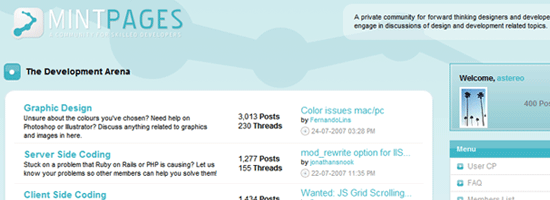
Feature
Post

Category
Column

5 Tell Tale Signs You Don’t Know How to Design

Just having some fun today in a random Sunday post to help expand our “Commentary” section. Today, I’m taking on the tough issues - the ones that really irk the hell out of me when I see them used by a lot of the so called “design” community, many times in forums. So, do you agree with me, or no, and what little (or big) things irk the hell out of you?

Five Tell Tale Signs

The Issues:

  1. Hosting design screenshots on Imageshack - It happens a lot more than you’d like to see. Browse any freelance forum, and you are most likely to see many people using Imageshack or other crappy free image host to showcase their designs. If it was a one time thing, than that’s acceptable, but to use free image hosts all the time - what’s wrong with you! Every time I run into someone linking to Imageshack, I automatically downgrade how good looking I’d consider the site to be (before I even see or - or it loads), just because the designer served it up to me through a slow, ad infested site.
  2. The sit back effect - Once again, this is a popular practice throughout forums and not so much in the professional design community, but it still becomes extremely annoying to me whenever I see someone doing it, no matter if they’ve been in the industry for five days of five years. When a client asks for you to contact them, you don’t reply and say “I’m interested, please email me :)”. That is a very common forum response to someone asking to have work done.
  3. That “Web 2.0″ phrase - “Web 2.0 Hosting Design for Sale!” Have you ever seen that? Most likely. It is incredible to see so many people believing that sticking a label to their designs is going to make them that much better. Guess what - it won’t!
  4. Advice Givers - One thing I really hate, is when people try to give you advice but have nothing to show for it. For example, some one tells you “Um yes, that design sucks, nice try”, but they don’t have their own portfolio or anything that can back up their claims. If they don’t know anything about what that our criticizing on, then why are they doing it?
  5. Photoshop - And the biggest, by far most embarrassing tell tale sign you are not a designer, is when you have no idea what a PSD is. You would think this would be impossible for any “designer”, but it is not. I literally have seen people ask “does it come with a psd”, and the person selling the template says, “no, what’s a psd?”

The Solutions:

  1. Hosting design screenshots - Stop being so damn cheap and buy some hosting! Giving your work its own place to be showcased lets clients know that you mean business, and you take your own work seriously. Hosting is extremely affordable these days, and even if you don’t want to go out and buy a domain and deal with all the “site owner” issues, there are plenty of portfolio hosts / services, such as Carbonmade, that will do it all for you!
  2. Solving the “Sit Back” - If you are truly concerned about a potential client, and actually want a shot at getting the job, open up an email and start writing! It’s up to you to secure the client, not for the client to get back to you about the potential job. Create some damn communication! A lazy designer isn’t a good one, much like a worker in just about every other field. Your job is to impress the potential client, and taking those extra step over all the other lazy designers will give you the edge.
  3. A cure for Web 2.0 - If you think “web 2.0″ has one specific meaning, than please go follow trends somewhere else. “Web 2.0″ means nothing, so do not go advertising yourself as a “web 2.0″ designer, or you work as done in a “web 2.0″ style. Otherwise in another year, your going to be pretty damn outdated, and it’ll be time for your clients to upgrade to Web version 3.
  4. Should I criticize or not? - The answer depends who you are. Know your own strengths before you attempt to bash someone else. If you just started, its not the best idea to go around criticizing the experienced. Hell, would you ever tell Zeldman that he didn’t know anything about web standards? I don’t think so. So don’t complain about things unless you can back up your claims with a strong portfolio and client list.
  5. Get to know your tools - Familiarize yourself with all the design related terms: psd, ai, layered, cmyk, rgb, photoshop, illustrator, etc. You are not ready to enter the industry or consider yourself a designer just because you may be able to download a free template and move shit around in photoshop and call it a design. You have to understand what the tools you are using are, and how they are used.

This is meant to be an off-beat post poking fun at some random issues.

Feature
Post

Category
Homepage News

Wordpress Plugin Series Now PDF

Remember the Wordpress Plugin Series? The 12 part article series written by Ronald outlines just about every step and procedure in creating your very first Wordpress plugin - and it is now available for download! We put together the entire series in a convenient PDF, so visit the series page to download it.

Feature
Post

Category
Friday Focus

Friday Focus #36

Week 36, without any more delay. Have a good weekend everyone, but first, here’s the weekly wrap up we around here like to call Friday Focus.

Sites of the Week

Starting off this week is WallCandyArt. An excellent canvas art gallery and shop which combines grays and whites with flash splashed here and there for some cool looking effects and rollovers.

WallCandyArt

Next is Harvest. You may remember we reviewed Harvest a long time ago. Yesterday I visited the site for the first time since I wrote that review, and I really loved the new design. It’s simple, clean, and super effective in my opinion.

Harvest Snapshot

That’s it for this week, as many of the css galleries were a little dry. Can’t blame people, for the most part it’s been to hot for me to really want to spend any extra time in front of the computer than I need to, so designing might not be top priority on people’s minds.

Digg Weekly

Design - Quiet Structure
An excellent article from Designview on using a “quiet structure”, with the use of a consistent grid. Give this a read.

Programming - Replicating the iPhone, the webkit way
How to use one background image to create dynamic, scaling buttons for the iPhone in Safari.

Announcement

Tomorrow and / or Sunday I’ll be switching the forums over to SMF. The few members we currently have have all requested it, as minibb is a bit too weak. It may take me a few days, possibly into next week depending on how lazy - I mean busy - I am to style it to match the site.

Feature
Post

Category
Strategy

Methods for Marketing Your Site

Outside of content, site growth can be directly affected by when, how, and where you market your site. There are all types of forms in which this can achieved: banner advertisements, text link ads, and viral advertisements. Then of course, there are the alternative methods - the so called hit and SEO boosters, or even most recently, paid comment spam advertising. There are hundreds of additional methods out there, but we are only going to focus on each of these and what they mean for your site.

The Look of Marketing

When

Before even choosing an advertising method, you first have to consider when the best time to advertise is. If you were a store and you had something to sell, the choice would be easy one to make - when ever you are about to launch a new product or service. But for the traditional site who may not have anything to sell, when should you put your advertising army to work? The typical result most people would probably say is, “when traffic is low”. But is that really the best time? No.

When traffic dips, it usually has to do with other factors that simply increasing or beginning to advertise won’t necessarily fix. It may provide that quick-fix-for-effect type of deal, but the traffic is less likely to stay. You first need to address these issues and get traffic back to normality before considering any major advertising campaigns. The best time to advertise, in my own opinion, is actually when traffic is booming. Why would this be? If your traffic is doing hot, that generally means your site is performing well. Maybe you just published a new article that has caught fire in the blogosphere, or received your first “digg-effect”. Whatever the case, you want to build off recent traffic spikes, rather than trying to build back up to the normal line that would happen if you began advertising during slow traffic periods.

How

As I said, there are almost an unlimited amount of ways you can advertise. Hell, you could even drop mysterious boxes all around your city with your site logo and url on it if you aren’t afraid of possible jail time. Let’s quickly sum of some of the more major and conventional methods.

Banner / Graphical Advertisements:
Considered one of the more traditional methods, banner advertisers are simple and to the point. You get to display what you want in the form of a static or animated gif, jpg, or flash file. Sizes vary from site to site, but banner ads are generally very good performance wise because they are usually easily visible.

Text Link Ads:
The SEO wizards will say that text link ads are the most important and helpful in improving search engine rankings through advertising, because they are simple and direct links. While this may be true, text link ads can be a lot harder to spot, especially depending on the site you plan on advertising through. Some do an excellent job of making sure their visitors can tell what they are clicking on is an ad, and others hide their link ads all over the place, including in the footer, where they are much more likely to go unnoticed and un-clicked.

Viral Advertisements / Social Networks:
Is it possible to advertise on a social network? Yes. But it is very effective? Not usually. Posting every single one of your articles on digg may bring a few stray visitors here and there, but unless you have a lot of friends and a lot of diggers behind your back, these types of free self-promotion advertising methods will do little for you. If you don’t make the homepage, you are not going to see much return. Of course if you could shell out the amount of money it would take to directly advertise on any social networking site, such as Digg, the incoming traffic would be a totally different story.

SEO / Hit Boosters:
One of the biggest gimmicks I find in the industry, and something I totally do not recommend. There is no doubt you’ve seen these so called services plastered throughout the internet. Whether it is in forums, spam emails, or popup ads, you are sure to have been bombarded with this kind of stuff before. You know, services that offer you 10,000 unique hits in 10 minutes for $30, or whatever it may be. I have personally never tried any of these services and never plan to. Each of theme always looks extremely sketchy to me, and I’ve always wondered how the hell anyone would be able to send some couple thousand unique visitors to me site in so little time. And you can be sure that no matter what any of these services may claim, the traffic is not targeted and not worth a penny. (Anyone think otherwise?)

Page Holes / Tagging Services:
Page holes are another form of simple text link advertising that I’ve never quite understood. A quick browse around many “designer” forums such as Talkfreelance, and you’ll quickly discover that every want-to-be developer has their own page hole sites. Links for a dollar, what a deal! Regardless, what is one link, even if it is a PR6 site, really going to do for you when it’s smashed together with all other links? Not much. Page holes and link tagging sites seem all but useless and are all but sure to bring very little traffic your way, but if you don’t mind sparing a buck for fewer total visitors then a dollar is worth in pennies, then why not right?

Of the methods mentioned above, in my opinion the most effective and helpful ones are banner advertisements and text link ads. When targeted, they can quickly drive visitors to your site. Giving potential visitors a visual in the form of banner ads gives them something to connect to and draws them in much more than a standard text link would.

Where

Where you advertise is entirely up to you, but of course, effectiveness will only increase if you advertise on a targeted and similar interest site that will bring in quality visitors who will be interested in your content. No offense, but if I was to advertise on a baseball site, I don’t think many of the visitors would care too much for design and development news. You have to make sure you are reaching an audience that will care about what the hell you are saying in your posts. Just because Joe’s Computer Site may offer you skyscraper size ads on all pages for $20 doesn’t mean a thing if your site is about swimming. Get my drift?

Also, you always want to investigate your possible advertisement places before making a purchase and commitment. Don’t believe what you read, because not everyone can be trusted. Make sure that your banner will really be found on every page if it says it will, and make sure that PR6 website selling links for $5 really is a PR6 after all. Also, whether you plan on using banner or text ads, placement is extremely important. You want your ads placed high up on the page, but you also don’t want them to be too obtrusive, because if their placement causes someone to accidentally click on them, that will only piss the person off and get them to close their browser window or tab even quicker. Even more importantly, and something you can do on your own end, is make sure the design of a banner ad looks good. Sh*tty looking banner will do very little in attracting anyone to your site. If a banner is animated, keep the animations limited and do not make them pause too much. Ideally, you want the person to be able to read whatever the banner is going to say before they have time to move away from it. If you plan on writing a story and adding in 30 frames to an animated gif, you are soon going to find out that not many people have the time or want to be bothered reading a novel just to see what you are advertising.

How do you advertise your site. When do you believe is the ideal time to advertise? Please share in the comments, and your tips may be added to the end of this article.

Feature
Post

Category
Friday Focus

Friday Focus #35

Week 35, a little later than usually because I just got home. But without further delay, here is this weeks Friday Focus. Enjoy the upcoming weekend everyone.

Sites of the Week

My personal favorites from various css galleries over the past week.

Leading off this week is Mark Boulton Design. Simplicity wins in the case of this portfolio. I really dig the look of project and client pages - providing a summary of the project and what the client had to say. It is nothing mind blowing, but it gets the job done in an extremely clean manner.

Mark Boulton Design

Next up is down2night, a place to search for nightlife events and hot locations. The site uses lots of blues and rounded corners, but it is one of the better looking “night life activity finders” I have seen. They even have a pretty cool heatmap of party and event locations.

Down2Night

And rounding out this weeks three is Biola. An absolutely great looking site that will appeal perfectly to its intended audience. More college sites should take a route like this.

Biola

Digg Weekly

Picked from the most dugg articles over the past seven days.

Design - Art of the Business Card
A large gallery of design business cards to use as inspiration. There are over 400 of them.

Programming - Ultimate HTML hex code list
A large list of color hex codes from Colourlovers. Pretty useful if you want to quickly grab hex codes for a variety of colors.

Keep in mind…

A few days ago the Devlounge community went live. You don’t have to spend every living moment there, but feel free to occasionally stop by and participate in some threads, ask for help, or suggest new topic ideas. Also, if you haven’t noticed we now have multiple feed subscribing options. While of course we’d like to see you subscribe to the full feed containing all the Devlounge goodness, additional ones are up there which could be helpful in certain situations (putting a Devlounge feed on your site for example, because no one cares about our site news). Just give these things a look over if you get the chance.

Feature
Post

Category
Column

5 Reasons I Don’t Read Your Blog and How to Change That

Blogging, in the long term is all about growing and getting better. Everyone wants to be read by more people, get more comments and have a huge blog, but not everyone can do that. There are many things you can do to turn a reader away very quickly, and you should really avoid these things. A select few that have me closing my browser faster than you can resize it follow.

5. Widget City

Social bookmarking and networks are great, but when I come to your site for the first time I don’t want to be bombarded by what you Digg, your del.icio.us bookmarks, flickr pictures, Facebook profile, or a big image of how many blogs link to you on Technorati. I’ll admit, I’m guilty of having my latest 10 diggs on my blog, but it’s totally unobtrusive and at the bottom of the page. Things like your Twitter and Pownce status can be integrated very nicely but they will slow you down, keep that in mind.

How to fix this? Just integrate them nicely. Make sure they don’t break up the flow or ruin your layout like those horrible MyBlogLog widgets.

4. Too Many Ads/Monetized too Soon

Many web savvy users are “ad blind”, including my self. I don’t care if a site has a couple ads trying to make some money but if I’m beaten over the head with AdSense, text links, banners, images, ads in the content and PayPerPost, then I’m leaving your site likely to never return. The worst is when all this happens when the site is still young and doesn’t see a lot of visitors. Not everyone is the next John Chow! Just because you put ads on your site doesn’t mean you’ll make money. Every time you put an advertisement on your site, it cheapens what you have to say. That’s not to say advertisements are bad, of course, as they can always be used tastefully.

How to fix this? Don’t cram all your ads above the fold, maybe take a couple out and if your site isn’t ready, don’t monetize!

3. Generic Free Template

When you use a WordPress theme, Blogger template or whatever, and it’s been used thousands of times before you, you’re automatically losing the battle. If readers have seen the design before, the content isn’t going to matter much because they might not even get there.

How to fix this? Even if you can’t afford to have one made for you, there are still great free themes that aren’t used widely. Google it, but look farther into the search. Use the blog search too, to find the release notes from bloggers, this is where the good stuff is.

2. Poor Writing Skills

No one is perfect, and everyone understands that, but a little effort goes a long way. Things like mixing up words, totally misspelling words beyond comprehension and the small stuff. Capitalizing your “I”s and sparing your readers the Leet Speak. Some words that you really shouldn’t mix up:

  • your and you’re
  • there, they’re and their
  • sense, cents and all their misspellings
  • scene, seen, etc…

It may be redundant, but mistakes like that are made everyday, even by the most read bloggers.

How to fix this? Just a simple spell check, but even that won’t catch everything, you still need to proofread.

1. Fake Comments or Reader Count

The number one thing that has me closing faster than anything else is when you fake numbers. Faking comment amounts, actual comments and feed numbers in an attempt to get people to think your site is popular and in turn subscribe kills me inside. I have the SearchStatus FireFox plugin that tells me the Alexa Rank and PageRank of each site I visit. If I see PR0, Alexa in the millions and thousands of subscribers, paired by 50 comments on each post, it’s too obvious. Simply checking if their FeedBurner feed chiclet is actually theirs or a static image will usually show their ’sneakiness’. Doing this doesn’t really work at all, because if you have to do it in the first place chances are your site isn’t worth reading anyways.

How to fix this? Either show the real numbers or don’t show them at all.

Connor Wilson is a freelance web designer writing his own blog with many blogging tips.

Feature
Post

Category
Design

The Redesign Process: Part Deux

Start back at start

It was almost a year ago when the first Redesign Process article was published. At the time I had just finished wrapping up and releasing Devlounge 2, the theme that actually was just released for free to the Wordpress community. It felt like such a refresher, such a change, and a step in an entirely “new” direction for Devlounge.

The Redesign Process: Part Two

It would take me almost a year, along with a bunch more “little” steps before the site would actually change the “core” design - which had stuck the same since April of 2006. After redesigns and redesigns, Devlounge 8 was born in June 2007, (yes, we pulled that Winamp thing and skipped just a few numbers) and a new mindset finally hit me – one that should have occurred a long time ago.

Design, Design, Design – Waste of time, time time

Looking back, it is quite unbelievable to think I spent so much time and put so much focus into redesigning a site that never had to be redesigned. I guess it is just one of those learning curves you have to experience to understand. That is until someone else tells you otherwise, and I’m doing just that. Throughout 2006 and early 2007, Devlounge underwent three published renovations or redesigns. The first being the design Devlounge initially launched with, in April 2006. Shortly after in July 06, Devlounge 2 was born. Then in October, I followed everything up with another slight refresh.

Devlounge at a glance - V1

If you’ve been keeping count, that was three redesigns / refreshes in just about 7 months (April to October). That means in those 214 days, each design was up for about 71 days, or just about two months. Out of control? You bet. Luckily, with the release of Devlounge 3 in October, things finally began to stabilize. In fact, Devlounge 3 alone survived longer than any of the other designs, and thankfully slowed down the pace or else we would have gone through another three designs before Devlounge 8 was launched.

Devlounge at a glance - V2

As I write this, this is the first time I’m emerging myself in the statistics that were the very many Devlounge designs. It is amazing I spent so much time redoing things that had no need to be redone, especially when you consider that Devlounge was less than a year old and I had more important things I should have been paying attention to than design tweaks.

Setting Out with Something to Prove

When April hit us this year, I found myself constantly looking at the Devlounge homepage and being bored it with it. There were inconsistencies I spotted all over the place, and a lot of focus on all the wrong things. I wanted that to change – and quickly. As soon as I brought up the idea of a redesign, the outcry began. Everyone was telling me I spent way too much [expletive] time redesigning, and I should be focusing on content. And instead, off I went, ignoring their suggestions and moving on with plans for a new design.

So in April 2007, I held a redesign contest. I was game to see what I would get with an overflow of entries, but I was disappointed when the contest drew to a close with just one entry, from Greg Wood. The design was clean and white, and I planned to code it up and put it to use as soon as possible.

Devlounge at a glance - V8

As soon as the PSD was turned over to me and the contest winnings sent, I began playing around with things. Before long, I had rough ideas that were totally different then the contest winning entry, but they were somewhat loosely based upon it. Sketch after sketch, retry after retry. I worked on things for a month, and eventually settled upon something I liked.

There were things I set out to accomplish with the new design from the start. They were all issues that the previous “redesigns” hadn’t done anything to address, even though each time I said they did.

  • Focus on Articles – The first thing you saw when visiting Devlounge from October to just a few weeks ago was homepage news – site updates that had very little to do with anything. I could have said “I just got smashed, the site will be closed this week!”, and that would have been the very first thing an incoming audience would have seen. Articles, of course, were found under the homepage news blurb, but I felt they deserved to be higher up, and have more prominence on the page.
  • Fresh Sketches – I had been using the same illustrations for over a year, and people were getting tired of them. I knew I had to find an illustrator to put together some fresh work, because people really thought the “artistic touch” was something that made Devlounge stand out.
  • More on the homepage – At the same time, the homepage needed to be redone and stuffed with information. We needed things that would pull people in, and not drive them away. Whether they were first time visitors or daily readers, the homepage needed to stand out and make its mark when they first saw it. The layout also needed to go in a completely different direction, and break out of the mold it had been in for the past year.
  • Retain familiarity – The last thing I wanted to do was to keep the core inner pages the same or close to it. Long time readers didn’t want to visit the site and put on a lab coat to run experiments and figure out how new things worked. Maintaining some of the original, long-time appearance was important.

Stepping up, Stepping out and the Critics Reaction

With Devlounge “8″, I felt that I met many of these goals. The homepage did change - significantly - for the first time since launch. Articles were now moved to the top, with a last minute change to have one featured and titles of others underneath (after the original plan called for two rows of three, totaling six articles with excerpts). Other pages were redone and reorganized, including the articles and interviews index (with the Article index still needing work, but not right now). And, throughout all this, inner pages remained with the same basic layout, so long-time readers and visitors could still feel like nothing had ever changed.

With the new design also came the promised end of any more redesigns. The focus, as it should have been all along, is returning to the content. I put so much time and effort into useless and purposeless designs, that I had no time to write anything. I guess it is a good excuse for any time you have ever seen me make a typo in an article - I can just say I was busy redesigning a site that did not have to be redesigned (laughs). Of course, redesigning is appropriate and can be very helpful to site traffic, readership, and more - when used in moderation. When you over do it, and lose focus on what your site is supposed to be about, it can hurt rather than help. Looks are not everything, and that is something I forgot for too long.

So here we stand, with the newest Devlounge design, and the story of how and why it came about. The biggest issue most people have had with this design is the homepage; many saying that it is unbalanced because it gets busier and busier as you scroll down. Still, complaints have been wide spread, so I’m willing to sit back and walk this one off. I have other things to do then start hitting the canvas for any more redesigns. There is writing to be done.

Feature
Post

Category
Homepage News

Forums Now Open

A lot of tweaks are still left to go, but the forums are now open. Expect more news and updates on them tomorrow. For now, make your way over there and get comfortable. To all of our readers in the U.S., happy Fourth of July.

Feature
Post

Category
Homepage News

Larissa Meek joins the team

Larissa Meek, former interviewee, bikini model, and etc, has joined the Devlounge team. Watch for her first article sometime in August. If you are interested, she recently wrote an article for that other site (Vitamin) titled Web Design-isms: 7 Surefire Styles that Work. Be sure to give it a read if you haven’t yet. We’re excited to have her as part of team, and it is just another addition in many we hope to continue to make throughout the summer to improve content and content flow.