Feature
Post

Category
Friday Focus

Friday Focus 01/29/10: Split

This week on Friday Focus: websites that are split right in the middle! Is there a schizophrenia outbreak somewhere that caused these designers to break the rule of thirds? Let’s find out.

Designs of the Week

Erika Works

A great opportunity to exercise good contrast. And a neutral tone against a deep red gives that rich, royal feeling.

Attila Acs

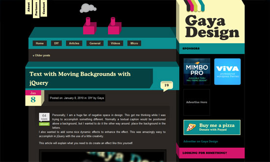
The schizo’s kicking in. Love the code peeking out in the middle, and that the right half looks hand-drawn.

The text is way too small, but otherwise a great look.

Weisswein Party

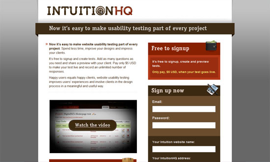
Very classy. I just wish that one didn’t have to scroll up and down to read the content and then select a new item from the menu, which could have been fixed in its place.

Quipsologies

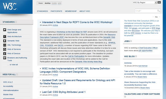
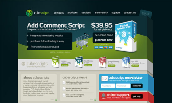
Pixel-precise graphics are still in vogue. And you can’t do better than the logo!

Matt Brett

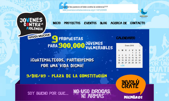
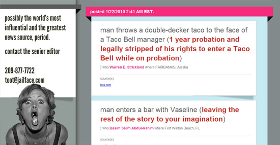
A nice touch in the Twitter area: the older the tweet, the more faded it is. Pink and brown is a pretty sweet combination too—and the site belongs to a guy!

Jimmy Oh

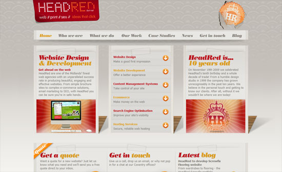
Lots of lovely little details here, and no stone was left unturned.

Questionable Characters

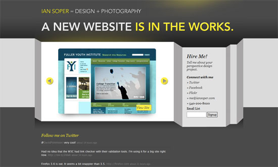
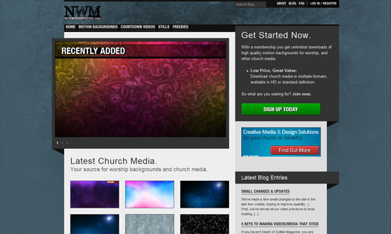
This site looks elegant but not too stifling, and has touches of quirkiness here and there.

Social Media Weekly

DesignFront-end Quality Levels

ProgrammingFind The Right JavaScript Solution With A 7-Step Test

UXLabel Alignment in Long Forms | Paper Prototyping for Engineers

Feature
Post

Category
Code

Three WordPress Admin Plugins to Love

I’ve posted before about being a somewhat “late-adopter” of WordPress, but now that over 90% of the sites I run are powered by the wonderful WP, I spend a lot of time in various WP Dashboards. Which is why I love these plugins, made specifically for back-end administrators:

WP-Task-Manager

Because of the aforementioned serious amount of time I’m in WordPress, it really helps to be able to keep track of to-dos from within the Dashboard. A widget lets you quickly see your task list, and it’s easy to create and manage tasks for other authors or admins, and write comments on these tasks. Download WP-Task-Manager »

wp-Typography

Like most designers, I’m very nitpicky when it comes to typography. This plugin features a host of options for people like me, including proper hyphenation, detailed spacing control (e.g. widow protection, forced internal wrapping, etc.), and smart character replacement for things like quote marks and copyright symbols. Download wp-Typography »

GD Press Tools

Finally, there’s GD Press Tools. Certainly not for the faint-hearted, this is one powerful plugin, with included options ranging from maintenance operations, to tracking the popularity of your posts and pages, to some very good database tools. Before you dive into using this plugin, make sure you spend some time learning which features work with your version of WordPress. Download GD Press Tools »

Which WordPress plugins make your life easier?

Feature
Post

Category
Code

Four Tools for CSS Optimization & Compression

Why optimize your CSS at all? In a nutshell: for faster loading pages. Because, really, anything that can speed up the loading of your site is a good thing. Here, my favorite four tools for CSS optimization and compression:

Clean CSS

A free online service, and what a service it is: this tool, based on CSS Tidy, also helps you with CSS shorthand, in case you haven’t got it memorized yet. A worthy bookmark.

CSS Compressor

CSS Drive’s CSS Compressor does just that: compresses your CSS in either Light, Normal or Super Compact modes. I personally prefer their Advanced Tool (also free), which allows you to get specific (e.g. whether or not to leave spaces between selectors and properties, etc.)

CSS Analyser

This one not only verifies your CSS with the W3C, it also tests your color contrast. Which, if you read my last post, is pretty awesome.

CSS Redundancy Checker

Finally, because redundancy is just not cool, especially when you’re trying to optimize your CSS, this nifty little tool is quick, easy to use, and simple to understand.

How do you optimize your CSS code?

Feature
Post

Category
Friday Focus

Friday Focus 01/22/10: Folded Out and 3D

This week on Friday Focus: these folded, boxy 3D-looking designs pose an interesting challenge to the designer in creating perspective and breaking out of boundaries. See how these websites did it!

Designs of the Week

Jóvenes contra la Violencia

Big, colorful, chunky, and grungy. It almost feels wrong to see “normal” sans serif text fonts here and there!

HeadRed

I like the use of the elegant type and wallpaper background against the less elegant ropes, folds, and tears that (which all are done in moderation).

Ian Soper

The shadow is not so believable, but I like the look. It’s quite different from the other folded/blocky/3D ones that focus on adding folded ribbons and boxy-fying things up.

IntuitionHQ

Love the icons and the color palette.

World Wide Web Consortium

The W3C has its own subtle application of the design pattern. Clean, clear, and lovely.

Gaya Design

Cute little chimney effect (that isn’t Flash) going on in the header. The design looks a little busy, but I like it.

Cleverclick

Now for something unbelievably simple, but still striking and attractive. One of those designs where the design practically goes unnoticed because it’s so subtle.

Jailface

This isn’t a particularly attractive site, but there are enough attention to detail and typography that gets the job—of making the stories readable—done.

InstantLoop

It’s been a while since I’ve seen a super shiny, “Web 2.0″-style design. Bring on the pastels!

New Worship Media

I think it makes sense for the design to be so gray and dark because the backgrounds in the gallery are so colorful.

Cube Scripts

When you’ve got products presented in boxes, a boxy-looking design feels like a natural progression, doesn’t it? What I really like is the footer treatment, which looks like a few sheets of paper with two angling out of place. Not necessary but a very nice touch.

Social Media Weekly

DesignCrafting Subtle & Realistic User Interfaces

DesignUnity In Design: Creating Harmony Between Design Elements

DesignRealism in UI Design

OptimizationHow to reduce the number of HTTP requests

CSSHow To Create Depth And Nice 3D Ribbons Only Using CSS3

CSSKeeping Safari (and Chrome) Hacks Out of Your Stylesheets

Feature
Post

Category
Design

Color Choices for Better Readability

When I started designing websites twelve (!) years ago, I did an embarrassing large number of them in black with white text. Fast forward to 2010, and now I’d say that 99% of the sites I design have black- or dark gray- text on white backgrounds. I’ve read the studies, of course- accessibility and readability studies stating over and over again that anything but black on white is difficult to read and possibly headache-inducing.

But what really matters here aren’t necessarily the colors themselves, but how they contrast with each other. Take the following example:

Of all these, Headlines 1 (black background, white text) and 3 (white background, black text) have the highest contrast. While these could arguably be the easiest to read, some people actually find the lower contrast examples in Headlines 2 and 4 more pleasing to the eye- myself included (note: I have bad eyesight, probably from spending too many hours in front of a computer for the past 12 years!) Which is why many designers would rather use #333 for text on a white background rather than #000.

This is also interesting:

I’m not sure about you, but my eyes naturally gravitate to the boxes on the left because of their bold colors. Now I wouldn’t recommend these for long paragraphs of text, but it’s certainly something to keep in mind when choosing colors for things like banners, mastheads and advertisements.

What color choices do you make in your designs? Do you stop and think about how they relate to readability?

Feature
Post

Category
Interviews

Andy Sowards, Your All-Around Web Guy

Andy Sowards is your all-around web designer and developer. In this interview, he talks about his 12,000 Twitter followers, making it in the industry without any formal training, and juggling his work and family.

Hello! Please give us a short background of yourself – age, current location, hobbies, likes, dislikes, etc.

Hi Guys! I am a 24 year old happily married father of three beautiful boys (soon to be four! Its a girl!), currently residing in Lynchburg, VA (very small town). I enjoy hanging out with the family, playing video games, and working out when I am not designing or developing something. I like learning new things, computers, food, and gadgets. I dislike watching sports, waking up early in the morning, and hate traffic. (Ed – Don’t we all, lol.)

How did you get into web design and development?

Well, I have always liked Web Design and Development since I was in high school – this then ‘hobby’ was basically just playing with graphics, Photoshop, and MySpace code. Then the hobby was turned into a career after me and my wife had our first child. I started out as a ‘design guy’ at a small but successful web development firm in my town. After several years (of hard work, dedication and learning) I went from design guy, to HTML/CSS/JS guy, to PHP/MySQL programming guy, to all of the above – until I was the lead developer/designer at the firm and was needed on lots of different projects.

You’re a self-taught web designer and developer. Does that get in the way of finding clients? Or is it irrelevant in this industry, as long as you have the necessary talent and drive?

Great question: I find that being self taught versus having a degree is irrelevant in this industry to land great clients. I have a long list of clients at this point, some big businesses, some small – but never once has anyone said “Can I see your degree?” or “Did you go to college for this?” I think that some of them probably assume it, and others just don’t think about it, but as long as the end result is what the client wants, then they are happy. A lot of the time clients approach me because of something else I had done that they liked, or from a referral, but being self-taught has never kept me from landing a client.

I understand that you have a full time job in a web dev company – how do you manage to fit it all in a day? Does the quality of work suffer, and if not, how do you do it? I’m sure everyone would love to know.

Yes this is true, It is definitely a LOT of work, but I love every minute of it. Like I said above, I am married with three boys (and soon to be girl, yay!) and I am the only source of income for our household, so every little bit counts. It is knowing that my family depends on me, and that I love doing what I do, that drives me through each day. The quality of work never changes in my eyes, because with each thing I do, I try to do it as best as possible for the most desirable outcome. There comes a point where when you put out crappy work, you get crappy things in return – and that doesn’t help anyone! So always do your best and it will definitely make things easier for you and your clients.


Where do you find inspiration as a web designer?

I find it all over the place, you can never have too much inspiration! I find it in nature, art, music, things around my apartment.
I find inspiration when I watch my kids play, I find inspiration while browsing the internet, Flickr, etc.
I find inspiration in other web design blogs. Pretty much everything around you is inspirational in one way, shape, or form.

What makes you stand out in a soup of designers and developers?

Wow that is a tough question. I would have to say that since my career has had me involved in so many different things, what makes me stand out from the crowd is, that I can practically do anything. I have done everything from design, development, programming, even some Enterprise Linux Server admin type stuff. Some designers only do logos, graphics, and so on while other developers only code html/CSS. Still many others only program, or do advanced Javascript.

Me? I do it all, and love doing it all. I like working with teams that design the site, and I build out the html/CSS/JS and program it. I also like working alone, and doing it all from start to finish. I can go from designing a logo in Photoshop one second, to creating a MySQL database scheme to integrate into a new web app I am building the next. Doing it all really raises my value to my clients, as well as keeps my days from being monotonous, boring, and lifeless. I love putting together all the pieces to create a fully immersed experience!

What was the last project you enjoyed working on?

My most recent project was pretty fun, I had the pleasure of working with an IT firm that develops productivity applications. My task was to take their current design and work with them, and their company goals, to create a new and fresh site design and layout for the site. Basically I had to breathe some life into it, without changing everything. It was a great project with a great client, it required some design skills in Photoshop, as well as some programming in the WordPress platform. I also spruced it up and brought it into the new age by adding some Javascript trickery in there with jQuery. The final result turned out well, and there are plans for more changes in the future, but the finished project can be found here.

Twitter has skyrocketed my web design and dev career.

You’ve got 12,000+ followers on Twitter! How did you build your following? What are the topics that you usually Tweet about? How has your success in Twitter crossed over to your web design and dev career?

Ah yes, I am a huge fan of Twitter! It took a long time to build my following, lots of dedication to tweeting in 2009 lol. I basically built it by engaging with my followers, listening to their needs, helping out people and their problems, tweeting awesome links, but most importantly, just being myself. I tweet about anything from logo design, freelancing techniques, Javascript tutorials, to advanced regular e|Expression and programming. I basically tweet about design, development, programming, computer science, and nerdy stuff.

Twitter has skyrocketed my web design and dev career. When I started tweeting a little over a year ago, not many people knew who I was – now it seems like everyone (in the design/development community at least) has seen me or my site, or recognize my twitter avatar. It has presented me with some fantastic opportunities, new friends, new clients, and in the past few months alone I have been approached by several companies trying to recruit me. So it has definitely proven for an interesting ride, and I will definitely keep tweeting to see what happens next.

You seem to be quite the family guy! Do you find it difficult to keep up what with all the stuff that’s on your plate?

I LOVE my family, they are seriously the greatest thing that ever happened to me. I am 100% positive that I would not be where I am today without them. Having said that, the obvious answer to this question is yeah, sometimes it is a little difficult to make sure everyones needs are met and nothing falls off my radar, but so far everything has gone fairly smoothly, and it is definitely worth all the hard work it takes to make it. Going to bed at night (or staying up all night) knowing that everything is taken care of is a great feeling. The key is to never give up. I have never been a ‘quitter’.

Its going to be a busy future, but I wouldn’t have it any other way!

What are your plans for the future? Anything else you’d like to learn and go into?

I have a lot of awesome things planned for this year! I will be helping launch a few blogs in the next couple of months, as well as a personal project that will be going live in a few months from now which is very exciting! I am also fully redesigning my personal site so stay tuned there for when all of this stuff launches soon.

And so, there is always something I would like to learn! I am CONSTANTLY trying to learn everything there is to learn about design, development, programming, and computer science as a whole. I am also studying a lot about businesses and startups because I plan on launching a few startups in the next year or two. Its going to be a busy future, but I wouldn’t have it any other way!

Feature
Post

Category
Webapps

5 Awesome Email Marketing Services

As a developer, I’m often asked by clients for recommendations to email newsletter and marketing services. AWeber and MailChimp are usually the first ones I mention, simply because I’ve used them both for quite some time, recommended them to previous clients, and always had good results.

Today, however, I want to show you some other choices for email marketing. Some have been around a long time, and some are fairly new- but all of them are awesome. See for yourself:

Campaign Monitor

This is another service I am constantly recommending to friends, family and clients. Campaign Monitor, the flagship product of Australian company-I’d-most-like-to-work-for Freshview, is sleek and powerful and does everything you’d expect from an email marketing tool- and then some. They have plugins & extensions for everything from WordPress to Shopify, a whole library of articles and tips on email marketing, and some of the nicest-looking email templates available. There are no setup or monthly fees- Campaign Monitor charges a flat delivery fee of $5, plus 1 cent for each recipient.

EmailBrain

EmailBrain, which was bought by Dotster two years ago, is a good, solid service that’s chock-full of features, such as some very robust reporting such as unique vs. total links clicked, or how many people chose to forward the email to a friend. Their “Periodic Plans” provide you a certain number of “credits”. The smallest plan, for example, is $9.95 a month for 2,000 credits. That means you can email 2,000 contacts once a month, or 1,000 contacts twice a month, or 500 contacts four times a month, and so on.

LetterPop

I love how you don’t need to sign up for LetterPop to try out their email newsletter builder, 289 templates (at last count) that can be dragged and dropped and edited to your heart’s content. It does seem that they’ve gone to great lengths to simplify the process of email marketing for users, with nice touches like Flickr integration. They currently have five easy-to-understand plans, starting with a free plan of 10 newsletters a year to 25 subscribers.

Mad Mimi

Of all the email services I’ve listed here, Mad Mimi has got to be my favorite- and not just because of their adorable big-haired, horn-rimmed-glasses-wearing mascot, but because it’s an absolute gem of a service. Easy to use? Undoubtedly. Powerful? Amazingly. Gorgeous themes and templates, truly useful tracking reports.. can you tell how much I like this service? They offer four monthly plans, starting at $8 for 500 contacts, as well as a free plan of 100 contacts.

Nouri.sh

Nouri.sh is a little different from the other services I’ve listed here: they offer blog-powered newsletters, which means that they basically take your RSS feed and convert it to a newsletter. Which also means that you don’t have to create separate email newsletters at all, yay! I’ll admit that at first I was worried about how the finished emails would look, but thanks to some good customization and branding options, they look just fine (note: the free plan does not include custom templates). More than fine, actually. But one of the things I like the most about Nouri.sh is their WordPress plug-in, which among other things will allow you to add a quick subscription widget to your blog and track the number of subscribers and campaign data. There are five plans available, including a Free plan that includes up to 1,000 emails a month.

What email marketing services or tools do you use or recommend to clients?

Feature
Post

Category
Friday Focus

Friday Focus 01/15/10: Uppercase

At one point in our internet lives, we learned to avoid typing in all caps, because it meant we were yelling. At another point, we became attachmented to typing in lowercase, because it looked and felt cool. We see a lot of designs going lowercase in many portions of text, but nowadays, going uppercase is is all the rage. These designs seem to pull that off quite well.

Designs of the Week

Giraffe Restaurants

The largest amount of custom web fonts and uppercase text I’ve seen, methinks. But oh my goodness does it work. I can’t stop looking at it!

DIBI Conference

Looks good overall, but I have a problem with the typeface in the body. Why use a different one from the logo?

Riot Industries

Enjoying the minimal treatment here—just because you’re using a bold fonts you should be all in-your-face with your design. I just wish the About pullout section were styled a little bit more similar to the rest of the site.

Atom Bicycles

There are several different fonts on this site but it doesn’t go too far.

Friendly Duck

I’m liking the center-aligned header/blurb here. Very nicely spaced too.

Artery Recordings

My gripes are under the hood: using JavaScript for image hovers, tables, and <br />s (instead of <p>s). Tsk tsk tsk.

Windrock Lodge

The inner pages need to be more consistently styled with the overall grungy look, but points for almost getting there.

Social Media Weekly

CSS8 Free & Best CSS Editors For Web Designers

JavaScriptjQuery 1.4 Released: The 15 New Features you Must Know

Feature
Post

Category
Design

Favorite Five: Fresh Free Fonts

That’s right, it’s time for another feature on free fonts- and since it’s the beginning of a new year, I’m selecting five of the freshest fonts out there today. They’re mostly modern in feel, making them perfect for 2010. Get downloading:

Ubuntu Titling

This is a fresh version of one of my favorite free fonts, Ubuntu Title. Ubuntu Titling looks similar, clean and rounded, but is just nicer somehow. It also includes capitals and small capital alternatives. A good choice for contemporary designs. Download Ubuntu Titling »

Sniglet

Another rounded one, Sniglet is a font from the excellent open-source foundry The League of Movable Type. Made by Kingdom of Awesome, Sniglet is fat and delightful and wonderfully rendered. It also comes with a full character set. Download Sniglet »

Katy Berry

I’ll admit to having a soft spot for curly girly fonts like this one, which are perfect for tea party and bridal shower invitations, or simply for adding a free-spirited feel to your next design project. Download Katy Berry »

Patagonia

Another gem from Kingdom of Awesome, this is the kind of font I find myself looking for reasons to use. Lovely letter spacing and just the right amount of boldness make this an easy-to-read font that works particularly well for headlines and announcements. Download Patagonia »

Lane

Best for last again! It’s not always easy finding “thin” fonts that render well, but Lane does so impeccably. Shown here is Lane Narrow, but the free download also comes with “Upper” and “Posh” versions. Download Lane »

Feature
Post

Category
Interviews

Gareth Leeding On Taking The Freelancing Route

I’m sure that one of the things on your mind as a full-time designer is whether to take the leap to finally make it on your own. Everyone dreams of having their own design company – or at least, private practice – but never really know how to begin. More →

Feature
Post

Category
Code

Quick Tip: Using WordPress Slug-based Category Templates

If you create custom themes for WordPress, chances are you’ve already used category templates in the past. They usually look like this:

category-x.php

where x corresponds to the ID number of the category, and are extremely useful if you want to give a specific category a certain look. For example, if you wanted to add an “Asides” area to your theme, you’d create a category named Asides, get the numerical ID of that category (e.g. “3″) and create a template file named category-3.php

My problem, of course, was having to find the ID of the category, which could vary from one WP installation to another. The truth is that I usually chose to go the route of conditional queries instead, doing something like this:

if ( is_category(‘asides’) ) {
// what I’d like to show for my asides
}

WordPress 2.9, however, has added support for slug-based category templates. So instead of naming my template category-3.php, I can go ahead and name it something wonderfully semantic like category-asides.php

The hierarchy in which WordPress looks for which template to use has been updated as well. Now, it’ll look for the slug-based template first, then the ID-based template, and finally the default template.

Do you use WordPress category templates in your themes?

Feature
Post

Category
Friday Focus

Friday Focus 01/08/10: Red

Who’s in the mood for some red designs this week? Let’s start the show!

Designs of the Week

Carmilla la Vampira

A bit of parallax going on in this horizontally scrolling site. Love the illustrations, which are interconnected through color.

Red Nose Day

I love that practically everything looks hand-drawn! But everything still looks tidy, and therefore readable.

Bitela Pizza

I think my only nitpick here is the use of Flash for the top menu, and the lack of rounded corners in the pizza graphic. Other than that, this site is making me hungry for Brazilian pizza.

Chrome Bags Store

I like the not-quite-centered layout and the little nicks and cuts to the content boxes. Edgy, that’s what I think they call it.

Dark Crimson

I’m a sucker for these 3-dimensional, folded elements (is there a name for this yet? I really want to know). And the shades of red in this site are quite appealing. I just have a tiny issue with the top and bottom padding in the Featured Projects box—should’ve had more.

The Vibe Tattoos

Now this is one of those sites that put me on the fence when it comes to looks, but I like how striking it is. Plus the quirky icons below? It captures how left-of-field tattooing is.

thoughtbot

I like the whole industrial feel with a bit of a plastic-y twist in the menu and buttons. It makes browsing the site that much more exciting.

Aaron Shapiro

Beau.ti.ful. You can go a long, long way when you get the typography down pat. And whitespace is your best bud.

Elk City Chamber

I really like the animated neon sign and oil rigs, dresses down the whole grand look of the site with its ornate borders and background.

Design Expedite

This site’s bordering on very low contrast, but it’s still readable.

Bureau347

There isn’t as much red in here as the other sites but it makes since a very bright shade of red was used. I have to point out that something brilliant is going on in the contact page: the map of their company office is a live Google Maps spread which spans the whole background. Neat!

Social Media Weekly

BrandingBreadline Design’s Company Naming Machine
Just for kicks.

DesignA UI Design and Prototyping Treasure Chest
“Having these close by will save time and speed up your design and prototyping work flow. Here is a collection of these types of elements that should be a big help to you.”

Programming16 Different Clones You Can Build with Drupal
“So, if you’re thinking about building your next big site, here are a few ways that you can take existing modules and turn a project quickly, without needing to make any custom modules.”