Site layouts are filled with boxes and corners, but not everything has to be so straight-laced. These designs feature touches of something a little more organic: animated waves and curves that soften the look and can even make things more fun. [Read more…]
Design Focus: Wiggly BG
Get a shot of energy by looking at these websites with background animations. How do you tow the line between eye-catching and too-distracting movement? Let’s see: [Read more…]
Design Focus: Site Frames
Designs of the Week
Get solid WordPress themes, plugins, and even design training from iThemes.
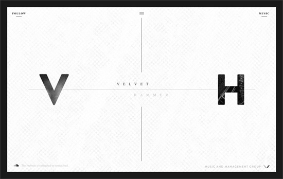
There’s a nice mix between a modern feel and subtle grunge touches here, which sort of represents both the music management and artist aspects to their company. The page scrolls inside the box and there are three menus which overlay on the area once clicked: social media, music, and the main menu.
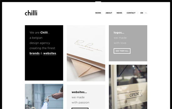
A clean, simple, predominantly black-and-white site with a boxy, bento-style layout.
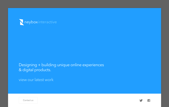
Nice bright colors marking each section and product of the homepage. The large imagery and small descriptions are a familiar pattern in websites these days, but the fact that the layout doesn’t span the entire width of the browser instantly makes it look different from the rest that’s out there, not to mention the treatment of the above-the-fold block.
Social Media Weekly
Search Optimized, Turn-Key Designs, Unlimited Everything. Start building with the Genesis Framework today.
CSS – Ways You Need To Tell The Browser How To Optimize
“Rather than the presumed “browsers will get faster at running my code”, there is a little more “I need to change the way I code for browsers to get faster.””
Typopgraphy – glyphdiff
“Glyphdiff is a simple tool comparing the differences of two fonts on given glyphs.”
JavaScript – JavaScript for Designers
“Rather than sit, and try to digest boring definitions, we’ll dive right into building an interactive HTML prototype, and have fun learning JS together along the way.”
Design Focus: Animate.js
Check out these dynamically designed sites that all happen to be JavaScript conferences.
Designs of the Week
Need help in promoting your site? INeedHits has been in the search engine marketing since 1996!
Wingdings is that you? There are a lot of “back-to-basics” making their way into website designs these days, like the bright blue and the pixelated, low-resolution images, and on top of that it’s the famous symbol font whose glyphs are gliding through a 3-dimensional stream. Even the circular shadowed bullets are used as markers for the carousel.
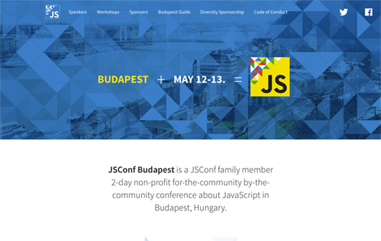
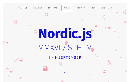
Quite the elegant triangle animation in the header that lets you interact with it too. I also like that the speaker avatars have their corners cut off in the shape of triangles too.
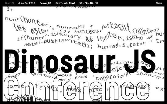
Also greets you with this cool glitchy effect applied to a block of code, this site is probably the kookiest of all with its oversized cursors and headings. I also like the black and white not just as a color scheme but as a negative filter when the text scrolls through the edges.
Social Media Weekly
Design – Design debugging
“Developers typically split the task of finding issues from building a project for wider release. These modes are often called debug and release. I think designers should take a similar approach.”
CSS – Flexbox Patterns
“Flexbox is awesome, but it introduces many new concepts that can make it difficult to use. These interactive examples will show you practical ways to use it to build UI components. They start out simple and get more complex near the end. You can start using these patterns in your own code right away, though I recommend you apply accessibility best practices to the markup (like using semantic HTML5 elements).”
Design – The Way We Build
“This process led us to the development of our new Design Language System (or DLS), as well as a suite of internal and third-party tools that allow our teams to not only work smarter, but also closer. The DLS is a collection of components defined by shared principles and patterns. This allows for rapid iteration using a shared vocabulary across design, engineering, and other disciplines. The structure of the DLS is simple and coherent, easing communication across teams.”
Build on DIYThemes’ Thesis Framework for rock solid SEO and great layout customization options.
Design Focus: Interface Inception
Last year we featured designs that expose the behind-the-scenes in creating a website. Here’s another round of interface imitation inside the web browser, with really interesting twists.
Designs of the Week
Pagelines lets you build WordPress websites and it’s as easy as drag and drop, go check it out!
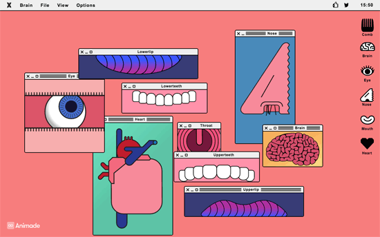
A modern, humorous homage to Frankenstein that lets you play with different parts of the body in their respective windows, with sound and animation to match. Works quite well as both a web toy and an artistic installation online.
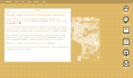
You don’t see yellow—or in this case, gold—used as text or the primary, foreground color very often and this site pulls it off. I like that you can get to know him through his books, travels, habits, and podcasts. Also, it’s smart move to show all the pertinent contact information in messaging format. Since message bots are all the rage lately, I’d say this is definitely on trend. Another interesting trend popping up everywhere? Emoji—and it’s pretty obvious why.
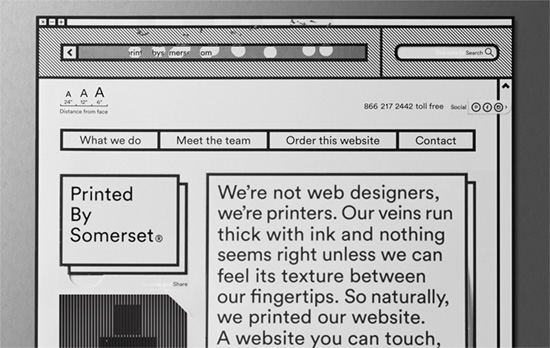
They literally printed out their site and then put it back up on the Web—that’s at least three levels of inception right there. The analog interactions are brilliant: scratch-off address bar, pull-out social media, and tear-out/flip-up layers. If companies want to showcase their brand and personality through their website, this is the way to do it.
Social Media Weekly
Ready to go out and design your next website? Try building with the Catalyst Framework.
HTML, CSS, SVG – How to work with SVG icons
“There are many ways to use SVG icons in HTML and CSS, and I haven’t tried them all. This is how we do it in our small front-end team at Kaliop.”
Design – R/m Design School: Grid
“Essentially, in making the grid, the designer works out the rules and limits to be followed. These rules and limits create, as the work goes forward, a specific statement that often defines and directs the further development of the layout and sometimes leads to unexpected but very welcome results.”
Interface Design – Building the UI for the new The Times website
“The redesign of The Times and The Sunday Times is all about content. It is about showing the right piece of news in its dedicated amount of space on the screen. The challenge of keeping this sort of strict hierarchy in a responsive layout determined by content can be difficult.”