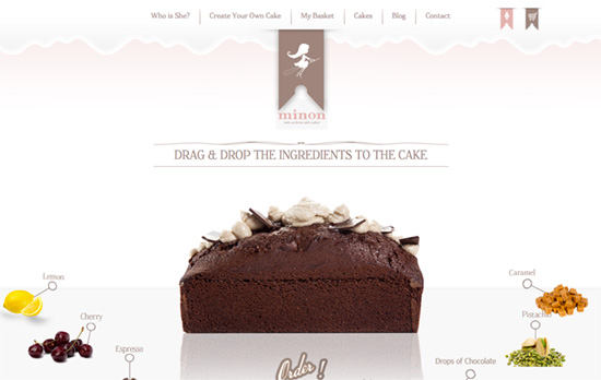
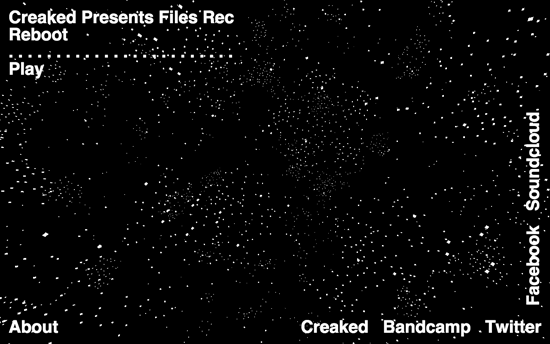
The interactive highlights of these designs are controlled by how much you want to scroll, so instead of just passively “watching” the animation go by, you say stop and go to experience the sites as you please.
Designs of the Week
Get solid WordPress themes, plugins, and even design training from iThemes.
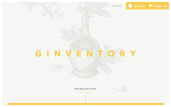
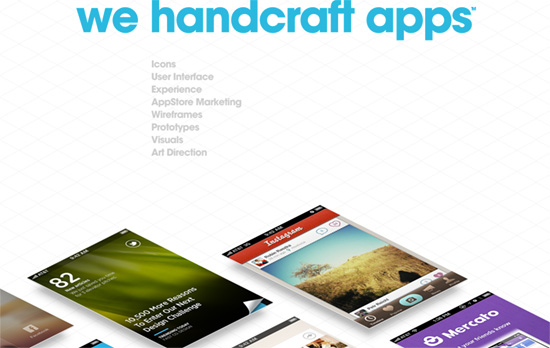
I wish this weren’t “scroll-jacked” but everything else is just lovely. Definitely not the usual website featuring a mobile app.
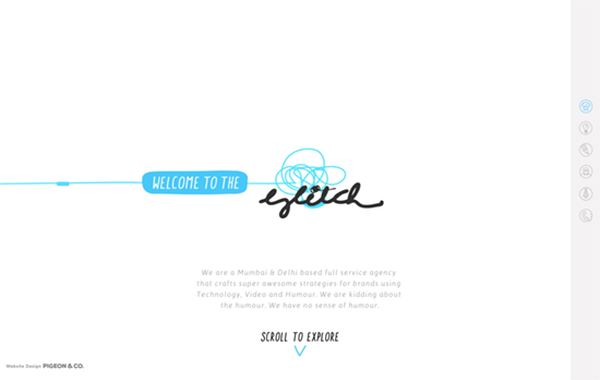
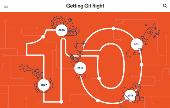
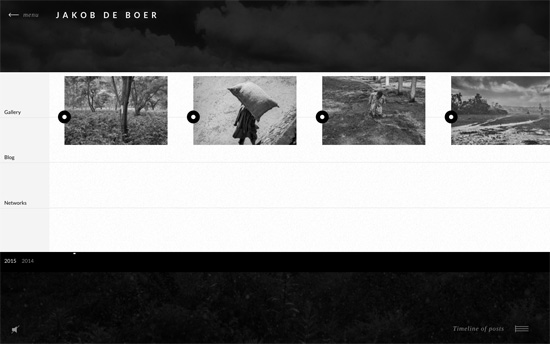
Such a fun idea to do stop-motion animation by going around the agency’s office and do all sorts of quirky twists. The weird thing is if you use the right-side navigation it moves too quickly, so definitely scrub through by scrolling.
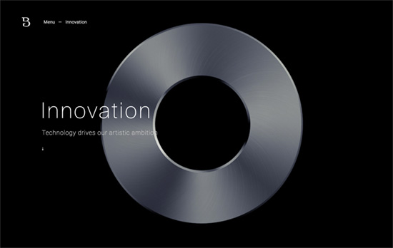
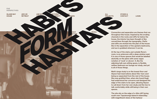
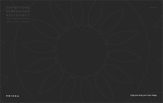
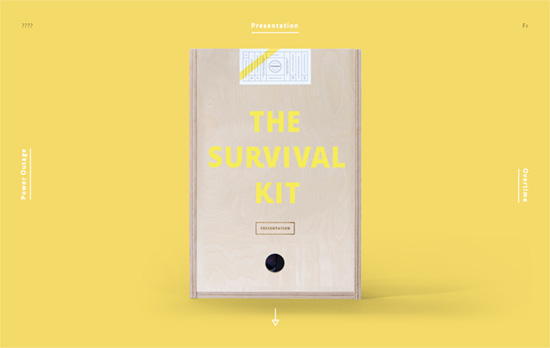
The whole site uses a various animations on its elements as you scroll down, but it’s the Innovation page in particular where you get this satisfying experience of rotating an object mid-air by your scrolling back and forth. I also like the rectangular animation that overlays the menu.
Social Media Weekly
Create unique, extraordinary websites with Squarespace. No experience necessary!
Design – Why Bother Making Beautiful Team Pages?
“There’s no one right way to design a team page, but I think it says so much about the company’s respect for an employee when it’s willing to pay for the cost of high quality photos of its team.”
CSS – REM vs EM – The Great Debate
“Turns out, rem and em have their strengths and weaknesses. They should be used differently, depending on the circumstances.”