Feature
Post

Category
Friday Focus

Friday Focus #47

Here with are with another month drawing to a close. We are just 5 weeks away from the first year anniversary of Friday Focus, so feel free to start putting together your gifts for us now. I’m not sure what exactly the 52nd week of Friday Focus will actually hold, but hopefully I can get a whole bunch of things to stuff the focus with when the time comes. In another quick announcement, I apologize for not getting out the Wordpress 2.3 sum up article out right away like I had promised. The week became a lot more busier than I expected it to be. Things are coming, just be patient.

Enough talk, let’s kick off the weekend with a new Friday Focus.

Sites of the Week

Leading off is Groop, a really simplistic, clean design that utilizes flash. They’ve done some really cool work, including stuff for Live Earth, so check them out.

Groop

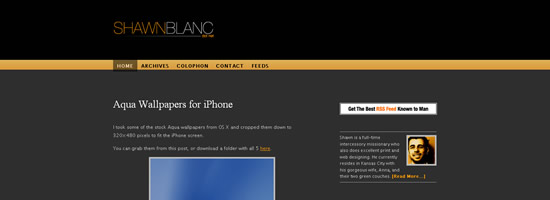
Next is ShawnBlanc.net, a good example of a dark design that is simplistic, uncluttered, and eye catching.

ShawnBlanc.net

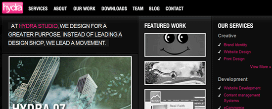
And finally we have the updated version of Hydra Studio. They’ve done some really clean work, including designs for the bands The Almost, Underoath, and Mae among others.

Hydra Studio

Digg Weekly

Design - 100 (Legal) Sources for Free Stock Images
From the digg description: Staying legal as a designer or webmaster means you’ll have to either create your own images or buy them from stock sites. Fortunately, there are a number of sources for free images, and we’ve collected them here. So read on for 100 sources where you can find free stock images: and don’t worry — they’re all legal!

Programming - 7 Reasons I Switched Back to PHP
Everyone thinks that Rails is the future of coding. It is already in use on tons of web applications, but this article just may make you reconsider.

Feature
Post

Category
Column

The Debate of Flash, Usability, and Standards

Hey All,

I thought today, I would touch on the debate between Flash and CSS/Accessibility, based on my own work experiences. I would also like to announce that I will be releasing a tutorial/review of Microsoft’s new suite of Expression, as well as the accompanying Silverlight. I was fortunate enough to work on a project for Microsoft, and learned about these tools first hand. I would like to point out, that I was not behind the design however, and would have made a few changes. However, I will be touching on my concerns regarding this as well.

Microsoft Expression Screen Capture

Until I’ve worked everything out on what will be shown in my next Article, I thought I would focus on a few things that have been bothering me at work. You see, I recently started working at an online marketing agency. This means that they don’t focus on the web as much as they focus on making things look “hot”, that being a direct quote from our lead designer.

You see, upon leaving the bank, and arriving at this agency I entered somewhat bitter from the corporate world. When I saw how they operated, as to how the bank operated it was a complete shock to experience such a laid back, great environment to work in. I want to stress this now, because I love my job, and this is by no means a post about how I hate my job, but instead a clash of opinions. So, on that note, let’s get started.

I came in during a rather large turnover, for various reasons. It wasn’t so much a bad place to work, as much as several situations at first. As a result my first project was a problematic dating site, built in ASP. This was problematic, as my job, being hired as a programmer, was to convert the access database to MySQL. This issue, however, was not even an issue in this job. You see this site had been worked on before me, twice before. An attempt to move it to a MySQL database had already been made, with the failed work still showing. It was during this time, did I learn how easily it was to break the layout my new employers had created. It was driven through tables, in a delicate balance of sizing and spacers. If you pushed this layout by just one pixel, it broke unlike anything I’d ever seen before. Things disappeared, navigation dropped to a completely different location, and the text breaking the layout disappeared due to poor CSS.

When I raised my concerns over this, I was told their concerns were not to build the layout in divs and CSS (as at this time, I’d pointed that the layout would be easier to work with, easier to maintain, and quicker to implement new features) as tables were far easy to work with when building and they’d deal with any other problems later on. They turned away and went back to designing for more major projects, and finishing all the flash elements, like the basic rollovers for the navigation. It was at this point did I start to realize that my own web interests may clash. Needless to say, I worked through it (among a dozen other issues) and got the job done.

Dinnerworks Site

The next issue came with the Microsoft, as we were in the designing stages. I had raised the question regarding what we would do with all screen resolutions under 1280 x 720. I was told they were merely designing for Microsoft’s resolutions and that anyone underneath that wouldn’t be considered. Again, I had problems with this because I am an advocate for accessibility. I am still learning, but ever seen learning my fiancée was going blind, and often struggled to used the internet due to lack of support and hence why she didn’t understand why it was so important to me, I’ve been learning more and more. I still have a long way to go, but I know some of the basics, and one of those is cutting off anyone who may view a website differently. Again I was shocked. I didn’t understand, at the time, why they would do this.

So again, today I learned of a new social networking project we’ve begun. I do believe it could be very successful, and I am, right now, in support of it. Although the idea is very rough, it could really work out well. However, I then learned they wanted to build this new app, with hopes that it could be the next facebook. Although I don’t see it being a 1.6 Billion, and rising, application, I do see it being somewhat successful.

At least, I did believe that, until I learned they would eventually want this whole site to be designed entirely in flash, and designed for any screen resolution at least 1024 x 768. I could see this being the one thing that could make this project fail in the long haul. I believe in flash, and I believe when used correctly at the right places it’s a great tool. I just don’t think I agree with the concept of sites being designed for flash, and then the HTML being considered secondary, if at all. (As was the case with the Expression project)

I do believe there is a time and a place for certain resolution requirements, but with something that is hoped to be the next big social networking item, I think they need to stop trying to make things look “hot” and “sexy” and instead, focus on allowing as many users as possible to access the site as easily as possible with as little hassle as possible.

My question to you all is, what do you think? When the goal is to make something look good, do we need to sacrifice accessibility, and usability? Or are standards, XHTML, and CSS holding designers back from making something unique and amazing? Is full flash sites still popular, or have they run their course? Could a social networking program be successful in 100% flash?

What do you all think? You know my views, so I’m interested to know yours.

Feature
Post

Category
Friday Focus

Friday Focus #32

It’s incredibly hot where I am as we enter into the last weekend of May, a three day weekend for many of us. As May draws to an end we get closer to the new Devlounge design and a surge of new content. I want to personally thank Ronald, as his Wordpress plugin series (which I promise will be getting it’s own “table of contents” page this weekend) has restored Devlounge visitors to what they were a few weeks back before we began the decline. If you’ve been following the series (which he has left a note about at the end of this week’s focus), please leave your comments in the series finale on how helpful the series was to you. We have had a lot of trackbacks, but little comment feedback on the series itself. It’s always nice to know our readers appreciate the effort of hard working writers.

Let’s kick this weeks focus off. Enjoy the weekend everyone.

Sites of the Week

Up first this week is StayDecent, the personal portfolio of Adrian Unger. For this one, I love how the display of work is put together. There is also Ajax used here and there, and lots and lots of big, bold fonts.

Stay Decent

Next up is another portfolio, this one for Jason Julien. The portfolio is neat and clean, and there’s is a very nice collection of work that goes along with it. Worth a look.

Jason Julien

Digg Weekly

Favorites from the past 7 days

Design: 60 Elegant and Visually Appealing Designs
From the list-creating-masters of Smashing Magazine comes an entirely new list, this time with 60 “visually appealing and elegant designs”.

Programming: The top 10 dead (or dying) Computer Skills
While not directly related to design, most of us understand computers a bit more than our average friends, so I thought it might be interesting to know what is and isn’t needed anymore.

Up and Coming

Software - 10 Open Source Apps You Can’t Live Without
A nice collection of open source apps including the usual suspects Firefox and Open Office.

Design - 20 Killer Resources Every Good Web Designer Should See : May
Within the post are twenty resources from icons, to CSS, to Web 2.0 layer styles.

Design Dilemma

What would be your approach for finding a color scheme if you are color challenged?

WordPress Plugin Spotlight

The Devlounge Plugin Series is drawing to a close with the last post scheduled to be published Sunday. It has been quite a journey and a few people have e-mailed in saying that the series has been helpful. If you have yet to check out the series and are a WordPress user, please start with the introduction.

Feature
Post

Category
Friday Focus

Friday Focus #30

Number thirty! Enjoy the weekend everyone.

Sites of the Week

Starting this week off is Unfortunate. This site makes the list because I really like the idea, and I think it’s pretty fun. The site itself isn’t bad either, but I think it’s the originality of the project that gets more vote a bit more.

Unfortunate

Next up is a site for Syntax clothing. If you’ve followed Friday Focus for weeks and weeks on end, you know what I’m a sucker for online store fronts, and Syntax is no different. With a site designed to look likes its inside of a bag, Syntax really looks great.

Syntax Clothing

And rounding out this weeks picks is a personal portfolio, with some really cool work. Owlscout is a dark brown design, but I really like a lot of the graphics and illustration found in the portfolio. Give it a look if you get the chance.

Owlscout

Digg Weekly

Favorites from the past 7 days

Design - How to make sexy buttons using css
This tutorial was simple and the results were pretty nice. If you want clean looking buttons, considering trying this css technique.

Programming - Top 5 Javascript Frameworks
The top five javascript frameworks (according to this author), with a brief summary of each ones features.

Up and Coming

Design - How do you write a graphic design brief?
A design brief ensures that you know exactly what you want to achieve from your project and allows a point of reference for designers to focus on.

Programming - The JavaScript Programming Language
Want to learn JavaScript? Here’s five videos to help you out.

Design Dilemma

How do you convince a micro-managing style-challenged client that having a plethora of fonts on business cards, posters, or websites is not only third grade, but that it looks absolutely dreadful?

Have your own dilemma? Send Ronald yours and we’ll feature it in the next focus (with a credit to your site).

WordPress Plugin Spotlight

I didn’t find any plugins this week to spotlight, but there is some cool WordPress news. From Avinash I learned that WordPress 2.2 RC1 has been released. I’ve had the opportunity to tinker with it (to test plugin compatibility) and haven’t found any problems so far. The changes are mostly under the hood. One of the features I really like is a plugin sandbox that makes sure a plugin has no errors before loading it or activating it.

WordPress Plugin Series

I have started a plugin series that is sure to benefit all WordPress users who are interested in getting started with plugin design. Here are the posts so far:

Feature
Post

Category
Friday Focus

Friday Focus #29

One more week to go before we hit 30 weeks of Friday excitement. Just to let you know, I’m cutting out one site of the week and my weekly “Top Week Submissions” from Digg for this weeks Focus, because I didn’t have time during the week (see “Slow Month“), and since I didn’t do much browsing around the web this week, I thought it’d be better to leave out entries than try to half-ass them all too quickly. So, most of this weeks focus content comes from Ronalfy, who by the way has multiple posts on the writing block in a series you’re truly going to enjoy (especially you Wordpress fans). Hopefully it’ll start this week.

Sites of the Week

First up this week is Visit Cascadia. A fun but very nicely designed site. I like it a lot, and some great uses of flash here and there really add to it.

VC

And wrapping it this [short] week is UKOS. I love the tabbed navigation, and even though it’s simply, the layout is very balanced and clean.

UKOS

Digg Weekly

Up and Coming

Design - 16 Best-Loved Fonts In Web Design
A great collection of the various fonts shown throughout the web.

Software - 20 Sure-Fire Ways to Come Up With Great Ideas
A great list of how to come up with good ideas.

Design Dilemma

This week’s design dilemma is contributed by Inspiration Bit.
Would you consider using tables for laying out forms and cut the headache with the cross-browser issues, or would you still bang your head trying to get the form to display correctly working with DIVs?

Have your own dilemma? Send Ronald yours and we’ll feature it in the next focus.

WordPress Plugin Spotlight

Simple Yearly Archive Plugin is very similar to the Clean Archives plugin. Both allow you to display your posts categories by year and offer different display options. For a way to show your archives by categories, check out a plugin called Categories and Posts.

Feature
Post

Category
Friday Focus

Friday Focus #28

Here we go with week 28 of Friday Focus, and Ronald is now back to contributing to this weekly madness, where we pick some of the best of the best from the past 7 days. Let’s get to it!

Sites of the Week

Starting this week off is Flektor. This clean / grunge style design incorporates flash here and there to showcase features, and is a newly launched social / media storage site (ala Photobucket). It makes the list because I like the overall style.

Flektor

Next is I-Heart-Luxe which a womens fashion blog. While the design is nothing amazing, it is simply and clean, and goes well with the talk of “luxury” clothing. Some of the images could use some redoing (for example, rss and advertising options on the right) because they are a bitty choppy due to poor quality, but overall, a pretty solid blog design that serves the purpose.

I heart luxe

And rounding out this week is Coda, the newly launched application by Panic. I love the site design, which I think does an absolute great job at spot lighting all the features of the product. Plus, the app itself looks delicious - it’s times like these I wish I had a Mac.

Coda

Digg Weekly

Favorites from this weeks top submissions

Design: Icon Search Engine
While we all love FamFamFam icons, there are used just about everywhere now. Here is an “icon search engine” that should hopefully help ease the burden of finding different icons to use in designs and web applications.

Programming: Faster Page loads with Image Concatenation
Web applications tend to use a lot of images to help a user navigate the interface, and more simply, just to make the overall appearance look a hell lot better. Too many images can slow down the loading times of an application though and bog down bandwidth. This article offers some suggestions.

Up and Coming

Design - LifeHacker’s Coolest Workspace Contest: The home-integrated office
Cool workspaces we all wish we had.

Software - Firefox: Necessity Or Necessary Evil?
Wired Blog asks if Firefox is a necessity or a necessary evil. I guess Internet Explorer is already the necessary evil?

Design Dilemma

Adobe Creative Suite 3 is out. Which bundle do you go for?

Have your own dilemma? Send Ronald yours and we’ll feature it in the next focus.

WordPress Plugin Spotlight

Random Redirect is a plugin that allows users to click a link and be sent a random post somewhere on your blog. This plugin allows users to “discover” your content so-to-speak. The plugin is easy to install and easy to use.

Feature
Post

Category
Friday Focus

Friday Focus #25

Friday Focus has returned to our regular schedule of being published on Fridays! Ronalfy has also rejoined us this week after taking some time off for the Reader Appreciation Project.

Sites of the Week

First up this week is a tourism site for Knoxville, Tennessee. The design is really fun, and I really like the active/energized approach they took instead of trying to make something too standard to draw people in. It looks much better than average tourism sites.

Knoxsville

Next up is Scrapblog. The design was updated here and there, and I think they did and excellent job. Just looking at the homepage alone makes me want to register, regardless of all the pink :) .

Scrapblog

And finally rounding out this week, is BubblesSOC. I first discovered this site when the designer joined Mintpages a few weeks ago, and I was impressed. It’s a very “cute” and fun design by 23 year old designer Sidney Collin, out of the University of Alabama.

BubblesSOC

Digg Weekly

Design - Choosing the right font for the job
A pretty good read on choosing the right font for your different projects. An issue frequently discussed by a lot of people, especially when cheap fonts are used instead of paying for premium ones.

Programming - Facebook Releases Thrift
Thrift is a software framework for scalable cross-language services development. It combines a powerful software stack with a code generation engine to build services that work efficiently and seamlessly between C++, Java, Python, PHP, and Ruby. Thrift was developed at Facebook, and they are now releasing it as open source.

Up and Coming

Design - 10 Tools to help you Select a Web 2.0 Color Palette
But where are the tools for a Web 3.0 color palette?

Programming - 12 More SEO Tips for 2007
A nice list of 12 things you can do for search engine optimization.

Design Dilemma

The purpose of Design Dilemma is to post one dilemma a week and allow the readers to voice their suggestions and/or opinions. If you have your own dilemma, please send Ronald yours using the Devlounge contact form.

Your newest client wants a new design, but wants the design up front before any cash changes hands. You’ve been screwed over in the past and are beyond working for free. How do you respectfully let your client know that this is not acceptable without burning the bridge.

WordPress Plugin Spotlight

Instant Upgrade allows you to upgrade your WordPress installation from your admin panel. Gene Steinberg told me it usually takes less than a minute.

WP Ajax Edit Comments is a plugin I wrote that allows users to edit comments inline via AJAX. This is a plugin you will have to try for yourself. There’s a test page where you can add your comment and edit.

Announcements

Just a couple of things to point out here today. The first is, if you have yet to get a design going for our refresh contest, get going now! The contest comes to a close on April 16th, so be sure to submit as soon as you can. Also, if you are participating, please let us know in the comments on the Refresh contest page so we know if we’ll be getting a decent amount of entries or not.

And finally, if you haven’t already, give our recent interview with the Digg Crew a read, as it was user-submitted questions that were used in composing the interview! While it is short compared to some of our others, the answers are worthwhile and to the point, so make sure you take a look!

Feature
Post

Category
Friday Focus

Friday Focus #22

Here we are with week 22 of Friday Focus. I apologize for the incredibly slow article week this week, state testing really wore me down for being in the writing mood, and some above-average temperatures for this time of year drove me outside when I was home school. Without any more delay, here’s this weeks Friday Focus.

Sites of the Week

Rejected Robot starts off this weeks favorite three according to AJ. This fun portfolio plays off the idea of a box for a robot, with 3 pages: Front, Pieces, and Back of Box.

RejectedRobot

Critbuns, the second of this weeks top three, features a bulletin board style design that I really like. Like grays with pink accents also work very well in this case.

Cirtbuns FF

And finally rounding out this week is Electricpulp. While the layout might be pretty standard, the background illustration really help distinguish it from the “layered” look many designs have taken on these days.

Electricpulp

Digg Weekly

Design - 25 Code Snippers for Web Designers (Part 1)
25 services and bits of code that can help make your life easier and save you a nice amount of time.

Programming - Why HTML renders different in different browsers
A thorough article from this authors point of view on why html with render different in every browser. This is why cross-browser compatibility is so important people!

Here are a few more Digg links that are up-and-coming.

Design - Failed vs. Unfailed redesigns of newspaper websites
This article analyzes the redesigns of two newspaper sites.

Programming - WordPress Launches “Offical” Plugin Directory
Finally there is a good attempt by WordPress to have a one-stop-shop for WordPress plugins.

Design Dilemma

The purpose of Design Dilemma is to post one dilemma a week and allow the readers to voice their suggestions and/or opinions. If you have your own dilemma, please send me yours at ronalfy+devlounge@gmail.com.

You’re about to go over a design concept with a client when the client stops you mid-sentence and says, “I already have a design in mind.” The client then proceeds to show you a design template from one of those template sites. You want to make the client happy, but at the same time, you don’t want to put your name on someone else’s design. Furthermore, you’re conflicted whether you can still call yourself a designer after using someone else’s template. Any thoughts?

WordPress Plugin Spotlight

One plugin that caught my attention this week was one called Expand Comments (Thanks Bes). The plugin loads comments on your main page via AJAX. The plugin also allows you to submit a comment on the main page as well. I never could get the AJAX comment submission to work in Internet Explorer, however. This plugin seems ideal for blogs that don’t have a lot of comments.

Is Your Website Afraid of the Nude?

April 5th is coming up fast. What is April 5th, you ask? April 5th will be the second annual Naked Web Day (as started by Dustin Diaz). Naked Web Day is an opportunity to show an appreciation for Web Standards, semantic markup, and good code hierarchy. If your site doesn’t look good naked, perhaps it needs a good workout by April 5th.

Feature
Post

Category
Friday Focus

Friday Focus #21

Welcome to another edition of Friday Focus, now in it’s twenty-first week of wrapping up all the weekly happenings on the web (ok, not all, but some). Let’s get started.

Sites of the Week

Expression Engine (EE) recently launched a new design for the products site, I it looks very good. It’s a really great, streamlined designs composed of navy and light blues, and whites.

Expression Engine

Virb, a social networking site from the creators of Purevolume (Unborn Media) also launched publicly this week. It’s simple design beats out Myspace, and what’s even better is the almost unlimited ways you can customize your profile using css and html.

Virb

And finally this week comes Carfreaks, an absolutely great looking car blog / magazine. Even on dark colors, the design works perfectly.

Carfreaks

Digg Weekly

This week’s best according to AJ, picked from the top dugg articles over the past 7 days.

Design - What Can Pulp Fiction Teach You About Typography?
An amazing animation to an audio clip from “Pulp Fiction” that uses various fonts and text sizes to convey the meanings behind the words. I thought this was very, very cool.

Programming - How to Create Sliding, Collapsible Div
An article outlining the steps to create a sliding, collapsible div with javascript and css. Includes step by step instructions.

This week’s up and coming according to Ronalfy from Digg.

Design - Web 2.0 Tutorials Round Up
Smashing Magazine does it again with a nice list of Web 2.0 tutorials.

Programming - Include Flash in web pages without “Click to activate this control”
Unobtrusive Flash Objects (UFO) v3.20 is a neat little tool that allows you to include a flash object in Internet Explorer without the user having to click to activate the control. I personally use an alternate solution that works great as well.

Design Dilemma

The purpose of Design Dilemma is to post one dilemma a week and allow the readers to voice their suggestions and/or opinions. If you have your own dilemma, please send me yours at ronalfy+devlounge@gmail.com.

Congratulations. You’re a freelancer and you’ve been hired by a company to redesign its website and input the old content into a new content management system. There’s only one minor problem: there are over a thousand static html pages and all of them contain tag soup. What would be your approach for stripping out the content and inputting everything into the CMS?

As a sidenote, nobody responded to last week’s design dilemma. I assure you that this dilemma has a solution. If you would like to know my approach, please express your interest in the comments. The solution is fairly involved, so I would have to write a tutorial for it.

WordPress Plugin Spotlight

The first plugin spotlighted is called MoveComments. When a user leaves a comment on an old post, or the wrong post, it is not very simple to move comments. The MoveComments plugin allows you to easily move comments from one post to another. The plugin is in an early version and I am looking forward to seeing what the author will do with the plugin on later versions.

The second plugin spotlighted is called Ajaxified Expand Post Now. If you use the “more” tag when you publish posts, this plugin will allow a user to see the rest of the content (via AJAX) by clicking on the “more” link. This plugin is also in an early version and is in need of an admin panel. To install and configure this plugin, you will need to be fairly comfortable with PHP.

Feature
Post

Category
Friday Focus

Friday Focus #20

Welcome to yet another edition of Friday Focus. Now on week 20, FF has been running strong for months! Enough talk, let’s sum up the week for you.

Sites of the Week

First up this week is Jobpile. I found this via CSSMania, and while the design is fairly average, the service itself is a time saver. Jobpile combines all the most popular job boards into one via the power of RSS.

Jobpile

I love clean and simple store fonts, and Ser-vice is just that. The site is incredibly simple, but it’s how store fronts should be, especially if you’re just some small print shop.

Ser-vice

And finally wrapping up this weeks collections of sites is Eurovision. The use of blues is excellent, and while the site has a lot going on compared to many of the “simpler” sites I tend to focus on during Friday Focuses, it all comes together nicely.

Eurovision

Digg Weekly

This week’s hottest (according to AJ) from Digg.

Design - The 14 Point Web Design Checklist
Fun list of how to make price quotes for clients based on what they do and don’t know.

Programming - Google Apps API
From the Digg description: Google Apps and its APIs open up a wide variety of new opportunities to integrate and extend Google’s communication and collaboration services. Domain adminstrators can use the APIs to migrate from and integrate with existing IT infrastructure. Application developers can use the APIs to extend Google’s growing offering of services.

This week’s up and coming (according to Ronalfy) from Digg.

Design
- You Know You’re a Web Developer When…
This is a play off of, “You know you’re a redneck if…” for web developers. My favorite on the list was, “You know you’re a web developer when 1px of margin can make or break your day.” The author should also add in there, “You know you’re a web developer when you use the Web Developer Toolbar to see why a logo’s home link isn’t working correctly.” If you’re confused, visit the site using Firefox.

- Grade Your Startup Website
This is a spiffy little tool that grades your website. It also shows your Google PageRank, Technorati rating, Alexa ranking , the number of inlinks from major search engines, the expected domain expiration point, and much more.

- E-Mail Address Encoder
I actually didn’t find this one on digg, but this thing is too useful not to share. If you ever want to publicize your or a client’s e-mail address, I would recommend using this tool to encode the e-mail address so that spammers can’t easily pick it up. I’ve actually put this to use under this week’s Design Dilemma.

Design Dilemma

The purpose of Design Dilemma is to post one dilemma a week and allow the readers to voice their suggestions and/or opinions. If you have your own dilemma, please send me yours at ronalfy+devlounge@gmail.com.

Your client wants you to incorporate some kind of flash image map on the main page of a site. The flash image map makes up the bulk of the front page navigation, so there needs to be a way to have a non-flash image map just in case flash isn’t available. The image map should also work without JavaScript enabled, and have the image map links visible in text-only browsers. Did I mention that the site has to meet Section 508 requirements? What would your approach be?

WordPress Plugin Spotlight

No WordPress plugins caught my eye this week. Inspiration Bit does have a good list of handy WordPress plugins. One plugin the article mentions is the Subscribe To Comments plugin. Coming from a user’s perspective, this plugin is invaluable. Typically I stumble upon a blog, leave a comment, and never return because I truthfully can’t remember where I left the comment. The Subscribe To Comments helps me keep track of the blog if/when somebody leaves a comment after me. The only drawback to this plugin is the barrage of e-mails I get if the blog is popular. This is where G-mail’s Conservation View comes in handy.

Announcement

Someone pointed out to me the other day that our “new” contact form on the contact page isn’t working right. I’ll have it figured out within the next day or two. If you’ve attempted to email us over the past few days, we apologize for this inconvenience, but we never received anything. Until further notice, use the contact form on the Advertising page if you wish to get in touch.