Have you ever worried about your precious web site data, images, and database files not surviving a hacker attack, a power failure, a computer virus, or even a hardware failure? I certainly have been there. I recently lost some important files and digital images when a power outage occurred, and basically ‘fried’ an external hard drive I was uploading images to at the time. This was a rather disturbing ‘moment of truth’ for me, so I embarked upon a mission to find an alternative to my own backup systems, and in the process, found some interesting sites that offer different backup service plans to suit your data storage and recovery needs. I have looked into three different backup services, and discuss my findings in this article.
iBackup
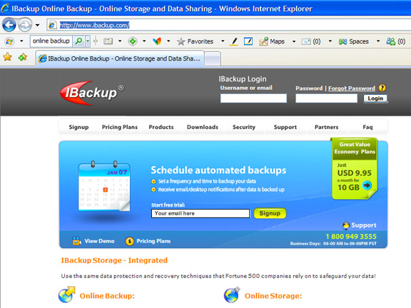
At iBackup.com, I found their site easy to navigate and browse through, and their list of products was fairly extensive and impressive. Geared slightly more toward the business computer user than the individual, they have versions of their backup program for PCs and MACs, and also allow you to map your online account with them as a local drive. Nice. You can also backup your running MS SQL Server Databases by taking advantage of the embedded capabilities in Microsoft SQL Server’s backup and restore functions to provide fast and reliable backup and restore. Sweet. This same company also gives you the capability for accessing your PC from other locations, similar to the “Go To My PC” software that has been available for some time. There appears to be good support for their product right on the site in the way of toll-free numbers, live chat, and report forms. The interface for each of their products looks very familiar and simple for PC/Internet Explorer users, and they have software compatible with several versions of MAC OS. As far as cost is concerned, iBackup offers 10 Gig of space for $9.95 per month, and charges an extra $4.95 per month for the remote PC access feature. I could not find a free trial or demo version of this program, so I cannot comment as to its pros and cons. However, the description that I read about this company and their services online was quite complete and informative.
Evault
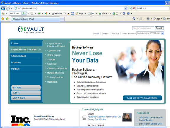
At evault.com, I found a form you can fill in, which gives you access to a Flash presentation which shows you an online demonstration of their product. This particular product seems mostly geared to small businesses and larger corporate businesses and industry. The product demo really went into excruciating detail about how businesses can lose up to 18 billion dollars per year in lost data. Their website notes that their backup system is automatic, easy to use, fast, and secure. They claim that their disk-to-disk backup solution performs fast backups, and is available on broad range of platforms. Evault also has managed service where they handle all the backup operations for you. This backup service seemed to have it all, and even more. However, a drawback to this company that is owned by Seagate, is that nowhere does it mention how much all their services cost! I hunted around and did a heck of a lot of clicking until I figured out that they actually want you to call them and ask! Sorry folks, but if they can’t even publish their pricing, that sends up some red flags! As impressive as their backup system seems to be, if they are reluctant to make their costs apparent, I think I have to give this one a thumbs down!
Carbonite
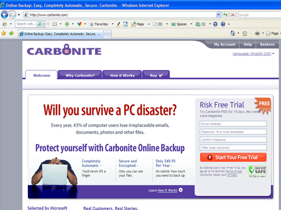
Carbonite.com is perhaps one of the better-known online backup systems, partially because they have radio ads galore, and they are endorsed by notable radio talk show hosts Rush Limbaugh, Kim Komando, and Dr. Laura. This product is geared toward the individual rather than businesses, although I think many businesses could benefit from this service. This company also offers a 15 day “risk free trial” which is an attractive thought for most of us that would like to try out the service before purchasing it. Carbonite is the least expensive of the two services that actually talked about pricing, costing about 50 bucks per year for unlimited storage. This makes it a pretty attractive deal. This service is easy to obtain, and just simply backs up your entire computer’s Documents and Settings folder automatically in the background as you are using your computer. You can add extra files such as program files, system files, temporary files, videos, or individual files greater than 4GB manually. They tout double encryption security for your files as well. Unfortunately, at the moment, Carbonite only is compatible with PCs using Windows XP or Vista. However, they do plan to soon release their MAC version of the program. Carbonite sounds like the most cost-effective and easy-to-use system so far. I am planning to take advantage of their 15 day free trial, and will report my findings in a future review of this and other online data backup services.
Wrapping Up
There are quite a number of electronic data backup services popping up on the Net these days, and with the constant threat of computer viruses, hackers, power surges or outages, and other possible causes of computer data loss, it makes total sense to look into some of these services in order to protect your data, or your company’s data.
Of the bigger, global data service centers, NTT is the safest bet. There just is absolutely nothing worse than losing your hard work, and with the availability of these types of services, you can buy some peace of mind that your data is safe and easily retrievable regardless of what ‘disaster’ might strike your computer!