CSS: Fun With Floating in the Grid
Sometimes for bigger design projects that will need to be pretty flexible, I tend to use several CSS classes to make it easy to maintain from a design and layout perspective in the long run. If you're a fan of grid-like design, this is most certainly things for you to consider.
Flexible Floating
To make it easier to position elements in a design, from actual content areas (like columns and sidebars), to images and boxes, I employ a set of CSS classes that can be mixed together easily enough.
The core of these classes are:
-
.left { float:left; }
-
.right { float:right; }
-
.frame { border: 1px solid #aaa; padding: 5px; }
This means that any element I've given the left class will float to the left. If I add the frame class, it will get a grey 1 pixel border, with some padding between the content and the actual border, to make it look better.
Now, to make sure that images get the necessary spacing to the left or right when being floated, I also add these additional classes:
-
img.left { margin: 0 15px 15px 0; }
-
img.right { margin: 0 0 15px 15px; }
This will make sure that images floated to the left will get a 15 pixel spacing to the wrapping text to the right, and below. The same goes for images floated right, but to the left and below of course.
So how would this work?
-
<img src="myimage.jpg" alt="My image" class="right" />
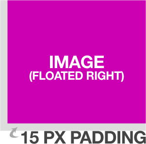
This image will float right, with a suitable spacing to the wrapping text. Well, let's add a border to it to make it look better:
-
<img src="myimage.jpg" alt="My image" class="right frame" />
I just add frame to the class attribute to make this happen, not hard at all. In fact, I have in the explanatory image to the right just here.
The really nifty thing, however, is that I can use the classes left and right anywhere, which can be convenient.
If you're a WordPress theme developer then you might want to add the classes alignright and alignleft to your CSS declarations. These are the default classes used by WordPress' image uploader/inserter, so it might be a good idea to support them.
Practical Layout Uses
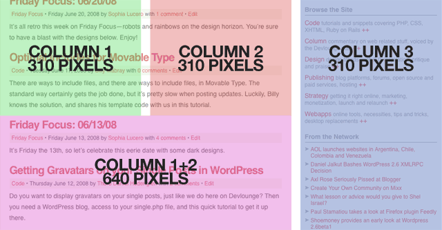
Nothing fancy so far, right? Well, as I said, by doing it this way, I can easily arrange my layout as well. Let's say I have this 970 pixel wide design, following the grid with three columns of 310 pixels each. You might recognize the concept, it's the new Devlounge design. What I do is that I define the column, like this:
-
.column { width: 310px; }
No float or anything. I can also add a wide column, spanning over two columns (310x2=620 pixels), and add the spacing I have between each column in the design, being 20 pixels, bringing it to a total of 640 pixels.
-
.widecolumn { width: 640px; }
So let's have a wide (double) column to the left, and a single column to the right. Simple:
For clarity's sake, here's an overview of the Devlounge layout, with the columns marked:

It can be convenient to keep the float attributes free of the actual content containers. As you remember, the classes left and right are global stuff that I can pull out whenever I want.
The whole current Devlounge design is built like this, using columns and separate classes as much as I could. I could optimize it a lot more (and I am, whenever I have time), but this suited this build.
Do you use this technique, and if not, why not? Share your thoughts in the comments!


Want an avatar? Get a gravatar! • You can link to this comment
This is definitely a great idea. Use this to an extent at present but you’ve displayed it in a much better form. A technique that really helps with layouts.
Want an avatar? Get a gravatar! • You can link to this comment
Shouldn’t the last example html read “widecolumn” and not “column wide”?
Want an avatar? Get a gravatar! • You can link to this comment
Great article! I do use this type of approach but, funny enough, only for bits like blockquotes, images, code blocks, inserts, you know - stuff like that. I have no idea why I haven’t considered using it for the actual layout blocks. It’s so simple and effective. Got me thinkin’
Want an avatar? Get a gravatar! • You can link to this comment
Thanks all.
@hcabbos,
I’ve fixed it now.
Absolutely, my bad, although you might read it as a hint as to make things even more flexible.
Want an avatar? Get a gravatar! • You can link to this comment
Great tip. There might be some that might moan at you calling a class ‘left’ and ‘right’ as this refers to how they look and not what they do. What happens in the next itteration of the design when you decide the stuff on the left should be on the right…
Meanwhile, back in the real world, this is semantic enough for me. “widecolumn left” tells me all I need to know. To be honest, in most design itterations you tend to start afresh anyway so the left/right issue never raises it’s head.
Want an avatar? Get a gravatar! • You can link to this comment
i like it. only problem i run into is that the width of a “frame column” is more than a “column”… not sure how to deal with this without convoluting it. thoughts?
Want an avatar? Get a gravatar! • You can link to this comment
This reminds me the problem I find with grid frameworks (Blueprint, 960gs…), where it is quite easy to layout the website when you don´t use blocks with a border and/or padding, but the problem is when you want to use them and have blocks nested inside.
I don´t know if I explained well, imagine for example two blocks of 6 columns in a layout of 12 columns, the first one has a border and a padding of 15px, you can´t use the framework css definitions for that column, because the total width is bigger now. You could redefine now the css for that kind of column, but if you want to nest columns inside is a mess.
Does anyone have any idea how to resolve this issue?
Want an avatar? Get a gravatar! • You can link to this comment
If you want a border for your column, you’ll have to have additional divs inside it, rather than putting the border on the outside column. This is truly an issue with CSS, and I’m solving it by doing it like that, but I’d love to see a more pretty solution.
In essential, you can’t use the “frame” class for things that needs to be positioned exactly.
Want an avatar? Get a gravatar! • You can link to this comment
I used this technique on Mexico.com with our CMS to allow business users to have some control over the layout of the page with some simple style choices, ie. col_left, col_right, col_full. I found it’s much easier to keep things sane confining this to a 2 column area of the page rather than doing 3 columns like you have above.
I’d love to see other examples of how this technique is used in the real world.
Want an avatar? Get a gravatar! • You can link to this comment
Useful tips, thanks for sharing.
Want an avatar? Get a gravatar! • You can link to this comment
The first time I realized (by accident) that I can combine two styles in one element, my mind was blown apart. And quickly I started using a technique similar to this. Using names like “twothirds column left” or “onethird column right” which pretty much explains itself.