The Next Devlounge Design: Mockup #2
It’s time for another mockup of the next Devlounge, a wee bit later than planned due to me moving house, and everything being as messy as humanly possible of course. Since they’re cutting the power at the office any minute now, I’ll just get this new mockup up there, and let you guys say what you think!
The Second Mockup
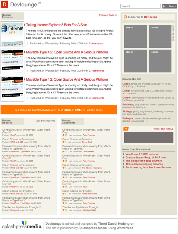
Some notes about the second mockups:
- It’s still the front page.
- I’m not too fond of the three top feature listings, due to dragging too many images around and changing too much. To put a long story short, it should look better than it does…
- Editorial info should be added to the sidebar.
- The footer isn’t done! I just took the one from the next Wisdump for now.
Here we go!

There you have it. Do compare with the previous mockup, which this one is built directly upon. Have I tackled the problems like you wanted? Please let me know what you think in the comments!


Want an avatar? Get a gravatar! • You can link to this comment
I must admit that this design is even better than the other one. Is there any chance you might be able to make the new design for my site, http://crenk.com ??
Want an avatar? Get a gravatar! • You can link to this comment
I have to say this is looking much better. Good job. One thing i think would be a good think to keep is the top navigation you have on the current site. It is simple enough but very effective.
Want an avatar? Get a gravatar! • You can link to this comment
Please, please don’t put the site navigation after the advertising.
Want an avatar? Get a gravatar! • You can link to this comment
Love it very mucho !
You think i can get it and also do some adsense stuff to it etc or different colors
Let me know via email i left you in comments
I would like to have it as test phase on http://www.bontb.com since i am doing an upgrade on theme anyways i might use yours since it’s exactly what i need.
Want an avatar? Get a gravatar! • You can link to this comment
I agree with Will & Brad
Want an avatar? Get a gravatar! • You can link to this comment
Thanks for the comments!
Regarding the site navigation and it being below the ad spot, well, I hear what you’re saying, but at the same time this is a far more active positioning than we got today. Think about it, today you need to click on “articles” and then chose which one to view – by having it in the sidebar we’ll get straight to it instead.
One possible alternative would of course be to have the red menu header yet again.
Want an avatar? Get a gravatar! • You can link to this comment
just my 5 cent: I’d go with the magazine trend-
be unique (as I perceive this place to be for months!).
else your site will just look like many.
you are a legend, because your designs are clean and easy to overview,
don’t sell out like others
Want an avatar? Get a gravatar! • You can link to this comment
A really nice clean design (the best kind whatever the ‘trend’ IMHO).
Regarding the comments made regarding the ‘menu’, I can see that you are trying to minimise the ‘masthead’ vertical footprint. However you have the advertising in the sidebar above the main menu choices and this causes navigation to appear secondary and less important and a little less intuitive. Is the content really less important than advertising?
BTW – it’s my only negative comment – good work!
Want an avatar? Get a gravatar! • You can link to this comment
I have just found Devlounge, I remember seeing it before, but it was a flying visit long ago.
Anyhow, as a fresh reader, I must admit, I love the current style, and the new style isn’t as……OK stop, that is what I was going to write as a comment to mockup #1. But then I remembered seeing this post further up the page, so I copied my current message and hopped to this page.
Right, so to follow onto my last part from mockup #1, this is much better. So much depth, so many places to look. Far different from other blogs, which I like!
So yeah, I love it, that’s not to say I dislike the current theme, but I guess you may be getting bored with it, slightly….
Want an avatar? Get a gravatar! • You can link to this comment
Thanks for the comments, all!
Peter, of course not! While we do need the ad spots to be high on the page (sales will scream if I put them below the fold, and no one’ll be paid…), I am indeed considering moving them down. We’ll see, the good thing about mockups is that there’s lots of room to fiddle around.