Let’s have websites with boxed-in content this week. How were these designed to produce such neatly-arranged yet still visually interesting content?
Designs of the Week
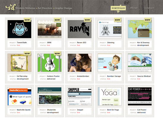
You know how boxy designs tend to feel cold and industrial? It doesn’t feel that way here. Perhaps because of the lighter background, the surrounding typography, and the actual content in this designer’s portfolio.
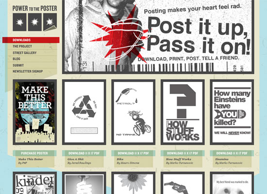
The grungy feel and the bold letters reinforce the activist nature of this website. The heavy borders go well with a lot of their posters, too, as each one is calling your attention to take action.
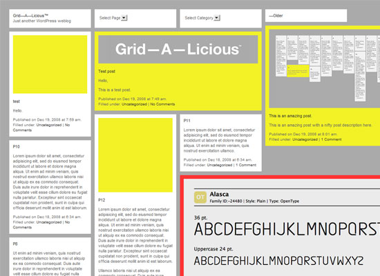
The beauty of this layout is that the content dictates the shape and arrangement of the boxes, instead of shoehorning each item into equal widths and heights. What’s even more interesting is this is a WordPress theme, so if you’re running a WP blog out there you can use this design on it.
Social Media Weekly
Design – 50+ Most Useful Valentine’s Day Designer Resources
It’s just a week away.
Programming – Use CSS Diagnostics with Stylish to find bad HTML
Links to several CSS diagnostic techniques including the Firefox extension Stylish.
Design – 10 things a web designer would never tell you
Tongue in cheek!