Twitter has just turned three but it it’s still the most talked about webapp in ages. That’s because people are constantly coming up with ways to extract, arrange, and present its data. Let’s take a look at some nicely designed 3rd-party websites that harness its power.
Designs of the Week
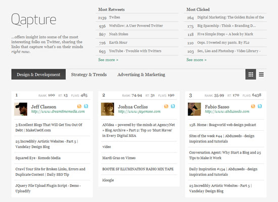
Elegant, clean, and easy to use, despite a relatively large amount of information you’ll find on this site. It’s great that there’s a summary of the most popular items on the page right at the top. Scrolling downwards you can switch between grid and list views—again, to control information overload. Third, I like that the actual titles of the webpages being linked to are displayed instead of the tweets themselves, which show up only when you hover over the links.
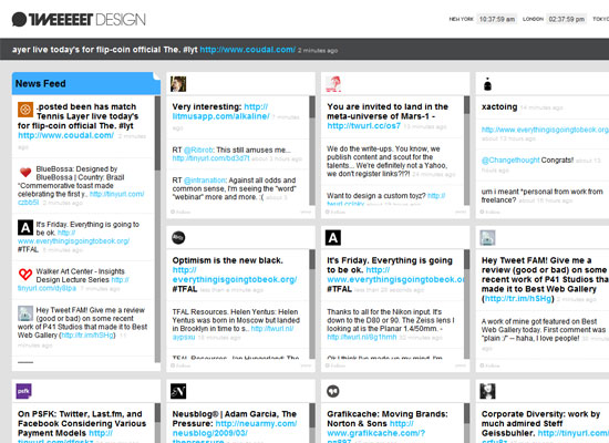
The site’s modern touches match its theme (“design”) but I have several concerns. One, I’m not fond of the marquee scrolling: it’s very choppy and whether it’s a JavaScript effect or an HTML <marquee> tag, it has fallen out of favor a long time ago. Two, the tiny pixel fonts: it would’ve been better if it were used in more elements other than the header and footer. Three, the left-aligned layout: I really don’t see a reason why it can’t be centered.
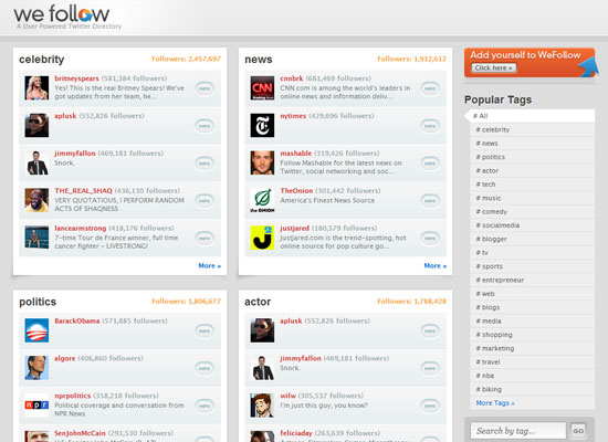
Despite very muted hues, the logo, avatars, and call to action button on the right are colorful and break the monotony. And even though the design elements are clearly Mac-inspired, they’re very subtle and not overpowering. This is a Twitter-related site after all, and not an Apple one.
Which leads me wonder: why are there no bird graphics, gratuitous use of light blue, and cutesy rounded typefaces in the above websites? Have people gotten tired of carrying over Twitter’s branding to their projects?
Social Media Weekly
Design – Designing from the inside out: Part 1 – Content Before Design
Programming – Discover the “Cool” of CSS: 25 Advanced CSS Techniques