Friday Focus 05/29/09: Huge Type
Typography on the Web is growing bigger and bigger—literally! That is this week’s theme on Friday Focus.
Designs of the Week
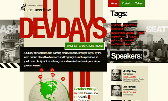
I like the boxy look. Particularly, that there are all these boxes of content in strong contrasting colors all on top of each other on a fixed background. Which happens to be a CSS parallax effect, by the way.
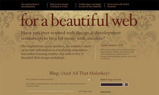
Huge type can be elegant too. It’s interesting how the inner pages of this site are white on dark gray, while the frontpage is brown on light brown (with a bit of maroon in the footer). And CSS text shadows all over!
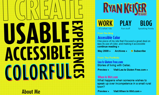
I love how bright and bold this site is, apart from the type treatments. It’s very much a study in the colors C, M, Y, K. And this designers loves colors so much he’s got a daily color inspiration (including a downloadable color palette file) section as footer. Good idea!
Social Media Weekly
Design – When the Design Doesn’t Match the Messaging
Programming – JavaScript Debugging Techniques in IE 6


Want an avatar? Get a gravatar! • You can link to this comment
Ryan Keiser must be colorblind. The yellow text headers (“from the blog” and “from the portfolio”) on cyan background, is a total no-no.
Want an avatar? Get a gravatar! • You can link to this comment
I really like the use of type in these pieces of work, good typography can be the difference between a successful design or a failure. With the choice of a nice font, or manipulated typeface, it can add a different approach, and lessen the need for images.
Want an avatar? Get a gravatar! • You can link to this comment
I seem to be lacking a background image for the nav on the Beautiful Web site. Mine does not show dark, as above, and the nav is quite difficult to read. (Firefox v3) It’s beautiful, but not functional.
Want an avatar? Get a gravatar! • You can link to this comment
Interesting as well how accessibility specialist Roger Johansson switched to larger type and less images. iPhone and mobile web focused design?
Want an avatar? Get a gravatar! • You can link to this comment
These examples are a good argument for large type when done right. I agree though that the yellow and cyan does look a little clashy.