Hope everyone had a great Thanksgiving! Hope you aren’t too stuffed yet, ’cause we have huge backgrounds on this week’s Friday Focus.
Designs of the Week
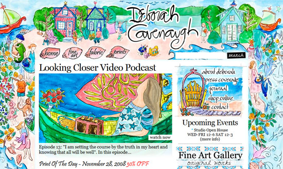
One of the questions that will be asked when dealing with large backgrounds is “how much is too much”? The main content here seems to drown into the illustrations and you have to wonder if this was done on purpose. A lot of other things throw your eyes all over the place. The designer certainly took risks in this instance, and you’ll probably either love it or hate it.
Now for a more realistic look. My only gripe here is that the foreground is almost disconnected from the background, the complete opposite of the previous website. Almost—the designer still made transparent borders to ease the transition.
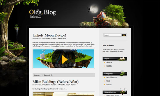
This looks like the best execution so far, but now the design is abstract. Dark, but still striking. The fades and glows reinforce the mysterious, gothic look.

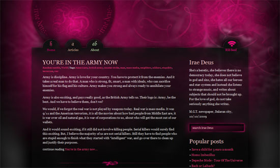
And back to another illustrated look. I’d say this one’s another “just right”. It’s okay for the text boxes to look like they’re floating especially since the background is an aerial view of a community. Makes sense. Rounded corners and outlines add to the relaxed, fun feel.
Social Media Weekly
Programming – 15 Must-Have Bookmarklets For Web Designers And Developers
Programming – Essential free apps for your web design toolkit