Feature
Post

Category
Friday Focus

Friday Focus #29

One more week to go before we hit 30 weeks of Friday excitement. Just to let you know, I’m cutting out one site of the week and my weekly “Top Week Submissions” from Digg for this weeks Focus, because I didn’t have time during the week (see “Slow Month“), and since I didn’t do much browsing around the web this week, I thought it’d be better to leave out entries than try to half-ass them all too quickly. So, most of this weeks focus content comes from Ronalfy, who by the way has multiple posts on the writing block in a series you’re truly going to enjoy (especially you Wordpress fans). Hopefully it’ll start this week.

Sites of the Week

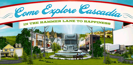
First up this week is Visit Cascadia. A fun but very nicely designed site. I like it a lot, and some great uses of flash here and there really add to it.

VC

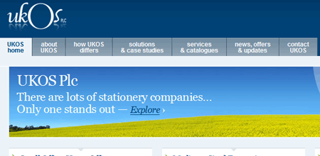
And wrapping it this [short] week is UKOS. I love the tabbed navigation, and even though it’s simply, the layout is very balanced and clean.

UKOS

Digg Weekly

Up and Coming

Design16 Best-Loved Fonts In Web Design
A great collection of the various fonts shown throughout the web.

Software20 Sure-Fire Ways to Come Up With Great Ideas
A great list of how to come up with good ideas.

Design Dilemma

This week’s design dilemma is contributed by Inspiration Bit.
Would you consider using tables for laying out forms and cut the headache with the cross-browser issues, or would you still bang your head trying to get the form to display correctly working with DIVs?

Have your own dilemma? Send Ronald yours and we’ll feature it in the next focus.

WordPress Plugin Spotlight

Simple Yearly Archive Plugin is very similar to the Clean Archives plugin. Both allow you to display your posts categories by year and offer different display options. For a way to show your archives by categories, check out a plugin called Categories and Posts.

  1. By Ranjani posted on May 4, 2007 at 8:29 pm
    Want an avatar? Get a gravatar! • You can link to this comment

    I don’t know, I usually find a way to get my forms to work using divs. I haven’t used tables in a long time, but I still feel that it wouldn’t be appropriate to use them for form fields. Tables, after all should hold data and were not meant to be part of the structure of a design — or that’s what I think.

  2. By Stefan Klose posted on May 5, 2007 at 5:57 am
    Want an avatar? Get a gravatar! • You can link to this comment

    Visit Cascadia breaks one of the don’ts of webdesign: This site is almost about 959 KB (!). Great and innovative Design – but.. thats much too big..

  3. By Ronald Huereca posted on May 5, 2007 at 7:22 pm
    Want an avatar? Get a gravatar! • You can link to this comment

    I, too, do not use tables for forms. Don’t get me wrong. I am extremely tempted every time I have to use forms, but am glad in the long run that I decided to stick with CSS and DIVs.

  4. By Dan Bowling posted on May 6, 2007 at 1:19 pm
    Want an avatar? Get a gravatar! • You can link to this comment

    I agree… tables for tabular data, not design. There are plenty of CSS “frameworks” that you can easily adjust to get a good baseline for your forms without dealing with browser deficiencies yourself.

  5. By inspirationbit posted on May 6, 2007 at 2:50 pm
    Want an avatar? Get a gravatar! • You can link to this comment

    I agree that it’s best to use tables for tabular data only, but sometimes all those CSS “frameworks” to get the forms displaying properly within the given template in any browser become too bulky, and it actually makes sense to use tables instead and save on a headache. I rather use tables and compromise a bit, than use IE hacks and tons of nested DIVs just to get those form elements aligned properly.

  6. By Trevor posted on May 7, 2007 at 7:52 am
    Want an avatar? Get a gravatar! • You can link to this comment

    Instead of using divs for forms, why not use something more semantic? What is a form really except for a list of fields to fill out? Why not use an ordered list, and then have each label and field within a list item? That is how I have been laying forms out, and it is consistent across browsers.

  7. By inspirationbit posted on May 7, 2007 at 9:21 am
    Want an avatar? Get a gravatar! • You can link to this comment

    Trevor, I like the idea of using lists to lay out the form, but would it work to layout a complex form with say 4 columns (two columns with a label and a field in each one)? Any online examples would be appreciated.

  8. By Trevor posted on May 7, 2007 at 6:54 pm
    Want an avatar? Get a gravatar! • You can link to this comment

    inspirationbit,
    Sure you could make it work with 4 columns. Float each list item and give it a width of 50%.

    My contact form is layed out using an ordered list, obviously it’s a simple form but still, it could easily be accomplished.

  9. Trackback