Feature
Post

Category
Friday Focus

Friday Focus #30

Number thirty! Enjoy the weekend everyone.

Sites of the Week

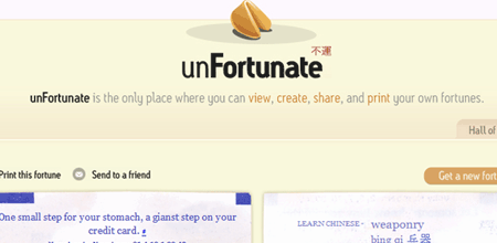
Starting this week off is Unfortunate. This site makes the list because I really like the idea, and I think it’s pretty fun. The site itself isn’t bad either, but I think it’s the originality of the project that gets more vote a bit more.

Unfortunate

Next up is a site for Syntax clothing. If you’ve followed Friday Focus for weeks and weeks on end, you know what I’m a sucker for online store fronts, and Syntax is no different. With a site designed to look likes its inside of a bag, Syntax really looks great.

Syntax Clothing

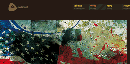
And rounding out this weeks picks is a personal portfolio, with some really cool work. Owlscout is a dark brown design, but I really like a lot of the graphics and illustration found in the portfolio. Give it a look if you get the chance.

Owlscout

Digg Weekly

Favorites from the past 7 days

Design - How to make sexy buttons using css
This tutorial was simple and the results were pretty nice. If you want clean looking buttons, considering trying this css technique.

Programming - Top 5 Javascript Frameworks
The top five javascript frameworks (according to this author), with a brief summary of each ones features.

Up and Coming

Design - How do you write a graphic design brief?
A design brief ensures that you know exactly what you want to achieve from your project and allows a point of reference for designers to focus on.

Programming - The JavaScript Programming Language
Want to learn JavaScript? Here’s five videos to help you out.

Design Dilemma

How do you convince a micro-managing style-challenged client that having a plethora of fonts on business cards, posters, or websites is not only third grade, but that it looks absolutely dreadful?

Have your own dilemma? Send Ronald yours and we’ll feature it in the next focus (with a credit to your site).

WordPress Plugin Spotlight

I didn’t find any plugins this week to spotlight, but there is some cool WordPress news. From Avinash I learned that WordPress 2.2 RC1 has been released. I’ve had the opportunity to tinker with it (to test plugin compatibility) and haven’t found any problems so far. The changes are mostly under the hood. One of the features I really like is a plugin sandbox that makes sure a plugin has no errors before loading it or activating it.

WordPress Plugin Series

I have started a plugin series that is sure to benefit all WordPress users who are interested in getting started with plugin design. Here are the posts so far:

  1. By Tyson Tate posted on May 11, 2007 at 2:24 pm
    Want an avatar? Get a gravatar! • Link to this comment!

    Re: Design Dilemma

    Easy: Take a bag full of major corporation identity packages. Fortune 100, ideally. Business cards, letterheads, shareholder reports, etc. (Even better is to show them materials from the biggest companies in your client’s chosen industry). Ask them how many different typefaces they see in each item.

    Then show them a bag of preschool newsletters, bad restaurant menus, etc. Ask them how many typefaces they see.

    Using 100 little clever and cute fonts that you found on bubbasbigfontlist.com is a sign that you have absolutely no cohesive direction in your identity. (And a sign that you’re only designing for your own cute preferences, rather than the public at large.) Major corporations become major due in no small part to the fact that they have a cohesive identity. Toyota = sleek reliable cars. Ford = tough trucks. Apple = well-designed creative tools. Martha Stewart = good warm country living style. Their identities reflect that. Toyota’s sleek logo and crisp graphic work. Ford’s metal and mud-splattered ads. Apple’s simple and fun ads etc. You get the idea.

    Well-designed — not cute and clever — identity packages make or break a company’s “professional” image.

    Then again, if your client is a daycare or a preschool teacher, maybe cute and clever materials *are* the answer.

  2. By David Airey :: Creative Design :: posted on May 11, 2007 at 2:30 pm
    Want an avatar? Get a gravatar! • Link to this comment!

    The design dilemma is actually a lot easier than above.

    Two steps:

    1/ Take a copy of the Yellow Pages in your stronger hand.

    2/ Beat your client over the head.*

    *I don’t condone violence in any way.

  3. By Ronald Huereca posted on May 11, 2007 at 5:09 pm
    Want an avatar? Get a gravatar! • Link to this comment!

    Tyson, David,

    Thanks for weighing in on the dilemma. It’s useful to show clients bad examples and also to smack them over the head from time to time.

  4. By Stefan Klose posted on May 12, 2007 at 2:39 am
    Want an avatar? Get a gravatar! • Link to this comment!

    I think it’s the most simple way to show them some really bad examples. That dilemma doesn’t exist if you can handle your arguments..

    Don’t like these three sites. First one is too complicated, no way to find what you’re looking for w/o searching. Second one is too crowded, third one too dark, not enough textual content.

  5. By inspirationbit posted on May 12, 2007 at 4:29 pm
    Want an avatar? Get a gravatar! • Link to this comment!

    What if the clients in question have their own samples of sites/cards/posters of their competitors, and those cards do have more than enough number of fonts. And the clients counteract that’s the look they’re going after. How to educate the client in this case? What if the client is very stubborn? Should the designer just step back and give up, or should he continue educating this client?

  6. By Ronald Huereca posted on May 12, 2007 at 6:33 pm
    Want an avatar? Get a gravatar! • Link to this comment!

    inspirationbit,

    In that case, I don’t think it’s a case of educating. It’s a case of giving the client exactly what they asked for and hope it doesn’t come back to bite you when/if you add it to your portfolio.

    One thing possible to try is to make two versions of what they’re asking for. One with the many fonts, and one without. Let them decide for themselves after that.

    This is a touchy subject, because I wouldn’t want a client coming up to me and saying they want a Flash intro (which is obviously a bad idea). I’d rather run and scream and throw myself into a brick wall before implementing a flash intro.

  7. By inspirationbit posted on May 12, 2007 at 10:40 pm
    Want an avatar? Get a gravatar! • Link to this comment!

    That’s a helpful suggestion - to make to versions - the correct one and the client-taste one.

    huh… brick wall - that hurts.

  8. TrackbackDark Theme Release · CSS Style Guides, W3C news and Validation

    Your words are your own, so be nice and helpful if you can. If this is the first time you're posting a comment, it might go into moderation. Don't worry, it's not lost, so there's no need to repost it! We accept clean XHTML in comments, but don't overdo it please.