The first Friday Focus in a while. That’s right, where back in action.
Sites of the Week
Our picks in the week found around the net.
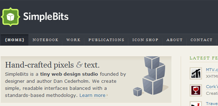
First this week is Simplebits. I’ve always enjoyed SB’s design, and I was very happy with how the redesign turned out. A combination of blue and tan, the layout continues to showcase some great articles while continuing to showcase work as well.
Next is the Sneak Blog. I tend not to be too much of a fan for dark designs, but I found this to be very attractive. The layout is awesome, especially for a personal blog. Worth a look.

Finally there’s Tanya Merone’s portfolio. It’s great to see female designers, because frankly I don’t think you see or hear enough about them. This design is very cool and very neatly organized. The only thing missing is Devlounge under the “Favorite Reads” section. And of course, it’s valid everything.

Digg Weekly
My personal favorites this week in Digg.
Design: Biggest Website Mistakes
A look at some of the biggest web design mistakes according to this author from 1996-2015 (don’t ask me how that’s possible).
Programming: 6 Ways to Make your PHP lightening Fast
A guide to optimizing your php scripts to reduce load times and increase performance.
Tool of the Week
Firebug is our tool of the week. It’s a must have Firefox extension for any serious web developer. Pick it up today.