This week on Friday Focus: designs that tilt to one side and keep the perpendicular lines away.
Designs of the Week

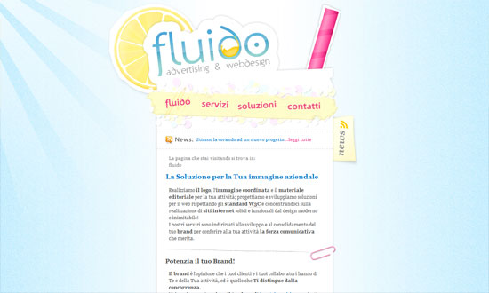
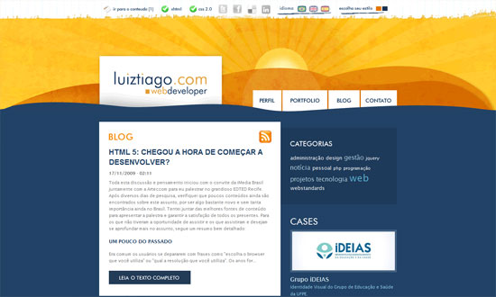
Love the warm hues, transparency, and even the tiny polka dots. Everything blends in nicely.

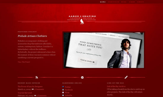
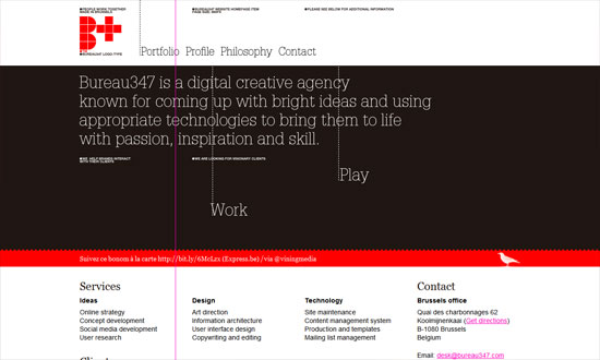
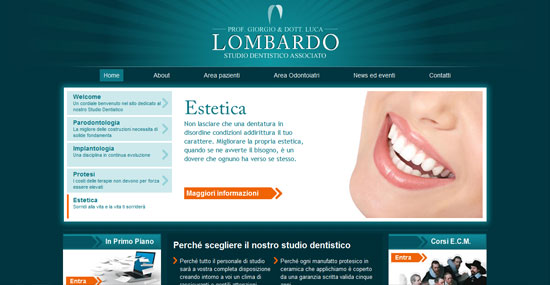
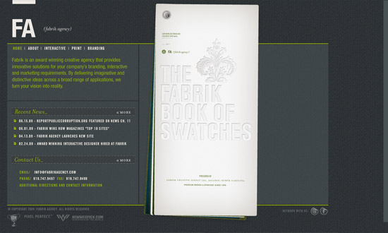
I like how the logo is used as a prominent design element, not just as a header. One thing you will notice with these slanting designs is how they usually mean they’re left-aligned too. More often than not that leaves a lot of whitespace on the right side, which may be a good or bad thing.

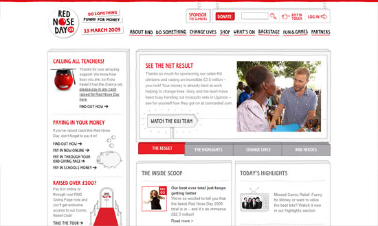
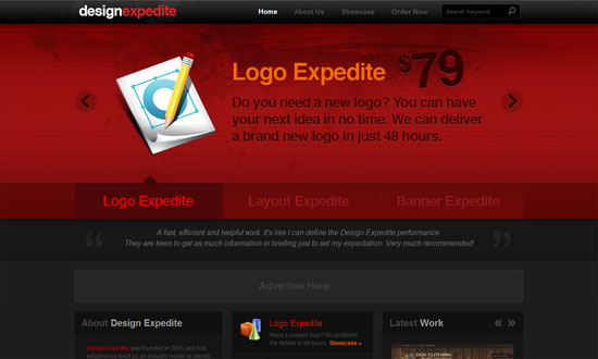
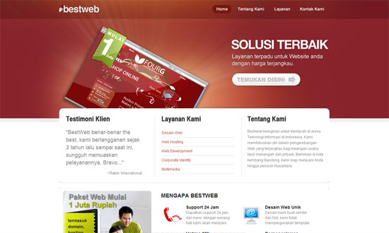
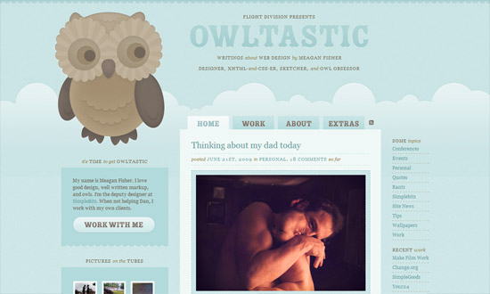
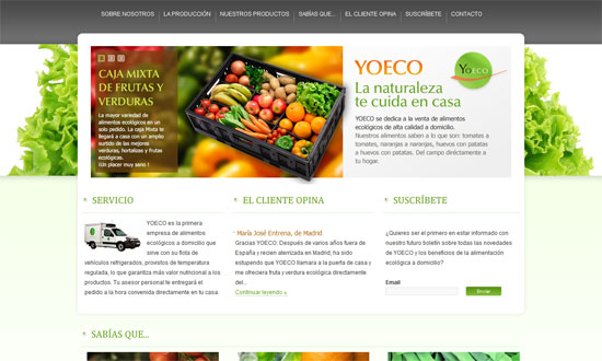
Really simple design, but looks fresh with the bold colors changing in each page and the boxy look.

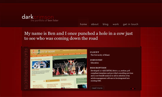
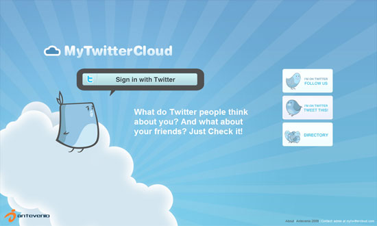
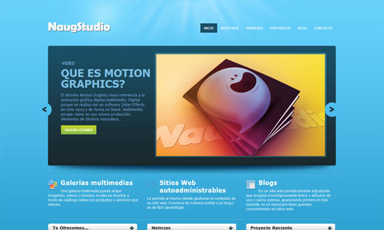
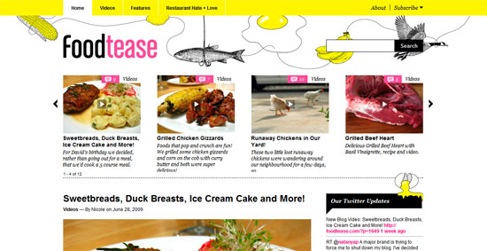
The nice thing about a vertical user-generated gallery is you only have to browse from top to bottom and not from left to right. I really like how the fixed footer has the logo slashed out!

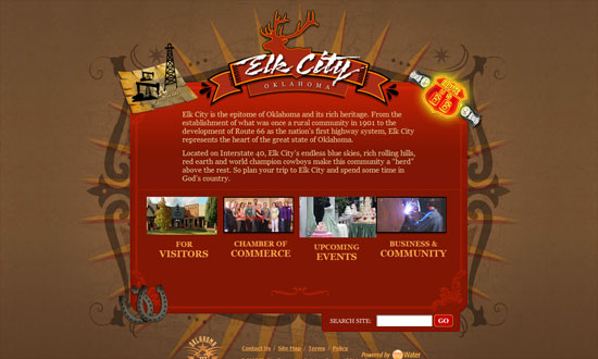
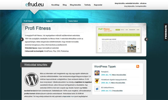
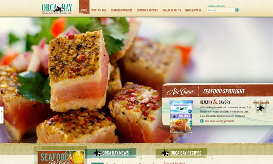
Forget rounded corners, slanting edges is the next big thing! Love the subtle, translucent shapes in the background and behind the content area.

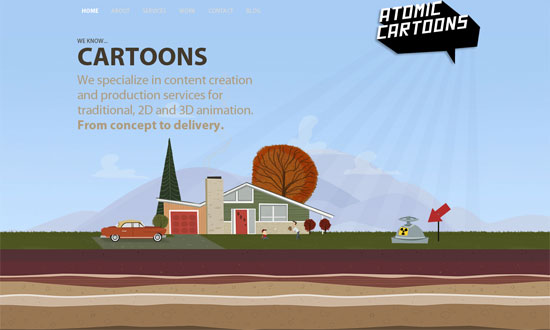
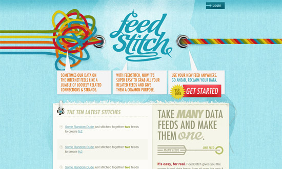
An extremely fun-looking design with not one traditional design pattern in sight! Love how the plus icons turn into arrows.

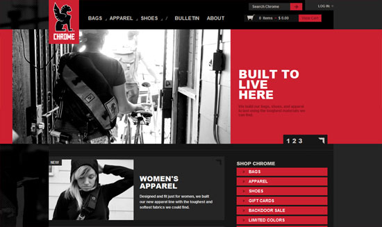
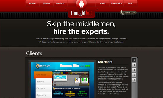
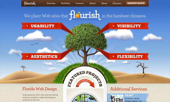
Instead of the usual horizontal lines to separate sections of a one-page site, this design slopes them upward.

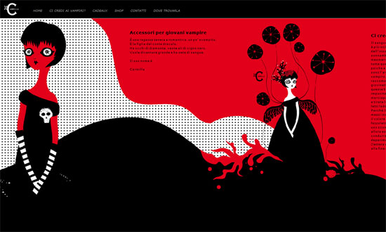
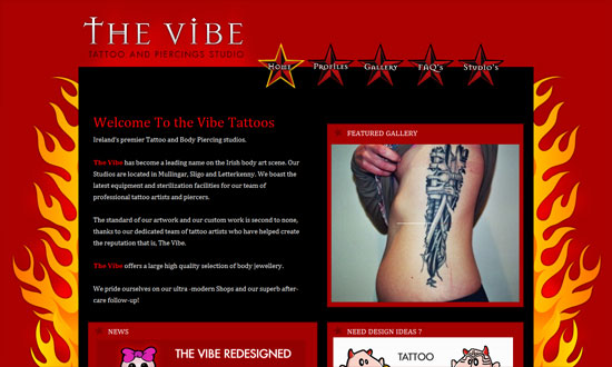
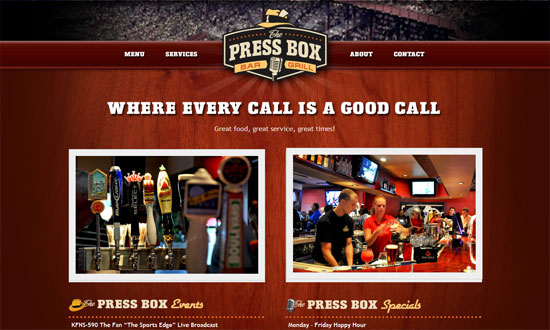
There’s something about slashes and slanted shapes that just fit with designy sites including fashion. Love the hover effect in the inner pages reinforcing this.

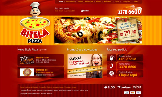
That other trend that’s also getting popular, circles, is in here too, but there’s an animated twist. The rainbow-colored header breaks the gray-filled design.

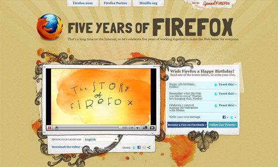
The hand-drawn effect is always a good way to add to slanting lines.

And finally: the easiest, most modern way to implement the slanting look in your design? Use CSS3 transforms!
Social Media Weekly
Design – Holistic Web Browsing: Trends Of The Future
“The future of the Web is everywhere. The future of the Web is not at your desk. It’s not necessarily in your pocket, either. It’s everywhere.”
Design – Designing with Lenses
“A design lens allows you to view the user experience through the eyes of a single design principle. Lenses were originally created for game design but are just as powerful for user experience design.”
HTML – Introduction to HTML 5
“Are you interested in HTML 5 and what’s coming down the pipeline but haven’t had time to read any articles yet?”
JavaScript – RequireJS
“RequireJS can help you manage the script modules, load them in the right order, and make it easy to combine the scripts later via the RequireJS optimization tool without needing to change your markup.”