Feature
Post

Category
Friday Focus

Saturday Slice (FF #24)

What a hectic and empty week! It took a few days to get the WordPress issues sorted out, and during our off days, we really didn’t want to post anything and risk screwing up the database somehow. So, because of this, we missed my promised new article, along with this weeks Friday Focus. So to get back into the swing of things, here is Friday Focus #24, temporarily named the Saturday Slice for this week. Sorry for being late!

Sites of the Week

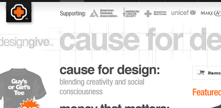
First up this week is Designgive. Similar to Threadless, artists will be able to submit their designs, but with each purchase, up to $3 of the cost will go to the charity of your choice. I urge everyone to submit their designs to benefit some great causes!
Design Give

Next up is Amy and Chris’s journal at Mushytime. I discovered this by accident while browsing a portfolio, and I quite like it.

Mushytime

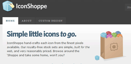
And topping off this Friday Saturday focus, is the recently launched homepage for Dan Cederholm’s (of Simple Bits) icons. The icons are small, affordable, and perfect alternative choices to the frequently over-used Silk icons from famfamfam these days.

Iconshoppe

Digg Weekly

DesignColorjack
A quick and easy way of getting color schemes by using this “color matching sphere”. I first found it a few weeks ago and though it was pretty cool myself, but I still have yet to use it.

Programming15 Javascript Snippets You Couldn’t Live Without
Links to 15 Javascript snippets, from sliding content areas and photo albums to font resize detection.

April Fools?

Don’t forget to check in tomorrow for the official kickoff of our redesign contest! (No Joke!)

Feature
Post

Category
Homepage News

Some Minor Downtime

We’re currently experiencing periods of on and off downtime right now. We’re unsure if it’s hosting related or WordPress related, but we’re looking into everything right now and it should be all fixed shortly. Please bare with us while we try to work this out. In other news, this whole week has been extremely slow, I promise a new article tomorrow, and the digg interview should be out in a few weeks. Thanks for sticking with us. April 1st is almost here :) .

The Devlounge Team

Feature
Post

Category
Friday Focus

Friday Focus #23

Edition number 23 of Friday Focus, a little later than usual, but none the less, here it is. Ronalfy was a bit too busy to contribute to this week’s edition, but if you’re dying for some of his recent writing, be sure to check out his most recent article on Coordinating Clients in a Corporate Environment.

Sites of the Week

First up this week is Chris Shiflett’s site. I love how it’s organized, and silver / orange color scheme as well.

Chris Shiflett

Next up is another personal portfolio site, this time of Jeremy Boles. An alternating gray and black, one page portfolio with that slick bello font. Looks good to me.

Jeremy Boles

And finally wrapping up week 23 is Derek Punsalan’s 5thirtyone. Recently redesigned, this colorless design is still organized extremely well, which is why I like it.

5ThirtyOne

Digg Weekly

Design42 Design blogs and Sites designers and webmasters need to know
Smashing Magazine should really consider renaming themselves Listing Magazine, as here is another lengthy list of top online design / development resources. Of course, we make the list (should be number one though, don’t you think?)

ProgrammingThe Only 10 Things to Know about CSS
I found this article really interesting. Now if I only I get could this guy to join our staff team. Either way, definitely worth a read.

The Refresh 2007 Contest – Spring

As previously mentioned on the homepage, April 1st will launch the beginning of our search for a new look for Devlounge to hit the stage this summer. I’ve been wrapped up with the same color scheme and basic layout for too long, and while I still love the colors, layout, and design as a whole, it may be getting old. To solve the problem, April 1st-15th will mark an open submission period for potential designs for the next version of Devlounge. The winner will score some nice prizes. You’ll be able to find out more of this on April 1st, so be sure to watch out for the official announcement, and start preparing your designs now!

Also note, if you run a startup or you want some exposure, why not contribute a prize to the prize pack for the Refresh contest? Score some free promotion and let people experience your project as well! Drop me a line if you’re interested.

Where’s the chatter?

Comments have seeming dropped off even more considerably lately (I didn’t know that was possible). Besides that damn Myspace music hack article, things have been mum around here! Please feel free to leave your responses to the articles you read, we love hearing from you! (That includes you you feed-reading-hiding-subscribers! ;) )

Announcement: Cracking the 1K Mark

Another somewhat important announcement, at least to us here on the team, is that we have finally cracked the 1K subscriber count on Feedburner. We still have a while to go until we catch Vitamin or Techcrunch (yeah, because that’s possible), but hopefully we’ll continue to make progress. Thanks to all our readers!

Feature
Post

Category
General

Today’s Friday Focus

Today’s Friday Focus is coming, just a little later than usual. CSSMania, the site I generally pick the weeks 3 top designs from has been down this afternoon. Hopefully, they’ll get back up before I head out for the night. But it is coming, even if it has to come out early tomorrow morning. Sorry about this.

Feature
Post

Category
Homepage News

Here it is: The Redesign Contest

Calling all designers! My time trying to figure out what the best contest for April would be has finally come to an end. I think this contest will be functional for everyone involved. You, the designer, get to have fun and show us your own vision of the next look for Devlounge. You also get the chance to win some sick prizes, most notably a Microsoft Zune, and fame forever here at Devlounge.

The Situation

Originally, I had planned to temporarily redesign Devlounge for the month of April as part of our month long celebration of turning “one” (years old that is). Than I started playing around with things and thought about doing another refresh / realignment for release in late May. But now, a lot of people are pointing out that they’d really like to see an entirely new, fresh look for Devlounge, and for us to break away from the main look that has made DL what it is so far.

Knowing well that I needed an idea for a contest for April, it dawned on me. Why not let the community that turns to Devlounge put together their own mockups of what they envision the next version of Devlounge to look like? This would kill two birds with one stone, giving me fresh ideas and something to work off of, and creating a much more exciting contest for participants.

So, here’s your early warning. The contest will officially kick off on April 1st (with an official post regarding the contest, rules, judging, and application form) and run through April 15th, so start getting together your mockups now!

Feature
Post

Category
General

Google Personalized Homepage Now Has Themes

The Google Personalized Homepage is a great tool for adding feeds and also showing the latest posts from Google Reader and Google Mail.

I noticed today that you can now select certain themes for your Personalized Homepage. Most of the themes I tried actually update themselves to local weather conditions. I hope Google allows users to submit their own themes soon.

Google Themes

Feature
Post

Category
Strategy

Ten Tips for Coordinating Clients in a Corporate Environment

Whether you’ve been put in charge of your corporate website, or you’re a freelancer who’s been hired on, designing a website for a corporation is never routine. There are turf wars, inner-departmental battles, upper management issues, and precedent that you must deal with.

Typically with freelancer jobs, there is only one client. However, in a corporation, there are many clients that you will have to deal with. These clients could be head of certain departments, divisions, or offices.

Listed below are ten short tips for coordinating clients in a corporate environment. These tips are listed in no particular order.

Establish Authority

Sometimes you will have to remind the clients that there is a reason that you are the web developer and they are not. There are times you will have to deal with a client that might actually know something about web development and questions you on a particular design decision. During these intense moments, it is crucial to listen and state your logical reasoning behind making a design decision.

The problem with dealing with multiple clients is that each one has a different idea of how a website should behave. You need to be empowered to make the final decision, however. Design by committee is never a good thing. Establish your authority to make the design decisions and make sure the upper management will back you when your client screams that web sites should never scroll.

Get Upper Management Cover

When you inevitably step on someone’s toes, it is important that the upper management has your back if a client strongly disagrees. One of your first jobs is to assure the upper management that you are the expert in web development. If a client then starts a fire, the upper management will be able to quickly put it out.

Get to Know Your Clients

In any working environment, it’s extremely helpful and beneficial to get to know people outside of work. Go out to lunch with your clients. Get to know them. If you start to get to know them on a personal level, the clients will be more willing to help you do your job.

Establish a Style Guide

Establishing a style guide is crucial. Style guides not only define the look and feel of the site, but also the behavior. A style guide will also force you as a designer to think through your decisions from beginning to end. The corporation may already have some kind of style guide. If that is the case, use that guide as a foundation for yours. The web style guide should be different, but do not venture too far away from the corporate style guide if there is one.

An example of a good style guide is A List Apart’s style guide.

How you do your style guide is up to you. If the style guide has upper management approval, you’ll have a standard to fall back on when someone disagrees with a certain part of the design.

Establish Single Points of Contact

When dealing with departments or divisions, it is absolutely critical that there is a single point of contact for each one. If you don’t have a single point of contact, then there will be nothing to stop dozens of different people from contacting you and flooding you with content changes, design “suggestions”, and the like.

Get the Clients Involved

Allow the clients to see your progress. It’s one thing to constantly ask the client for information and the client has no idea why he/she is doing the extra work. It’s another to show the client the work you are doing so that the client knows what the end result will be. It’s an extra way to show that the client’s feedback and contributions matter.

Get the Right Tools

Make sure you communicate to your upper management the tools you need. If the corporation does their own hosting, make sure you have the privileges to build the website. If the corporation needs to make a hardware/software purchase, make it very clear that without these tools, you will not be able to do your job. The point here is to get what you need up front.

Know the Key Players

Get to know the names and locations of all of the key players in the corporation. These key players will be upper management, the database administrators, the IT people, and the department heads. These key players can either make your job easier, or make it a living hell. Make sure each of these key players knows why you are there and what job you are trying to accomplish.

Educate Your Clients/Upper Management

While it is important to not overwhelm your clients with techno-speak, it is also important to educate them as to the benefit of the latest design techniques such as web standards. Since most of the clients won’t know the difference between MS Outlook and Web 2.0, educating your clients is more of a “show and tell” type thing. Show your clients why you are doing things rather than telling them about it.

Educate Yourself

The last tip doesn’t necessarily have to deal with coordinating clients, but it is important to stay on top of your industry. If you are a freelancer, make sure you take the time to learn new skills. If you are a corporate employee doing webmaster duties, try to convince the upper management of the importance of giving you time to learn new skills (such as training and seminars).

Conclusion

I hope you found these tips helpful. If you have your own tips for working within corporate environments, please share them in the comments.

Thank you for reading.

Feature
Post

Category
General

RAW 2007

Ronald is part of a project called Reading Appreciation Week, or RAW, scheduled to go on during April 9th through 13th. As it falls on our month long “celebration” of sorts of all things Devlounge, we here are gladly participating. The week is all about rewarding your dedicated readers that help make a site what it is. We hope as many people as possible will get involved.

Please have a look at the special Reading Appreciation Week website for more information on the project.

Feature
Post

Category
Strategy

Listen to your visitors

As a resource that brings you articles, tips, and suggestions of what to do and what not to do, you would expect us to be on the top of our game since we put ourselves in the position to be giving you advice. Yet, that’s not always true.

It wasn’t until a few days ago when a kind reader pointed out to me a brutal mistake on my end, especially considering the type of site I’m running here. I had been using javascript to show and hide the search bar for months, and more recently, I applied the same effect to the subpage bar for our extras. The issue, was that without javascript enabled, a big portion of functionality was being lost, and so were a few extra pages.

How could we falter in such an important area? Forgetfulness, laziness, lack of (or too much) alcohol in the system – who knows really? It was a simple mistake that could have caused big problems, and because it was overlooked for so long, it went unnoticed until someone else was able to point it out.

But it is not just about who to thank, but the path taken afterwards. There were two routes I could have taken after being informed about this bug. Sit here and do nothing, like I had for the first few months, because it was an isolated issue, and because really, why would anyone have javascript disabled? The other route I could take was to look into it and get it fixed quickly, to show readers that, hey, I am actually listening to what you’re saying.

Lucky for me (and you without javascript), I took the second route. Thankfully, this reader had even been kind enough to point me to an article that mentioned an alternative method, so we could continue to show the same show/hide effect for people with JS, and just show them the search if they were without it.

The Customer is Always Right

Just like when your at the market and you see that tantalizing candy bar and you peel off a .99 cent sticker from another item and smack it on the candy bar, then proceed to bring it to the cashier and say that was the price advertised, you walk out with a candy bar and a couple extra cents.

Alright, maybe not.

But that “customer is always right” theory applies to your site(s) as well. When someone makes a suggestion or comment, whether it be bad or good, it’s important to look into it. Even if it’s a meager percentage of people complaining about something, or wanting something changed, it’s better to be safe than sorry.

A lot of times, you’ll find yourself making stupid mistakes, whether it be typos, design errors, and a host of other things, and you won’t even notice, because it takes someone else’s eyes to notice the problem. But yet, when someone does report something, you can annoyed. I know, especially in the early going of Devlounge, I would get extremely angry when people would point out multiple spelling errors in each of my articles. While it may have angered me, I made the fixes, and it turn it helped me be a lot more careful when typing, which has brought my countless mistakes down a hell of a lot.

Always remember, visitors know more than you. It’s vital to listen to their thoughts, comments, bug reports, typo reports, and general feedback and do something about it! You may the boss, but that doesn’t mean you’re the best.

Feature
Post

Category
Interviews

Rina Miele

In this interview I go one-on-one with a designer I worked with a few years ago, before I was any good at design at all. Rina Miele of Honey Design stops by to talk design with me.

Devlounge: Hello Rina – thanks for giving up some time to answer some questions for us and let us dig deeper into the mind of an extremely talented designer. Care to introduce yourself and give some background information for our readers?

Rina Miele

Rina Miele: Hey all. WHATUP? I’m Rina, and I am 25 and live in Sleepy Hollow, (yes, it’s a real place) New York and I make designs and it’s fun and I’ve been doing it practically my entire life and I like colors and when I grow up I wanna be a supermodel and music is awesome and I love watching anything in HD and I love video games, vinyl toys and Lego™ and this sentence is ridiculous.

DL: How did you first get into design, and is it more of a hobby or full time job?

RM: Growing up. My father is a designer and I remember when the industry started to use computers. One day he just went out and bought a Mac — the Mac IIsi. Ah, what a classic: 20MHz, 1MB of RAM (yes, megabyte). I was fascinated by that thing. I even loved just playing with the screensaver for like 3 hours. But he had Photoshop… version 2.5 or something. All I know is that you basically were able to paint and there were no layers. That was tough! But that’s what I remember. I made designs on the computer from then on. What was that, like, 1990? It was cool, seeing the application developing and growing with it. I was always an “artsy” kid, but I didn’t really think much about “designing” as a career until high school was ending. It wasn’t anything monumental though. It sort of just happened because I could do it. So I went off to college, got some jobs, and here I am.

Rina Miele - Work 1

Design is a full time lifestyle though. That sort of sounds clichéd, but it’s true. I walk into a grocery store and notice every little thing, down to the labels on the anchovies. I’ve always been conscious of things around me. It’s a discerning quality I think many designers develop. It’s like an advanced form or curiosity, really. You just want to see what else is out there. I think in this way I’m fortunate to be able to work in this field, it surrounds us.

“Keep those business cards and use them, don’t just consider them decoration.”

DL: You have worked with some extremely influential brands in Pop Culture – VH1, the NBA, Allure Magazine, and Atlantic Records just to name a few. What does it mean to be hired by companies like these out of all the designers in the world, and have you had fun with these projects?

RM: All the work I’ve been doing lately has been really great. Anything in the entertainment field generally gives you a ton creative freedom. You always have to do something fresh/crazy/stimulating/new/innovative. I love that.

I’ve worked with a bunch of agencies on most of my projects rather than with the clients directly. I try my best to stay in contact with the people I meet. Anyone can tell you how hard that is if you’re busy 24/7 – but like I said, I do my best. It’s a small world, you’d be surprised who you run in to down the line and what roles they play in shaping your career. Keep those business cards and use them, don’t just consider them decoration.

Rina Miele - Work 3

DL: Do you have a specific area of work you like doing the most (Web, Print, ID, etc)?

RM: Hmm… Well, I’ve been doing 90% web for the last few years, and that’s been great, I love it. Though, I do have to say I miss print. I miss the tactile quality about it. I like making “things” – especially packages and all things 3D. It’s funny because I didn’t make a conscious decision to become a web designer. It just worked out that way. But yea, 3D/packaging is hot. That’s my answer and I’m sticking to it.

Rina Miele - Work 2

DL: Working in a field overcrowded with male designers, what does your own success story say about the role women can play in design / development?

RM: Girls rule, and boys drool. I’m kidding. Honestly, gender hasn’t been a factor I’ve ever considered. Sure, if you break it down it seems there are more males in the industry. But I’ve always been concerned with being a good designer. Period. I never gave much thought about being a good “female designer.”

DL: Where did the idea for the name “Honey Design” come from?

RM: My last name is Miele – it means honey in Italian. I wanted to create a pseudonym/alias for myself. I started asking questions like, “Who am I? What do I want? Where am I going?” Then I decided to keep things simpler. I looked to my name… realized how dope it is that it translated to “honey” and then sort of went from there. I’d love to say there’s a deeper meaning to it, something inspiring, but it was as easy as 1, 2, 3. The logo on the other hand wasn’t as easy… but that’s something else altogether!

DL: What do you like to do in your spare time when you’re not busy designing?

RM: I answered a little bit of this in Question #1. Other than what I mentioned I try to just sit back, relax and do nothing and/or sleep. We forget to do that sometimes. That’s really important. I can’t stress that enough. I have to start practicing what I preach though…

DL: Where do you get most of your inspiration from?

RM: Mostly from other artists – designers, illustrators, photographers, writers, etc. But I do take cues from other things like toys and games and such… but then again, didn’t an artist create those things too?

My inspiration for this week was a book I bought called “The Acme Novelty Library: #17” by Chris Ware. Check it out!

Thank you all for reading and thanks to Devlounge for setting this up.

Feature
Post

Category
Publishing

WebEdit Professional

Every designer/developer at one point needs to think of a system to manage their content. Content management systems (CMS) have literally changed the way designers design. With most content management system requiring themes, designers have to design immense flexibility into a layout.

What makes content management systems so powerful is their extendability. Platforms that can be used as a CMS (such as WordPress and Drupal) have a strong community following and have made almost anything possible with the platforms as far as managing content goes.

One of the benefits of good content management system is the ability for non-techies to update websites. In an ideal corporate environment, every department would be in charge of updating their web content. Unfortunately, this is not always the case and the work usually gets piled onto a webmaster figure. WebEdit Professional tries to make it easier for website collaboration on a large scale. The rest of this article is dedicated to a review of WebEdit Professional and explains the strengths and weaknesses of the application. One thing to note is that for this review, I only had access to their online demo, which means I wasn’t able to try out their install or theme creation process.

What is WebEdit Professional?

WebEdit Professional is geared towards designers/developers who want to allow the clients to update a website themselves. WebEdit allows clients to edit specific sections of a site with a very robost WYSIWYG editor (clients can also edit the raw HTML if desired). Clients are able to create and modify new files and upload images and other objects without the need for an FTP client.

The File Manager

WebEdit Professional File Manager

After logging in to the CMS, you are taken to a file manager. The file manager is nothing special, but it does the job. I’m personally not fond of the approach of the file manager because it requires the end user to have a vague familiarity with a file system and the site’s structure. If you’ve ever been in a corporate environment, there are still some people that raise an eyebrow when you tell them to save an item to the desktop.

Adding a File

Upload or Add Pages

The CMS allows you to upload a file or start a new page. However, my attempt to upload a file resulted in an error, “A File Name MUST contain a valid extension.” This begs the question of, “What is a valid extension for a file?” For those wondering, I attempted to upload a CSS file.

Defeated in my effort to upload a stylesheet, I decided to create a new page.

WebEdit - Creating a New Page

When creating a new page, you are taken to a new screen that allows you to select a theme and specify the file’s name.

One thing to remember here is that this CMS is supposed to be geared towards the non-tech savvy people. Is having to select a page theme and typing out a full file name intuitive for a non-techie? I leave that answer open for debate.

Upon creating my new file, I was taken back to the file manager. I would have liked to have been taken straight to the editor rather than having to search for my newly created file.

The WYSIWYG Editor

Central to any CMS is the WYSIWYG editor. In my opinion, this is the make-or-break for any CMS. I have to admit that I was fairly impressed with the CMS until I noticed a few things that I simply could not overlook.

WebEdit - Firefox Restrictions

The first odd thing I noticed was this little message at the bottom of the WYSIWYG that said, “FireFox Restrictions.” The popup window that came up after I clicked on the message explained to me about typing in about:config and finding some value and changing it so that the WYSIWYG would work fully. This restriction only affects the Copy, Cut, and Paste portions of the WYSIWYG and does not disable the standard Windows keyboard shortcuts.

WebEdit - Text Overlap

The WYSIWYG is very well done, but there are some issues. After adding in a “text box” and typing some text, some weird overlap occurred. I went to view the source code and was stung by the bitter aroma of tag soup.

WebEdit - Source Code

After seeing this mess, I tried adding in my own doctype and formatting the HTML so the code would actually validate. The CMS actually reversed all of the changes I made that were not inside the BODY tag. The WebEdit Pro website says that the CMS is XHTML compatible. I would love to see a working example.

One other thing that threw me for a loop was the ability to add form elements in a page. I’m really scratching my head on this one and perhaps I’m missing something, but if someone includes a form on a page, someone else is going to have to write the back-end to handle that form (and then there’s form validation). Below is a screenshot of the full WYSIWYG with one form element on the page. For more screenshots of the WYSIWYG, WebEdit has several screenshots available.

WebEdit - WYSIWYG Editor

Targeted Editing – Restricted Templates

One last feature of the CMS I will mention is the ability to select which portions of a theme are editable by the end user.

WebEdit - Restricted Templates

The areas in blue are the only areas allowed to be edited by the end user. As cool as this feature is, there is one serious flaw in the technique. The same problem that popped up with the WYSIWYG and the “FireFox Restrictions” is a little more prevalent. Until the end user performs all the steps to resolve this restriction, the restricted template is truly restricted. I suppose the end user better use Internet Explorer.

Conclusion

WebEdit Professional is a decent CMS. However, I am reluctant to recommend it because I don’t think its easy to use and the browser limitations are just silly.

I can definitely see why some designers would want something like this so that they can rebrand the CMS and sell it (with a nice profit) to their clients. However, I’m not entirely sure the price tag ($179) is worth the price of this CMS when there are several open source alternatives (including Drupal) that seem to have similar (if not better) functionally and ease-of-use. Drupal, for example, is extendable via plugins while WebEdit is not.

WebEdit has a very well done WYSIWYG, but the non-standard code, browser limitations, and usability issues drag it down. WebEdit is a good CMS for those that need a CMS not requiring a database, but for the price and the features, I would recommend seeking an alternative.

The review you just read was a paid review for WebEdit Professional. This is my first paid review I have attempted and am open to any feedback (positive or negative). Thank you. – Ronald

Feature
Post

Category
Friday Focus

Friday Focus #22

Here we are with week 22 of Friday Focus. I apologize for the incredibly slow article week this week, state testing really wore me down for being in the writing mood, and some above-average temperatures for this time of year drove me outside when I was home school. Without any more delay, here’s this weeks Friday Focus.

Sites of the Week

Rejected Robot starts off this weeks favorite three according to AJ. This fun portfolio plays off the idea of a box for a robot, with 3 pages: Front, Pieces, and Back of Box.

RejectedRobot

Critbuns, the second of this weeks top three, features a bulletin board style design that I really like. Like grays with pink accents also work very well in this case.

Cirtbuns FF

And finally rounding out this week is Electricpulp. While the layout might be pretty standard, the background illustration really help distinguish it from the “layered” look many designs have taken on these days.

Electricpulp

Digg Weekly

Design25 Code Snippers for Web Designers (Part 1)
25 services and bits of code that can help make your life easier and save you a nice amount of time.

ProgrammingWhy HTML renders different in different browsers
A thorough article from this authors point of view on why html with render different in every browser. This is why cross-browser compatibility is so important people!

Here are a few more Digg links that are up-and-coming.

DesignFailed vs. Unfailed redesigns of newspaper websites
This article analyzes the redesigns of two newspaper sites.

ProgrammingWordPress Launches “Offical” Plugin Directory
Finally there is a good attempt by WordPress to have a one-stop-shop for WordPress plugins.

Design Dilemma

The purpose of Design Dilemma is to post one dilemma a week and allow the readers to voice their suggestions and/or opinions. If you have your own dilemma, please send me yours at ronalfy+devlounge@gmail.com.

You’re about to go over a design concept with a client when the client stops you mid-sentence and says, “I already have a design in mind.” The client then proceeds to show you a design template from one of those template sites. You want to make the client happy, but at the same time, you don’t want to put your name on someone else’s design. Furthermore, you’re conflicted whether you can still call yourself a designer after using someone else’s template. Any thoughts?

WordPress Plugin Spotlight

One plugin that caught my attention this week was one called Expand Comments (Thanks Bes). The plugin loads comments on your main page via AJAX. The plugin also allows you to submit a comment on the main page as well. I never could get the AJAX comment submission to work in Internet Explorer, however. This plugin seems ideal for blogs that don’t have a lot of comments.

Is Your Website Afraid of the Nude?

April 5th is coming up fast. What is April 5th, you ask? April 5th will be the second annual Naked Web Day (as started by Dustin Diaz). Naked Web Day is an opportunity to show an appreciation for Web Standards, semantic markup, and good code hierarchy. If your site doesn’t look good naked, perhaps it needs a good workout by April 5th.