Feature
Post

Category
Friday Focus

Friday Focus 10/30/09: Orange for Halloween

We have some pumpkin-colored sites this week on Friday Focus, just in time for All Hallows’ Eve. Enjoy!

Designs of the Week

Joshua Giblette

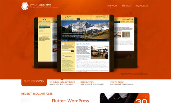
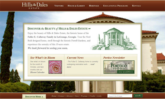
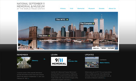
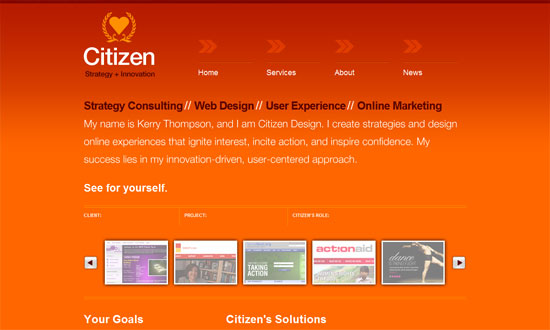
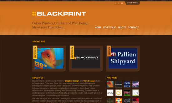
The top half is all about the work, while the bottom half contains supporting information from other sections of the site.

Daddy Design

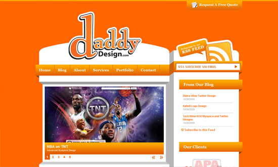
I never tire of this blocky, 3-dimensional style. The “request a free quote” tab at the top is a nice touch.

Senso Studios

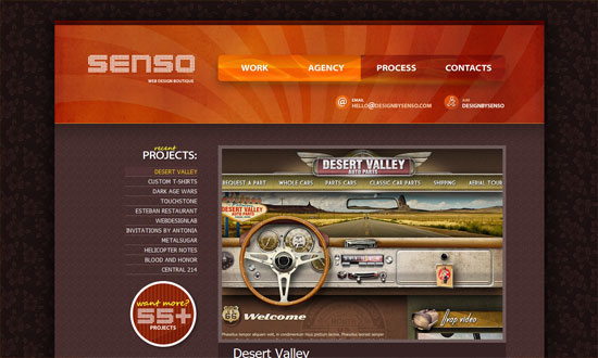
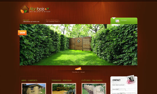
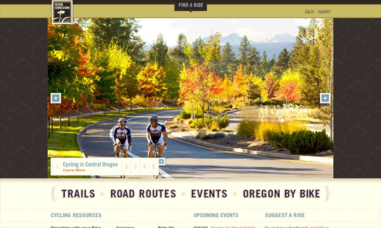
I love the navigation buttons in the header. The dark flowery wallpaper background is a bit weird though. But overall, I like the ample use of textures here.

Think. Do. Create.

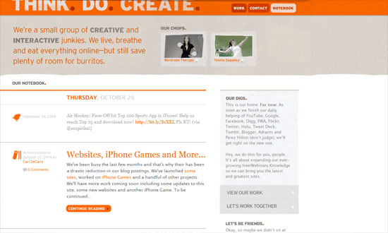
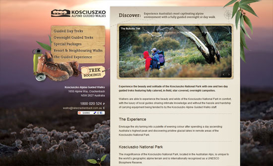
Clean and light with just a touch of grungy textures. Lovely.

Citizen Design

The use of hovers to switch between different chunks of text in the portfolio carousel was confusing at first, but it’s all good.

Joe Nyaggah

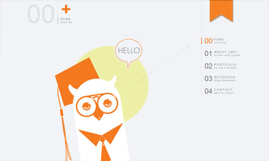
I enjoyed this website. Modern and airy with a touch of warmth thanks to the orange and the owl. The text only needs to be a notch larger.

Open Video Alliance

I really like this color scheme! Plus the whole translucent and outlined graphics.

Camera Civile Como

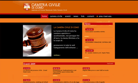
Orange, red, and black—I don’t think there’s any stronger color combination than that! Since it looks like this is a legal site, it’s great that the designers made sure the text is easy to read.

Blackprint

The best part of this site is that you can actually rate each item in the portfolio. Then in the client panel at the top, they’ve got the top rated designs and some great articles for resources.

Social Media Weekly

DesignHappy Haunting: Halloween Hits On the Web of Design

Icons200+ Truly Useful Free Halloween Icons for Everyone

ThemesTop 10 Free Halloween WordPress Themes

Feature
Post

Category
Design

Five Scary Fonts for Halloween

It’s just a few days to Halloween, and since it’s free font time again, I’ve picked out five fonts for you that are scary (and I don’t mean Comic Sans). Perfect for designing your Halloween party menus, printing on treat bags- maybe even using as your blog header, if you really want to get in spirit:

Burning Wrath

burning-wrath

World of Warcraft fans will probably recognize this font, which is similar to the one in the logo of “The Burning Crusade / Lich King”. I don’t play WOW, but I do love this font- especially its name. Feel my wrath burn!

Bloody

bloody

What would Halloween be without a font that bleeds? There are a lot out there, true, but my top pick has to be one named, aptly, Bloody. It’s clean, yet… well, it drips blood.

Daemonesque

daemonesque

Looking for something a little less obvious? The beautifully rendered Daemonesque is formal and deceptively classical: look closely to see the little skulls in the letters. Lovely.

Yataghan

yataghan

This one’s Vampire-inspired, which explains its sexy, sharp edges. A good font to have, especially if you have a Twilight-obsessed teen daughter.

Frankendork

frankendork

A nice tall font with great letter-spacing and just the right amount of “shakiness”. Particularly good for headlines.

Do you use scary fonts?

Feature
Post

Category
Code

Three Rocking WordPress Plug-ins for Developers

If you’re a developer that blogs (and you should) or one that develops websites powered by WordPress, chances are you already know about my top three favorite plug-ins. Yes, these are the ones I can’t imagine life without:

ExecPHP

One of my default plug-in installs, ExecPHP allows you to, yes, “execute” PHP from within WordPress. That means that chunks of PHP code will work in your pages, posts and widgets- not just in your templates. I previously used runPHP, but switched after running into some problems with the latter- and I’m glad I did. This one just works for me.

Preserve Code Formatting

Developers know how important it is that the formatting of our code isn’t trifled with. This lovely plug-in makes it so WordPress (or other plug-ins you’ve got installed) can’t modify your code, while retaining your original whitespace and characters. Simply use <pre> and <code> and the plug-in will take care of the rest.

SQL Executioner

A gem of a plug-in that allows you to access your MySQL database from within WordPress- that’s right, without having to fire up phpMyAdmin. Among other things, it performs “select”s and “describe”s, and modifies with “insert”s and “update”s.

What are your favorite WordPress plug-ins?

Feature
Post

Category
Friday Focus

Friday Focus 10/23/09: Enjoy the View

This week on Friday Focus: websites that will make you want to get in the car or on a plane and head to these exquisite destinations. At least we can enjoy their views from within our own browsers!

Designs of the Week

Hills and Dales Estate

I really like are the way the popup menus are designed. Even better is the way the background images load first, and then the content area fades into view.

Abribois

Great lighting in the header, and the way the color of the wood background makes the photos pop.

Kosciuszko Alpine Guided Walks

You don’t have to pepper your site with concrete representations of what your site is all about, and this is a good example of that. Makes for an elegant yet still outdoorsy look.

Utah.travel

I’m not sure exactly why you’d use a strap in such a prominent place such a header but it certainly looks different. Love the interactivity of the menus on the left. Another brilliant feature: the execution of the map menu on the right side.

Ride Oregon

Huge photos. Excellent typography. I’m just not sure about the wallpaper background.

National September 11 Memorial & Museum

Clean and modern. The labels on the photo itself are a great and necessary touch.

Jefferson County, Tennessee

This design reminds me of Obama’s online branding, and it looks so elegant. This isn’t even a travel destination site, but it definitely makes you want to go there.

Walden's Ridge

I like the textured background in the logo, and the way the photos fade at the edges.

Social Media Weekly

Design404 Error Page – Don’t Get the Page Itself to Be Even a Bigger Error

ProgrammingHTML, CSS, and Web Development Practices: Past, Present, and Future

Feature
Post

Category
Design

Four Free Photo Editors for OSX

As I’ve mentioned here before, I use Bootcamp to be able to run both OSX and Windows on my machine- but I do most of my work on OSX, and use Windows strictly for testing sites and playing games. As it is, I always have my eye out for good Mac applications, and today I want to post about some of my favorites: image editing apps that are lightweight and, best of all, free. These are not replacements for Photoshop (unlike Gimp), but are good to have for quick jobs when you don’t have- or don’t want to use- the latter.

LiveQuartz

live-quartz

LiveQuartz was a more recent discovery of mine, and one I’m very glad to have made. They call it “Free Photo ReTOUCHing for Leopard”- and if you’ve used an iPhone, you’ll understand why: if your Mac is equipped with a multi-touch trackpad, you can use gestures in LiveQuartz- for example, “Swipe” for tools and layer controls, and my favorite “Pinch & Expand” for magnification, zooming and rotation. It handles most image formats, including Raw, and features non-destructive layer editing. Definitely one to try out if you haven’t.

Image Tricks

image-tricks

I’ve used Image Tricks for some time now, and it’s important to note that you cannot draw in this app: it’s strictly for photo editing- which it handles truly beautifully. I believe it’s called Image Tricks for a reason: its built-in image filters are great, easy to use, and can spell hours of fun for someone who wants to play with their photos.

Paintbrush

paintbrush

If you’ve ever used MacPaint (and I’m old enough to have used it a lot), Paintbrush is the same thing- only better, because now you’ve got things like an airbrush, a rounded rectangle, and the ability to zoom. Seriously, though, this is a great app even if you don’t remember MacPaint, mostly because of how streamlined and easy to use it is. As they say, “Just pick a tool, pick a color, and go!”

Seashore

seashore

Seashore is simple but quietly powerful. Based on Gimp, it’s got everything from gradients, anti-aliasing and textures to layer editing and alpha channels- making it perhaps closer to Photoshop than the other apps I’ve listed here. To see what Seashore can do, check out these video tutorials made by a user. Good stuff.

Which is your favorite non-Photoshop photo editor?

Feature
Post

Category
Friday Focus

Friday Focus 10/16/09: Ornamental

This week’s Friday Focus features highly detailed and highly elegant creations that just capture the imagination. Enjoy!

Designs of the Week

Letterhead Fonts

Just about everything on this page will blow you away, including the typographic artwork found in the content.

World of Dormia

I love the glows and the fly-out torn paper menus. I think the text within the scroll could use a bit more tweaking though, especially with custom font replacement techniques rampant today.

Rose Fu

I love all the elements that come together to make this cozy, Victorian-inspired space. The subtle glow that appears when you hover on the menu links makes me wish it happened to the lamps in the header too!

Aenemya

Love the curtains, the lighting, and the custom fonts in here.

Jozga

This one’s more gritty since it’s got a steampunk theme, but still a great example of higly detailed design. So many textures in this one too.

Duirwaigh Studios

So whimsical! This feels like a mural with several parts that came to life. Check out the four other sections of the site for more brilliant versions of the header.

Social Media Weekly

Design7 Key Principles That Make A Web Design Look Good

User ExperiencePowers of 10: Time Scales in User Experience

Feature
Post

Category
Design

Five Big Bold Beautiful Fonts

Some of my favorite fonts ever are big and bold ones. Perfect for attention-grabbing headlines or logos you’ll remember, these are fonts you can’t ignore. All free, and all awesome:

Nevis

nevis

Nevis’ clean, crisp lines won over my minimalistic heart right away. Apparently, it features “96 of the most commonly used glyphs”. Even if you’re not sure what that means, you’ll agree that this font has a place in your library. Download Nevis »

HVD Comic Serif Pro

hvd-comicserifpro

As a comic font, this one’s a little more casual, but still a gorgeous bold serif that certainly gets the message across. Download HVD Comic Serif Pro »

Acknowledgement

acknowledgement

I’ve got to acknowledge how much I love this font (sorry, couldn’t resist). This one’s a little bit Western, wide but not overly so, and nice and thick but still very readable. Download Acknowledgement »

Giant Head OT

giant-head

Categorized under “Novelty” fonts, this one’s definitely fun, and perfect for more casual applications. Download Giant Head OT »

Old Republic

old-republic

I’ve saved the best for last: Old Republic not only shares its name with one of my favorite video games of all time, it’s a beautiful font, with sleek lines and a letter “w” I want to use over and over again. Download Old Republic »

Do you use big bold fonts?

Feature
Post

Category
Code

Tips on using CSS Resets

Because web browsers are notorious for displaying things differently from each other, for many web designers it sometimes feels like so many browsers, so little control. But there are ways around this- and one of my favorites is a little something called a CSS reset. A CSS reset can be anything from a single definition on your stylesheet to an entirely new stylesheet that you link to. For example, many designers like to add this to the beginning of their existing stylesheets:

* {margin:0;padding:0}

This, a very basic reset, "resets" all elements (signified by the asterisk) to have zero margin and zero padding. Here's an example of a more advanced reset:

html, body, div, span, applet, object, iframe,
h1, h2, h3, h4, h5, h6, p, blockquote, pre,
a, abbr, acronym, address, big, cite, code,
del, dfn, em, font, img, ins, kbd, q, s, samp,
small, strike, strong, sub, sup, tt, var,
dl, dt, dd, ol, ul, li,
fieldset, form, label, legend,
table, caption, tbody, tfoot, thead, tr, th, td {
margin: 0;
padding: 0;
border: 0;
outline: 0;
font-weight: inherit;
font-style: inherit;
font-size: 100%;
font-family: inherit;
vertical-align: baseline;
}
/* remember to define focus styles! */
:focus {
outline: 0;
}
body {
line-height: 1;
color: black;
background: white;
}
ol, ul {
list-style: none;
}
/* tables still need 'cellspacing="0"' in the markup */
table {
border-collapse: separate;
border-spacing: 0;
}
caption, th, td {
text-align: left;
font-weight: normal;
}
blockquote:before, blockquote:after,
q:before, q:after {
content: "";
}
blockquote, q {
quotes: "" "";
}

The above is one of the most popular CSS resets out there, made by CSS guru Eric Meyer. You use it the same way- either add it to the top of your existing stylesheet, or put it in a separate "Universal reset" CSS file and link to it from your pages. The advantage of doing the latter is that if you want to make changes in the future, you only have to edit one stylesheet.

It's important when using any CSS resets that you make sure to define certain styles that have been reset. For example, if you don't define padding-bottom and/or margin-bottom for your paragraphs, you won't see any space between your paragraphs.

You can, of course, write your own reset- in fact, if you've done a reasonable amount of web design with CSS, you probably already have a certain baseline framework you work with. When developing your own signature reset, it's a good idea to get to know the various browser defaults that exist, and perhaps the best way to do this is to view your non-css-resetted HTML page in as many browsers as you can get your hands on.

Finally, if you'd like to learn more about the various CSS resets available, and get more tips on rolling your own, here are some links I recommend:

  • Reset Reloaded
    Eric Meyer's uber-popular reset, with his explanations.
  • YUI Reset
    If you've used Yahoo!'s YUI grid system, you already know about their reset.css stylesheet. Another very popular one.
  • Tripoli
    It's called a "CSS Framework", not a reset, but Tripoli essentially does the same thing- and more: it resets everything, then provides definitions according to their idea of "optimal legibility and well-structured text presentation".
  • Don't want to use CSS resets? You're not alone. Read Jonathan Snook's No CSS Reset or Warpspire's Why I don't use CSS Frameworks.

Do you use CSS resets?

Feature
Post

Category
Friday Focus

Friday Focus 10/09/09: 10-in-1

I’m doing something different this week on Friday Focus. I found one site with ten different styles on the same content (plus one homepage). Each one tries to match the visitor’s mood for the day. It’s also a good way to showcase one’s design repertoire. The designer also employs many interesting techniques into each style, so be sure to check all of them out!

(Disclaimer: This site uses tables for its layout, which I do not condone. I just thought it’d be a waste to not feature this idea.)

Designs of the Week

Cromulent Design

This is where the fun begins. I like the grungy photo frame effect.

Cromulent Design - Nostalgic

A circus of textures, and vintage text and illustrations. I’m loving the mood in here, except for one thing: Courier New!

Cromulent Design - Lazy

Big, bold, and black and white.

Cromulent Design - Childish

I would’ve liked the contact form to be a bit more “childish” too.

Cromulent Design - Emo

I like the multiple background effect going on here—one’s fixed, the other scrolls with the content.

Cromulent Design - Pretentious

Odd idea for the Work section to be just boxes of numbers, but that’s minimalism for you. Could have made thumbnails appear on hover, though!

Cromulent Design - Happy

I think this is the most fun and well-designed of all. Another barrage of textures and bright colors.

Cromulent Design - Disoriented

Absolutely unusable! But a good idea!

Cromulent Design - Horrible

And of course, how not to design a website. Wink.

Cromulent Design - Kooky

Love the multiple-background scrolling effect again, and how the boxes slide into the top image.

Cromulent Design - Creative

Big, chunky fonts and cool hues, with a touch of texture.

Social Media Weekly

Usability15 Helpful Website Usability Facts & Guidelines
“Web site usability is the quality of a user’s interaction with a web site or, in other words, how usable a web site is to the user. Ultimately, users want to be able to easily access a web site and determine how to use it within seconds.”

DesignInteractivity in Web Design: A Beginner’s Guide
“Interactivity is a giant leap from the traditional form of web user interfaces seen earlier. Adding interactivity to a web site attracts user attention and tends to brings them to the website again. They add a good amount of visual interest and attract users to visit your site again and again. The main idea of a website is to convey a message effectively.”

Webmastering101 Five-Minute Fixes to Incrementally Improve Your Web Site
“A webmaster’s work is never done. What may have worked a few years ago when could be outdated today, so it’s important to constantly improve your Web site. However, a massive overhaul is just too much work to undertake at one time. Instead, tackle these quick fixes over time, and you’ll be able to improve your Web site with minimal pain.”

Feature
Post

Category
Design

Five Awesome On-Screen Rulers

They’re not the sexiest programs in the world, but for many designers, on-screen rulers are must-haves. Here are five of the best- including the one I can’t live without. All free.

Free Ruler (Mac)

free-ruler-osx

I’ve installed this little app on almost every Apple machine I’ve owned. First released in 2003, it can be used horizontally or vertically, offers measurement units in pixels, inches, picas or centimeters, and- my favorite of all, and why I rely on it so much- supports keyboard shortcuts for most functions.

On-Screen Ruler (Google Gadget)

onscreenruler-gadget

If you’re a Google Gadget user, this one’s almost a no-brainer. You can set various options here, such as ruler thickness, length, division size, and marking intervals. Double-click on its “handle” and it rotates by 90 degrees clockwise.

A Ruler for Windows (Win)

a-ruler-for-win

This is a nice one, and not just because you can set it to display in woodgrain. It can be flipped horizontally or vertically, is easy to resize, and is also “zoomable”- with 2x, 3x, and 4x magnification modes. Other display options: stainless steel, clear plastic, or yellow construction.

JR Screen Ruler (Win)

jr-ruler

Small and nifty, JR Screen Ruler features adjustable sizing, can be easily moved around your screen, and a whole bevy of right-click options, from flipping between horizontal and vertical to changing measurement units (pixels, inches, picas, centimeters).

ScreenRuler (Ubuntu)

screenruler-ubuntu

Finally, here’s one for Ubuntu. It’s great looking, with customizable colors and fonts, and support for keyboard control for precise positioning- as anyone who measures knows is very important when placing a ruler.

What’s your favorite On-Screen Ruler?

Feature
Post

Category
Webapps

10 Portable Apps for Web Designers & Developers

I’ve posted before about web development freeware to download for times your workstation dies on you- and today I want to feature something even better: ten portable applications, to keep on a trusty USB drive. These are especially useful for workers who travel a lot, or even for the odd moments you absolutely must do work on a random machine that doesn’t have your usual apps installed.

  • Google Chrome (Win) and Firefox (Win / Mac)

    First up: portable browsers. Have these on your USB stick, and you’ll never be forced to use IE again.

  • Gimp Portable (Win / Mac)

    What I like most about Gimp is how easy it is to learn for someone accustomed to Photoshop. It installs easily, is very well documented, and is a powerful image editor. (If Gimp is overkill for your needs, check out my recent feature on online photo editors).

  • Inkscape (Win / Mac)

    Most designers are more dependent on Illustrator than Photoshop, which is why Inkscape, an Vector Graphics Editor, is such a killer portable app. It may not be as powerful (yet) as other Vector Graphics applications, but it will definitely get most jobs done- and it’s Open Source.

  • Filezilla (Win) and Cyberduck (Mac)

    I’m not sure what it is, but I always seem to forget to keep portable FTP programs with me- this in spite of the fact that my FTP program is probably the top third most-used application in my daily workflow. Filezilla, fast and powerful, is good for Windows- and for Mac my choice is the Open Source Cyberduck.

  • OpenOffice (Win) and AbiWord (Mac)

    Because most of my clients send me content in Microsoft Word documents, I always have either OpenOffice or AbiWord, both free apps which support MS Word docs, on hand. If you haven’t looked at OpenOffice lately, check out all the new features that make this office suite a true contender. Of course, you can always use Google Docs, although I’ve found that the latter won’t open some Word docs for me.

  • Nvu HTML Editor (Win / Mac)

    For emergency HTML editing, you can’t go wrong with Notepad, of course- but an app like Nvu is nice as well. I like to think of Nvu as somewhere in between the plainness of Notepad and the powerfulness of Dreamweaver. *Note: Apparently, Nvu Portable is no longer being updated. Try KompoZer (here or here) instead. Thanks, Uri!

  • SyncPAppX (Mac)

    Finally, I couldn’t complete this list without mentioning SyncPAppx, a nifty little app (for Mac users) that synchronizes Portable Safari, Portable Mail, Portable iCal, Portable Address Book, and Portable iChat to the ones on your local machine. It syncs user preferences for all these apps, which makes for a lot less headache.

Do you use portable apps?

Feature
Post

Category
Friday Focus

Friday Focus 10/02/09: Destructive Design

Our featured sites today look like they were all hit by something disastrous. It’s an interesting trend perfect for the scary month of October. Welcome to this week’s Friday Focus!

Designs of the Week

Danny Diablo

I like the level of detail on this site, especially the interface elements like the scrollbars and buttons. I also like how the destroyed surface seems to have streaks of light coming from it.

Stefan Kovac

This is the only design that avoided that grim, dark gray color palette, and has a different sort of impact altogether. I love the concept of the main content area looking like it dropped to the ground. I also like that the rubble in the footer is also used in the blog section, though I wished it also showed up in the info page.

Ogrish the Movie

The typography and graphic treatment are imperfect, but this site still packs a punch.

Final Phase

This site looks a bit chaotic if you ask me—even if chaos was the driving concept here—but it’s got an interesting way of presenting the designer’s work. The use of pink feels off for such a dark site, but I like the idea of using such a bright color to change things up.

Social Media Weekly

DesignCrucial Rules to Follow When Designing a Logo

ProgrammingPassword (un)Masking

Information ArchitectureBreaking Up Large Documents for the Web – Part 1 (Part 2) (Part 3)