Check out these dynamically designed sites that all happen to be JavaScript conferences.
Designs of the Week
Need help in promoting your site? INeedHits has been in the search engine marketing since 1996!
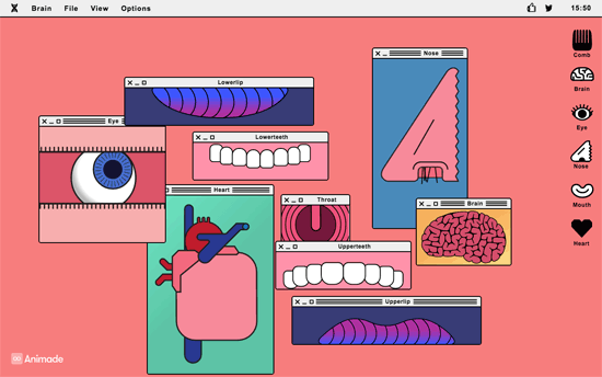
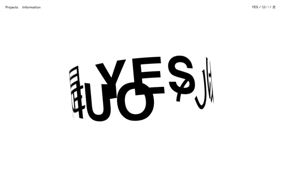
Wingdings is that you? There are a lot of “back-to-basics” making their way into website designs these days, like the bright blue and the pixelated, low-resolution images, and on top of that it’s the famous symbol font whose glyphs are gliding through a 3-dimensional stream. Even the circular shadowed bullets are used as markers for the carousel.
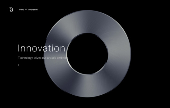
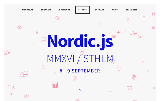
Quite the elegant triangle animation in the header that lets you interact with it too. I also like that the speaker avatars have their corners cut off in the shape of triangles too.
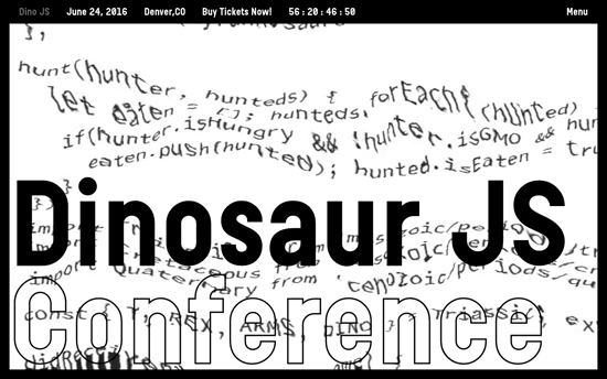
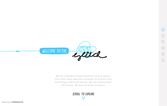
Also greets you with this cool glitchy effect applied to a block of code, this site is probably the kookiest of all with its oversized cursors and headings. I also like the black and white not just as a color scheme but as a negative filter when the text scrolls through the edges.
Social Media Weekly
Design – Design debugging
“Developers typically split the task of finding issues from building a project for wider release. These modes are often called debug and release. I think designers should take a similar approach.”
CSS – Flexbox Patterns
“Flexbox is awesome, but it introduces many new concepts that can make it difficult to use. These interactive examples will show you practical ways to use it to build UI components. They start out simple and get more complex near the end. You can start using these patterns in your own code right away, though I recommend you apply accessibility best practices to the markup (like using semantic HTML5 elements).”
Design – The Way We Build
“This process led us to the development of our new Design Language System (or DLS), as well as a suite of internal and third-party tools that allow our teams to not only work smarter, but also closer. The DLS is a collection of components defined by shared principles and patterns. This allows for rapid iteration using a shared vocabulary across design, engineering, and other disciplines. The structure of the DLS is simple and coherent, easing communication across teams.”
Build on DIYThemes’ Thesis Framework for rock solid SEO and great layout customization options.