Aligning Images The Right Way Using CSS
Images are great for blog posts and chunks of text in general. Even if they're just remotely relevant, they'll add some space and make the content more accessible. You want to spice your texts up with images.
You can position images however you like, of course, but a nice feature is to have the floating to the left or right, with the text flowing around them.
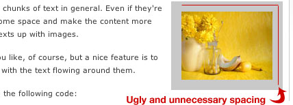
Like the one on the right here, using the following code:
-
<img src="TheImageLocation.jpg" alt="My Image Description" align="right" vspace="15" hspace="15" />
Nice huh?
Well, it could be better. You see, using the align="right" floats the image to the right, but the vspace and hspace values are around the full image, which looks a little weird with the right side of the image not being in line with the content's right side.
Like so:

What you should do is use CSS to float your images instead. Add these classes to your stylesheet:
-
.align-right { float:right; margin: 0 0 15px 15px; }
-
.align-left { float:left; margin: 0 15px 15px 0; }
The margin will make sure that there's no space where it isn't needed, in other words, you won't get that nasty spacing problem like the one in the image above.
Use it like this:
-
<img src="TheImageLocation.jpg" alt="My Image Description" class="align-right" />
While we're at it, why not add this to the stylesheet as well:
-
.frame { padding: 5px; border: 1px solid #aaa; }
Now you can add the frame class to your images for a nice looking border around your images. So if we want to float an image to the right with a border, we'll do it like this:
-
<img src="TheImageLocation.jpg" alt="My Image Description" class="align-right frame" />
Take a look to the right. There you have it, floating correctly and all, looking a lot better than the first one, right?
You know what the best part with this is? If you're a WordPress users, this is version 2.5 compliant code. They've finally switched to using CSS for aligning images, about time I'd say.
There you have it, easy handling of images, looking a little better, and being a lot more flexible should you want to change spacings, border colors and such.


Want an avatar? Get a gravatar! • You can link to this comment
I would get a little more specific when you are applying the frame
img.frame { styling }
Want an avatar? Get a gravatar! • You can link to this comment
Good little article outlining better use for CSS for beginners.
Not only can this method of approach be used for images, but all areas of html/css. Play around, get a feel for what limitation you may or may not have.
Want an avatar? Get a gravatar! • You can link to this comment
Nick, you’re right, however I like to be able to apply classes across the board when they’re as general as these, and as Dan notes you can add these element anywhere.
Want an avatar? Get a gravatar! • You can link to this comment
I use this method already, albeit with id’s rather than classnames. Just lets me reduce a few letters (typing out class is larger)
Want an avatar? Get a gravatar! • You can link to this comment
TDH – I was just arguing for the sake of arguing hehe (Good general CSS article).
Sumesh – I don’t necessarily agree with using IDs in place of classes for general styling to save space. The W3C defines an ID as “a unique identifier to an element”.
Want an avatar? Get a gravatar! • You can link to this comment
^^ especially if you decide to use more than one image on the page and then IDs are all wrong. Class is an extra 3 letters and so I would say it is NOT worth the possible problems.
btw great article..
Want an avatar? Get a gravatar! • You can link to this comment
You sir are a genius.
With exquisite simplicity you have solved a problem which many have obfuscated. Thanks very much.
Want an avatar? Get a gravatar! • You can link to this comment
What about centring images! the text-align property is a bit weird when used with images surely..
Want an avatar? Get a gravatar! • You can link to this comment
oh god.. just figured it out forget it lol
Want an avatar? Get a gravatar! • You can link to this comment
Nick, agree with you. use ID to identify an element, and use class to apply styling to an element, it makes more sense..
anyway, when using this technique, dont forget to mention about “clearing” the float(s). 1 entry could have left, right or centered align images, so..EasyClearing come to the rescue!
Want an avatar? Get a gravatar! • You can link to this comment
Hi, i have some images with links in my blog, i put the codes to add every image, but by default all of them are aligned up to down and i would like to align them one and other to the right or left side. can you help me please?
http://img181.imageshack.us/img181/250/imag11tf5.png
Want an avatar? Get a gravatar! • You can link to this comment
I personally try to avoid presentation descriptive class names such as ‘align-right’ or ‘align-left’. The purpose of using CSS is maintain content and presentation in diferent layers, separated. And if you have to redesign, maybe those class names become useless.
Want an avatar? Get a gravatar! • You can link to this comment
This is a great one. I been looking for this.
and got into here via Google
.
Thanks You !
Want an avatar? Get a gravatar! • You can link to this comment
This is a great fix.
You can also change the vertical and horizontal space under the Advanced Settings tab when you click on the Edit Image icon. The drawback is that you would have to do for every image.
Want an avatar? Get a gravatar! • You can link to this comment
Thanks for this blog! I was having lots of problems using CSS to align my images.
Want an avatar? Get a gravatar! • You can link to this comment
Hey,
I found out the hard way: float and align are definitely not the same.
This is especially so when using the clear attribute on page layouts. If you clear a floated image (useful, say, in a post) then it will clear all elements on the page layout.
I don’t think there is an alternative to align…
Want an avatar? Get a gravatar! • You can link to this comment
Very nice article. Was stuck in a similar scenario…
Thanks
Want an avatar? Get a gravatar! • You can link to this comment
Don’t take this the wrong way, but I was totally expecting more of this.
You could expand this article by mentioning the differences of aligning an inline image and a block image. How to trigger each behaviour and how to align each of them is way different. For example, text-align works for inline, while margin works for blocks. Vertical align can be used to position an inline image (i.e., an icon besides a link) with the text, etc.
Props for encourage the use of CSS for styling, though! Just think there’s room for so much more.
Want an avatar? Get a gravatar! • You can link to this comment
@Daniel K – The image will only clear other floated elements in your page layout.
Want an avatar? Get a gravatar! • You can link to this comment
thanks, now show me how to put the image in the center and middle of another div.
Want an avatar? Get a gravatar! • You can link to this comment
very simple & useful
♥
Want an avatar? Get a gravatar! • You can link to this comment
Thank you very much for this wonderful tip! *joy* I had been very dissatisfying with the usage of align=”right” on my blog, it just didn’t appear the way I wanted. For some reasons, I Googled again today and found you. Thanks a million!