The Next Devlounge Design: Mockup #1
As promised, we’re inviting our dear readers to share their minds on the next Devlounge design. This is the first of several posts detailing the development of the next version of Devlounge, be it design decisions or how to better sort the content.
Some thoughts on Mockup #1
You’ll find Mockup #1 below. It’s not a far step from today’s Devlounge, for several reasons, one being recognition. The main thing to notice is the way the content is divided, with features at the top, and then a stream of updates. The sidebar will be utilized for more static content, such as downloads and extras, and perhaps some other things.
Anyway, there’s not too much to say about this first mockup, called Mockup #1. It’s not complete, and everything will look slightly different in code.
Here goes!

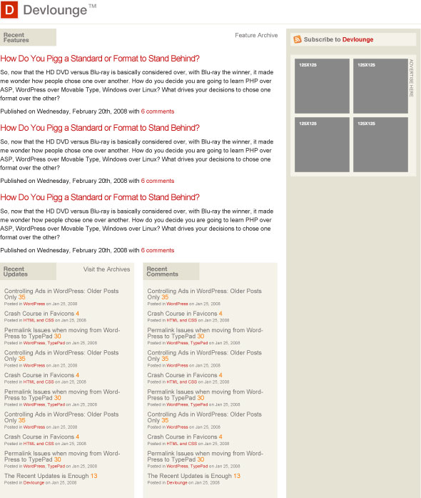
What do you think? Speak up in the comments, your opinions will help make the next Devlounge a prettier, and more organized, place!


Want an avatar? Get a gravatar! • You can link to this comment
I quite like the design. It keeps the Devlounge identity and branding and keeps a very nice simple yet effective design.
Want an avatar? Get a gravatar! • You can link to this comment
Nice, I like the way to display recent updates and comments.
Want an avatar? Get a gravatar! • You can link to this comment
The design is nice and simple, but i would make the recent updates/comments thing smaller and add only titles for ie. the 3 next posts that come in line .
Want an avatar? Get a gravatar! • You can link to this comment
Where’s the menu and the search input? Oh, there isn’t any.
Want an avatar? Get a gravatar! • You can link to this comment
neat! one thing, that light brown(?) boxes seem not really blend in..IMO better if they are (very)light grey
on top of that, neat grid design
Want an avatar? Get a gravatar! • You can link to this comment
You’ve lost several important elements. Search and the main navigation for example.
It’s not that adventurous either. I know you like to keep things clean here but that’s not synonymous for boring. I’m not saying that’s not an improvement from the current home page (which just has less life than a preserved corpse) but there’s scope for improvement at an artistic level.
Layout-wise, I think it’s almost there. I like the two columns under the main post - but will they be hard to be kept the same height?
And that orange you’re using to show how many comments there are (in the sub-columns)… Why? It’s not used anywhere else. I would change that to a feint grey (like your sidebar background colour) so it’s less prominent than the title (unlike now) but still differentiated.
Want an avatar? Get a gravatar! • You can link to this comment
I personally think that the current layout and design is well thought out and designed compared to this new comp.
Want an avatar? Get a gravatar! • You can link to this comment
I’m all about simple, but for once in this site’s life you just need to go for a huge WOW factor. If you’re moving away, don’t go back to the small font, semi-simplistic style of the past. Hell, rebrand even.
Lets see some TDH, instead of AJ’s previous style.
Want an avatar? Get a gravatar! • You can link to this comment
What i miss from the previous design is:
1.Navigation and Search feature
2. Recent update and comments was not necessary,instead you could gave tied with other news of splashpress media blogs.that might look good.
try this..
3.Recent comments should be replaced with dtwitter and fridau focus.
4.recent updates== all the updates in splashpree media.
Hope to see better devlounge.
Want an avatar? Get a gravatar! • You can link to this comment
Whats so different about it???
Want an avatar? Get a gravatar! • You can link to this comment
Thanks for the comments, guys! Remember, this isn’t a final design, or even a final mockup, it’s just something for you to comment on, so that I can move onwards in the right direction.
Some clarifications and additions:
As for more wow, yes, I have plans for the three feature stories, but just didn’t have time to make them look OK for this mockup. I agree that it needs some action. (I’m moving house, quite chaotic and busy!)
I appreciate the feedback! Keep it coming, if you have anything else, or stay tuned for the next mockup!
Want an avatar? Get a gravatar! • You can link to this comment
Hey TDH
Thanks for clarification.Comments section suposed to be removed cause it gives devlounge an average blog look.Thats why AJ cutted it out on most of his designs,if u see carefully.If you want you can put the comment section as small box in sidebar but not this big as on page.
Font size is ok.
Hope to see better devloounge.
Want an avatar? Get a gravatar! • You can link to this comment
Looking better.
Want an avatar? Get a gravatar! • You can link to this comment
Well, i think it looks ok, however, Why dont do something with the posts.. It’s so boring when displayed:
HEADING
Article text, article text
- article info
HEADING
Article text, article text
- article info
Why dont do it more “magazine style”
Want an avatar? Get a gravatar! • You can link to this comment
You lost the top red bar - a very bad change.
The top bar gives life to this simplistic design - without it you are looking at a plain text dump. The top 100px of this site drives the mental hunger that keeps me coming back.