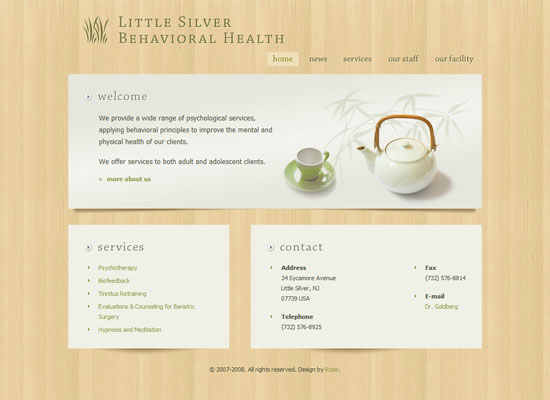
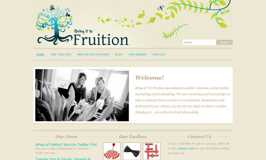
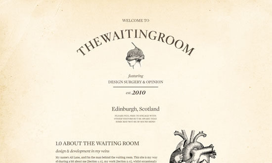
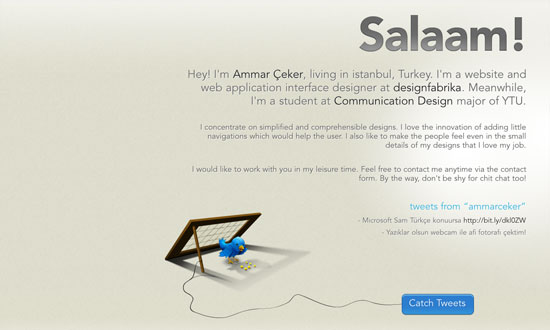
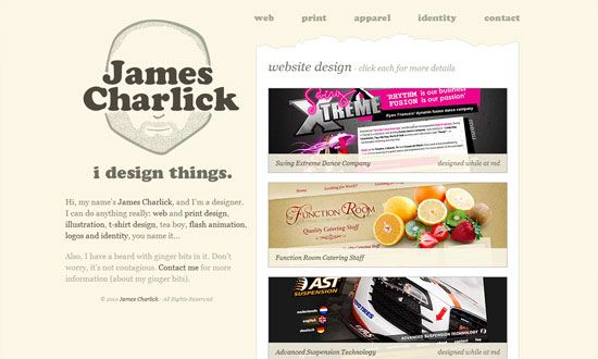
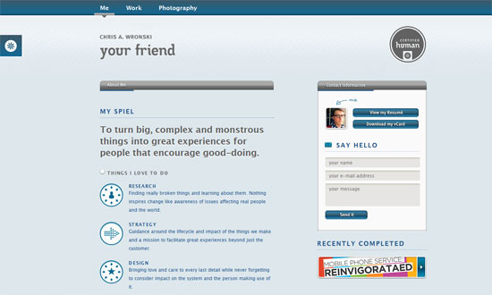
I’m seeing a lot of sites whose color palette consists almost exclusively of light grayish, brownish hues. Sounds boring? No such thing for a smart designer.
Designs of the Week


Social Media Weekly
CSS – 13 Pure CSS Techniques for Creating JavaScript-like Interactions
“Here are 13 tutorials that teach you how to push the limits of CSS and make it do things that we’re not accustomed to it doing.”
HTML – The Origins of the <blink> Tag
Typography – 10 Great Tips For Improving Your Web Typography
“Once a specialist occupation, the digital age has opened typography to computer users and web designers. When creating pages and laying out text with other content there are several guiding principles that designers should bear in mind.”
Bloggers – The History of Web Design Blogs
“Although the article may seem rather subjective to you, we hope that it will give you at least some basic understanding of how it all started and evolved into its current state.”