This week’s websites feature beautiful, iconic letterforms that serve as design anchors to the content.
Designs of the Week
Get solid WordPress themes, plugins, and web design training from iThemes.
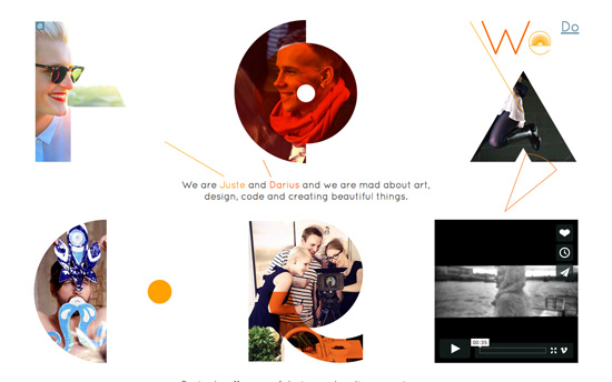
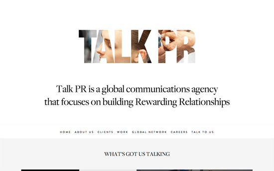
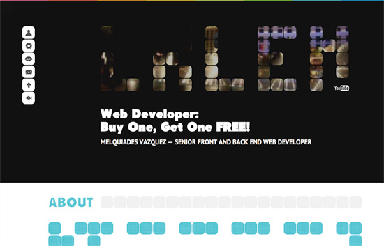
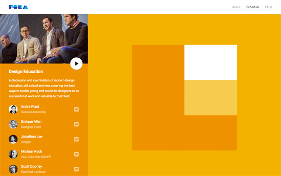
Their about page spells out their company name (logo) in an almost abstract way, and these shapes mask and highlight different photos & videos that tell their story.
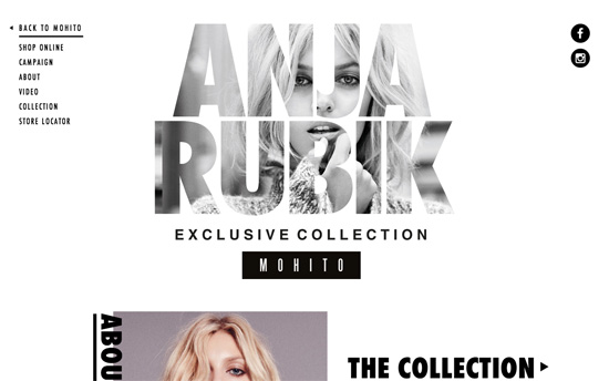
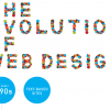
The letters here are inspired by Google’s Material Design language, and the color-coding per section is nifty. There are a lot of sections for the one-pager though, so a menu that lets you skip should’ve been present.
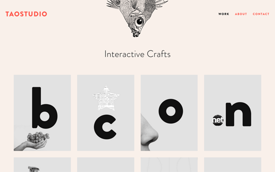
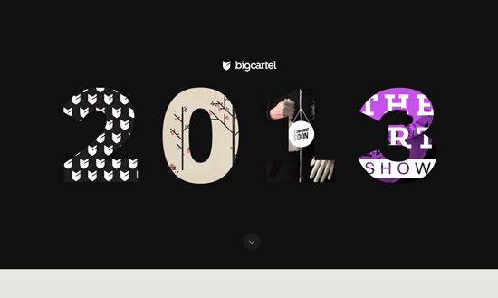
Card-based layouts are all the rage these days and this in particular reminds me of flash cards from childhood, but the twist is how the project images integrate with letters in a minimal, quirky, modern way. The grid ends with a card that says “what letter are you?”, inviting you to contact & contract them for new work, which I find clever. Other details I like: the sea creatures hanging upside down each page, and the submit button on the Contact page that looks like an actual keyboard key. Again, the design goes for quirky, clever things.
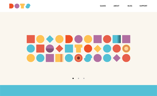
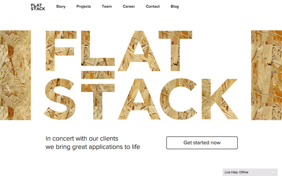
With letters that are just a couple of steps evolved from primary shapes, you can see how close their logo design is to the star of their games: the circle (or in their case, the dot).
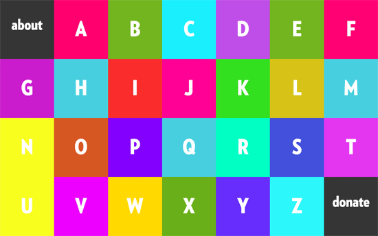
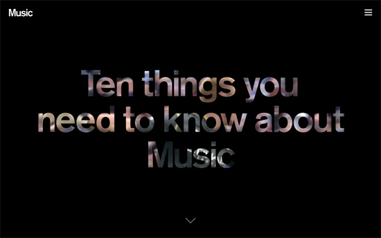
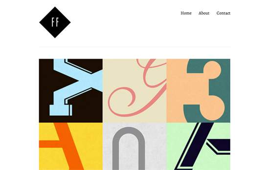
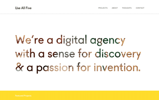
Color palette is a bit strong, although it totally works with the enclosed illustrations for each letter. I would like to see more of the comic/drawn look to the letters to tie in with the drawing style more.
Social Media Weekly
Make Headway, make intuitive layouts, make it your WordPress theme of choice!
JavaScript – The JavaScript World Domination
“JavaScript seems to creep into the most unexpected places these days. It’s not too long until your very toaster will be running JavaScript… but why?”
User Experience – Change Blindness: Why People Don’t See What Designers Expect Them To See
“For example, studies have found that people fail to notice that the details of an image have changed.”
Responsive Web Design – Responsive Design with Viewport Control
“To ensure your media queries work on hand-held devices, put this in your <head>!”